
Wozyk – a digital travel platform
About the
project
Wozyk is a digital travel platform created to make searching, comparing, and booking bus tickets feel simpler and more intuitive.
Our work covered both the brand identity and the digital product experience, allowing us to build the project as one connected system rather than treating branding and website design as separate tasks. The visual language, interface, and communication principles were developed to support the same idea: making everyday travel feel clear, accessible, and easy to navigate.
The goal was to create more than a functional ticket aggregator. We wanted Wozyk to feel like a modern, recognizable travel service — one that people can understand quickly, trust easily, and return to whenever they need to plan their next trip.
Building a Brand
Wozyk operates in a category where clarity and trust matter as much as speed. People need to understand the service immediately, compare options without friction, and feel confident that every step — from search to booking — is reliable.
Our task was to shape a brand language that could support this experience across both communication and product design. The identity needed to feel modern, accessible, and dynamic, while remaining simple enough to work naturally within a functional digital service.
From Strategy
to a Brand Language
For us, design is never an isolated creative exercise. It is the natural outcome of strategy.
Every decision - from the smallest visual detail to the overall brand experience - was guided by research, purpose, and long-term scalability.
We started by looking at how digital travel services communicate and where they often become too complex or impersonal. Instead of focusing only on competitors, we paid attention to the full user journey — how people search, compare, choose, and book trips.
The discovery phase helped us define Wozyk not simply as a ticketing platform, but as a practical travel companion built around ease, clarity, and confidence.
The strategic direction focused on reducing complexity at every step of the journey. The brand needed to feel fast and functional, but also approachable and human — helping users make decisions quickly without making the experience feel cold or overly technical.
This became the foundation for Wozyk’s positioning, tone of voice, and overall brand character.
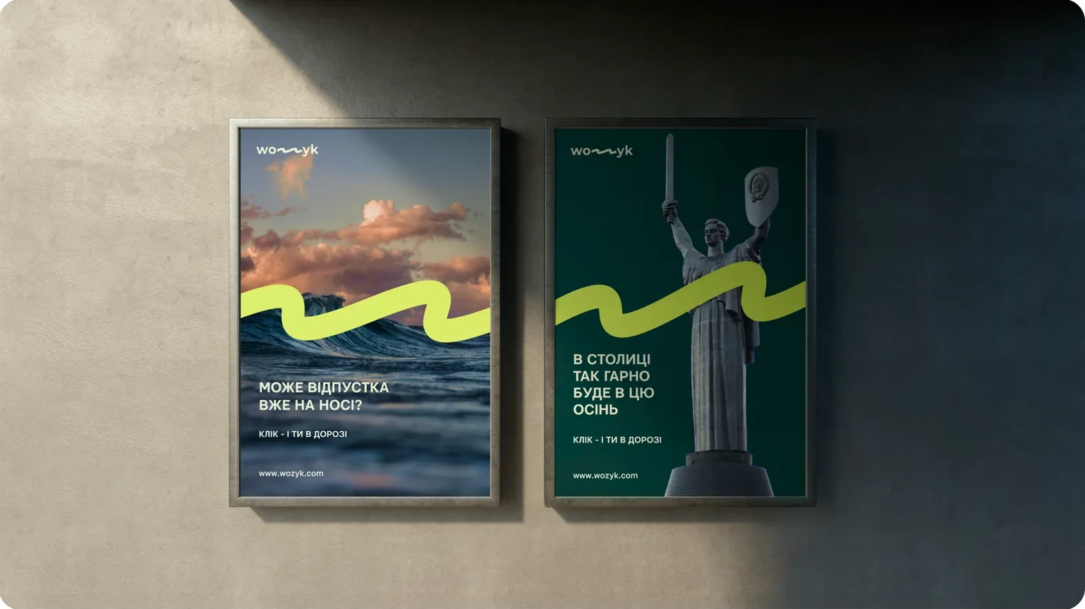
With the strategic direction in place, we focused on translating Wozyk’s core qualities — simplicity, speed, and accessibility — into a visual language.
We explored a system that feels dynamic without becoming overwhelming: clear typography, confident color use, simple graphic principles, and a structure that works naturally within a digital product. The goal was to create an identity that supports the user experience rather than competing with it, while still giving Wozyk a distinct and memorable character.
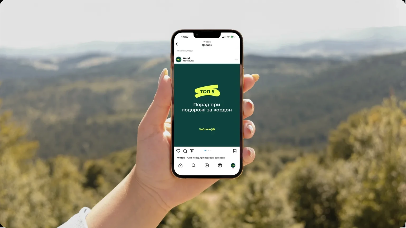
We brought Wozyk’s visual direction into a complete identity system designed around clarity, movement, and ease of use.
Color, typography, iconography, composition, and interface principles were developed to work together as one consistent visual language. The system combines a bold, energetic character with enough structure to keep communication clear, functional, and easy to navigate.
As a result, Wozyk gained more than a distinctive visual style — it received a flexible identity system that can scale across the digital product, marketing materials, social media, and future brand applications without losing consistency or recognition.
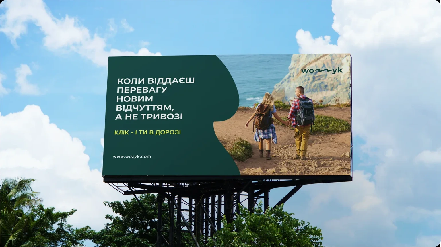
The final stage was turning Wozyk’s identity into a practical system that could work consistently across both the product and the brand’s communication.
We adapted the visual principles for the website, booking flow, social media, marketing materials, and other digital touchpoints, making sure the system remained clear, recognizable, and easy to use in different contexts.
As a result, Wozyk gained a flexible brand framework that supports growth without losing its core qualities — simplicity, energy, and a confident, user-friendly character.
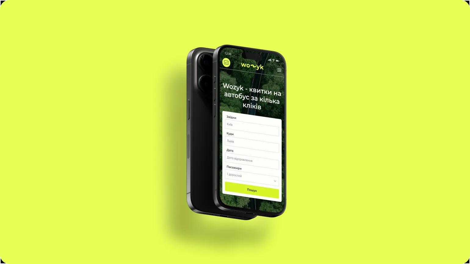
Results
The project gave Wozyk a clear and recognizable identity built around simplicity, movement, and ease of use. The visual system now works consistently across the digital product and brand communication, making every interaction feel connected, intuitive, and unmistakably Wozyk.
Most importantly, the brand now has a flexible foundation that can grow alongside the service while preserving clarity, recognition, and a confident, user-friendly character.
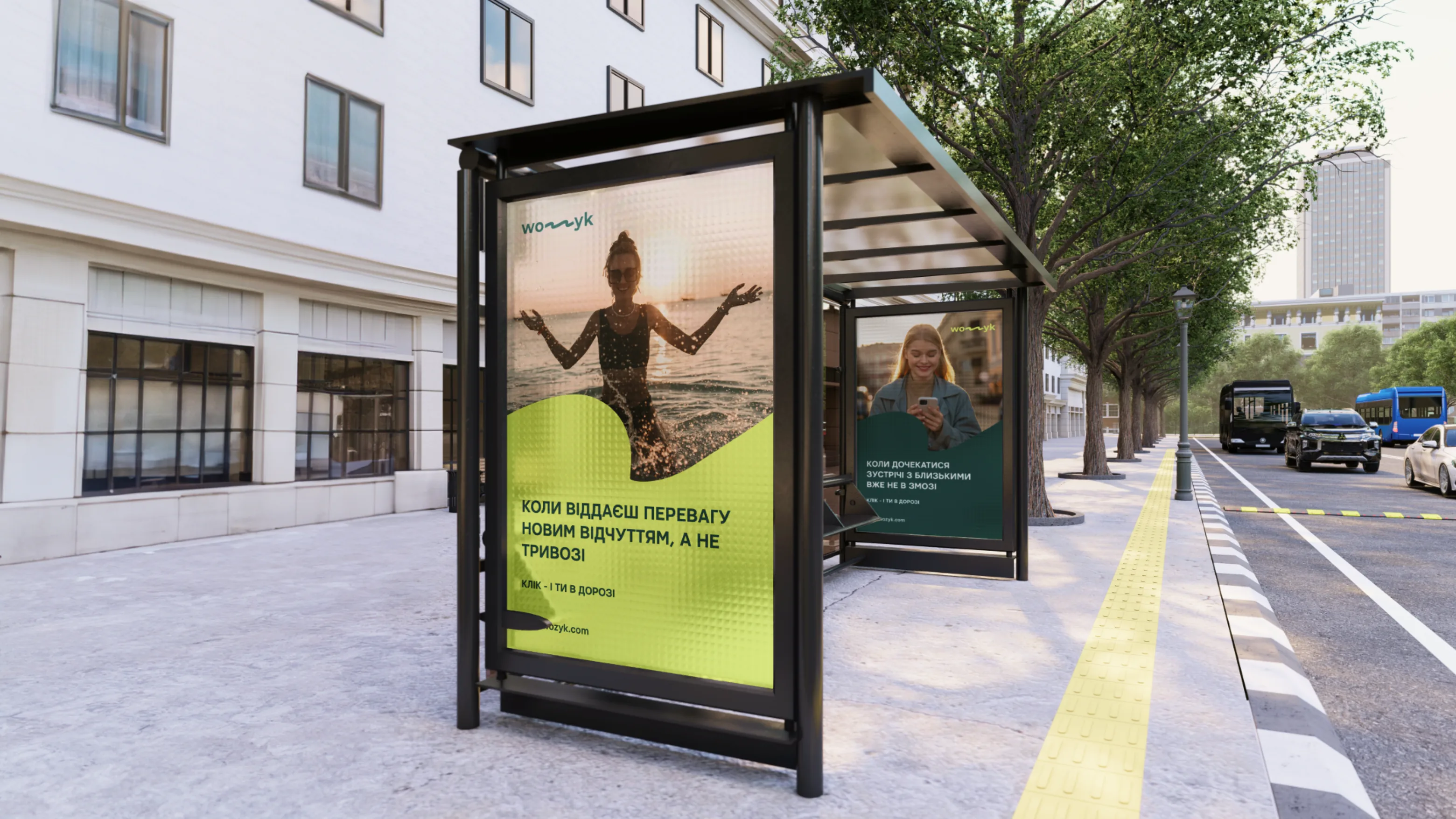
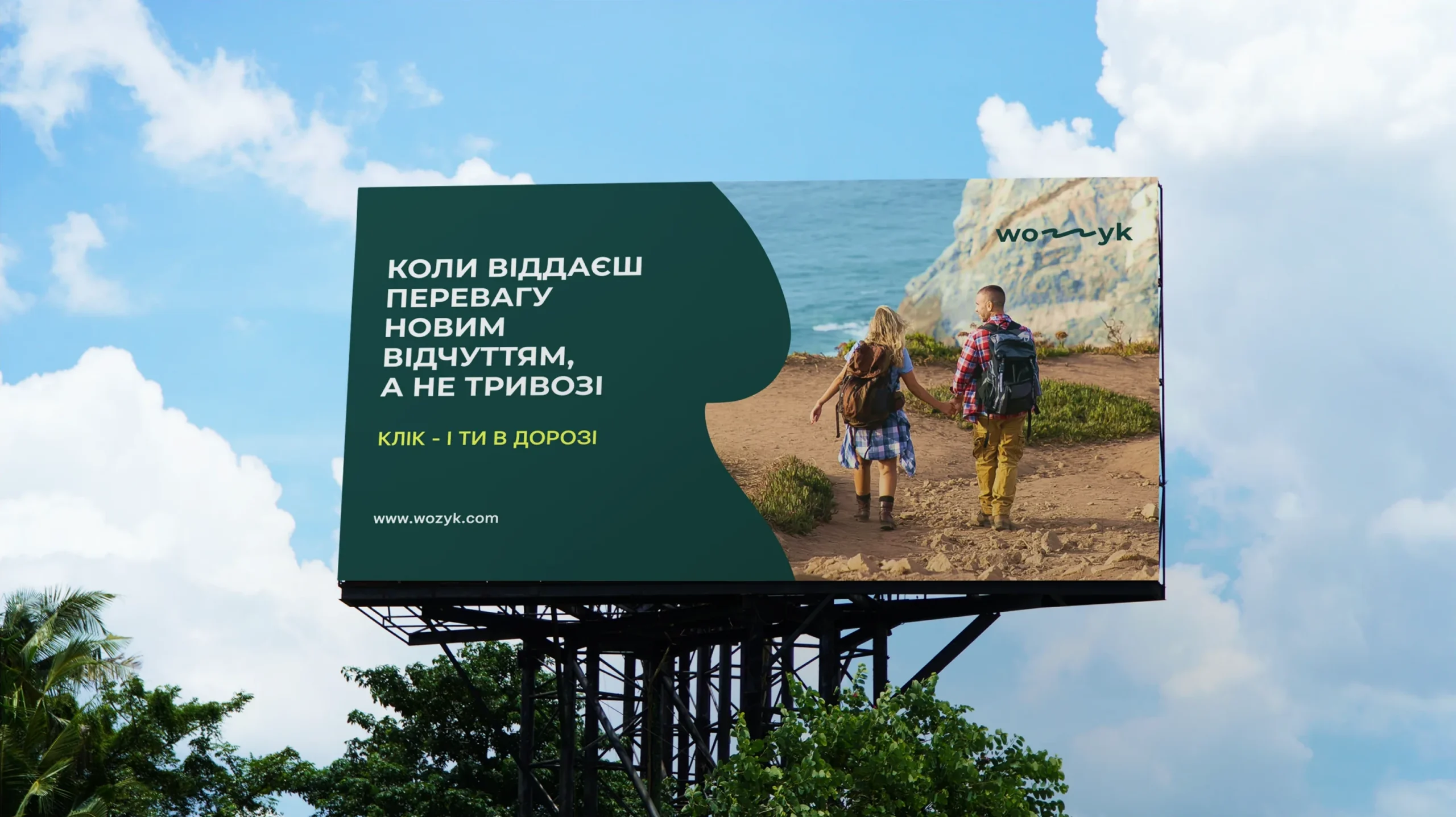
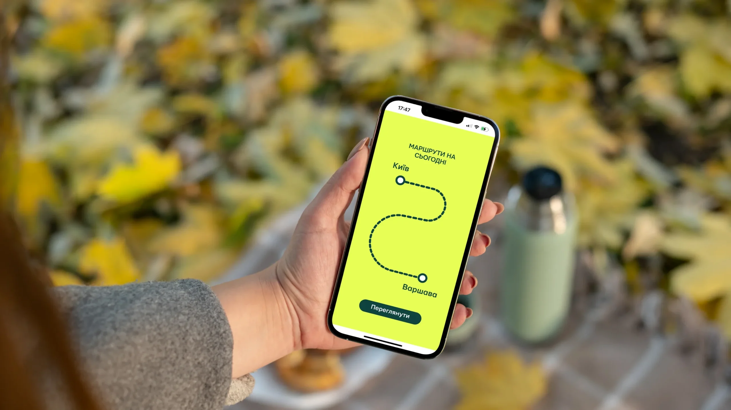
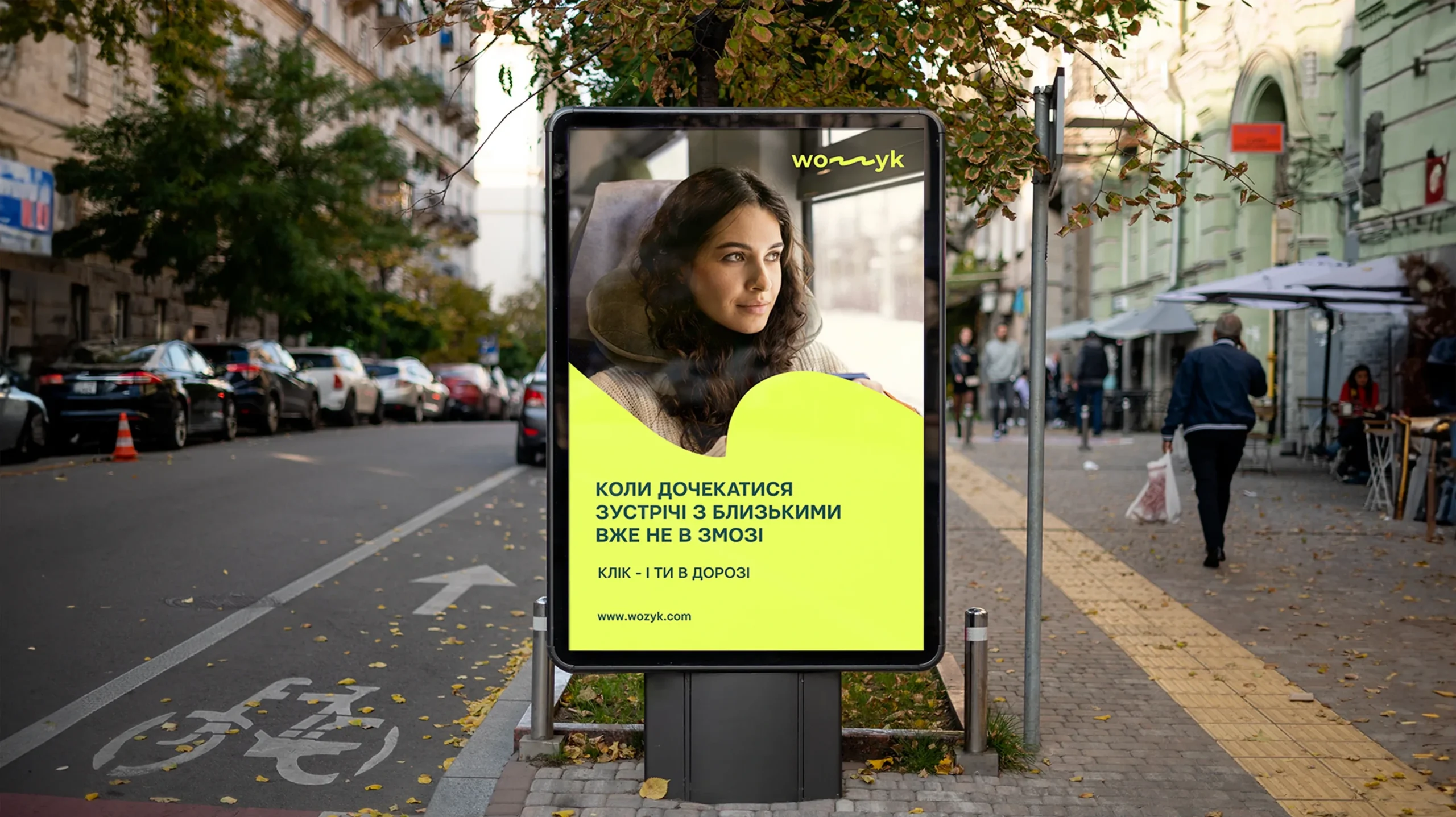
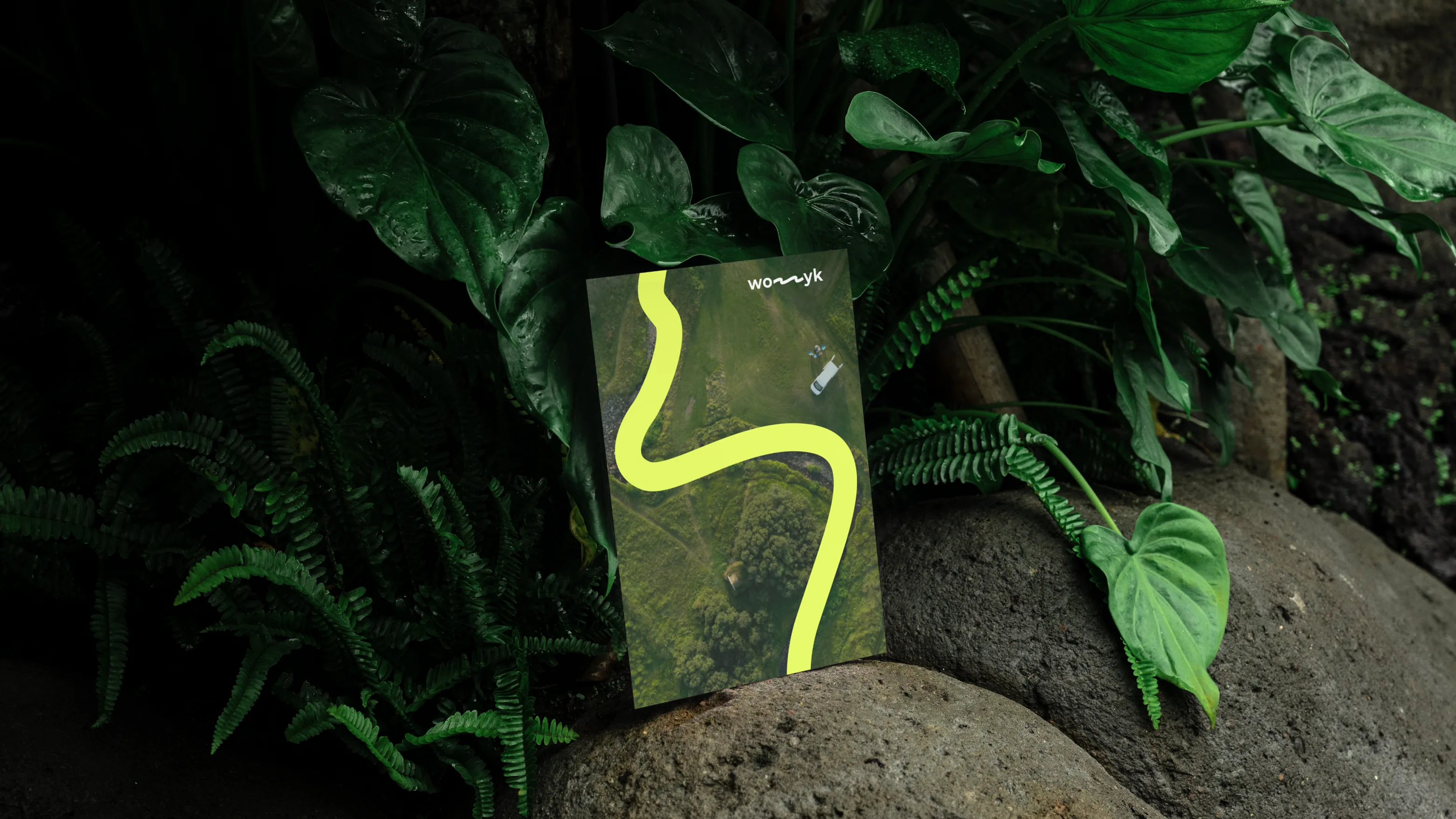
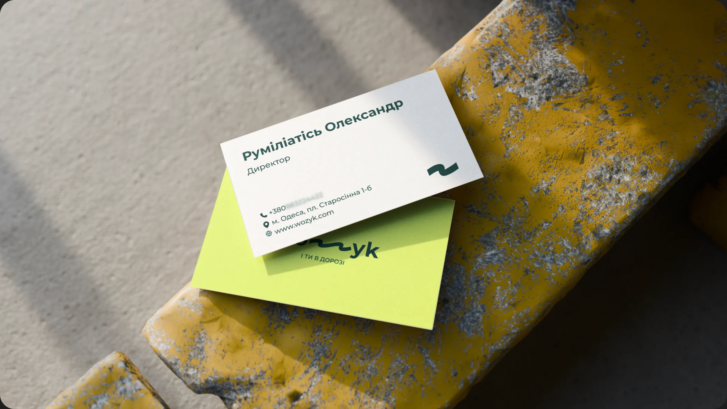
Logo
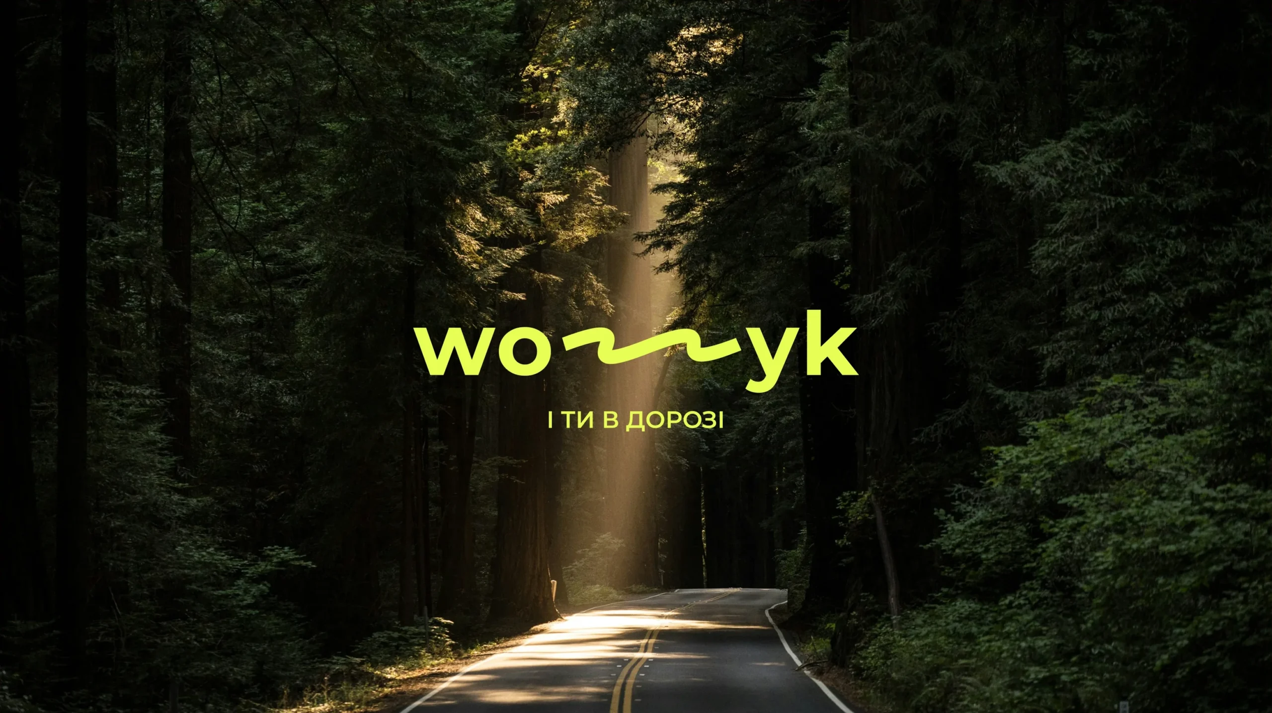
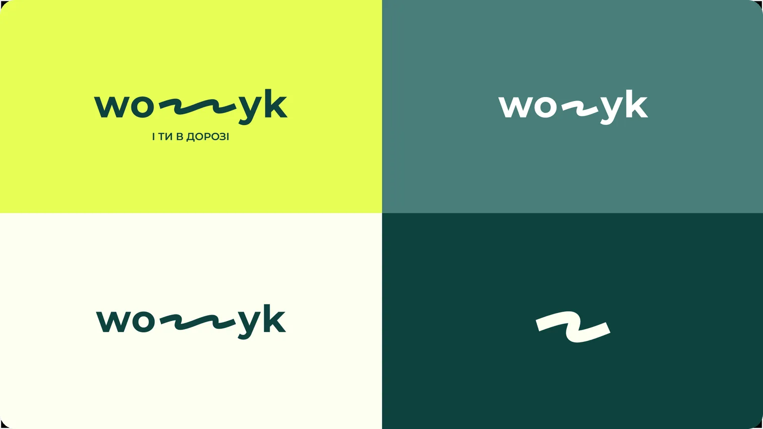
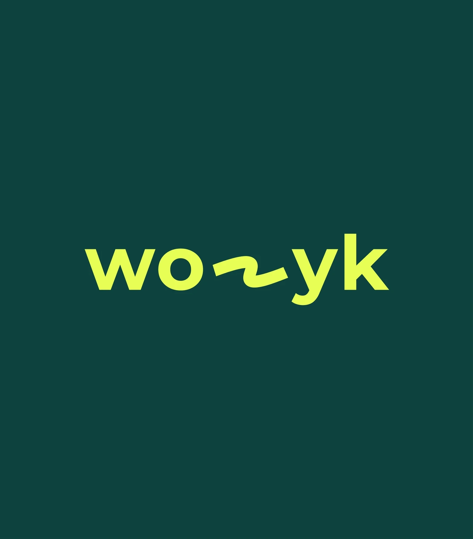
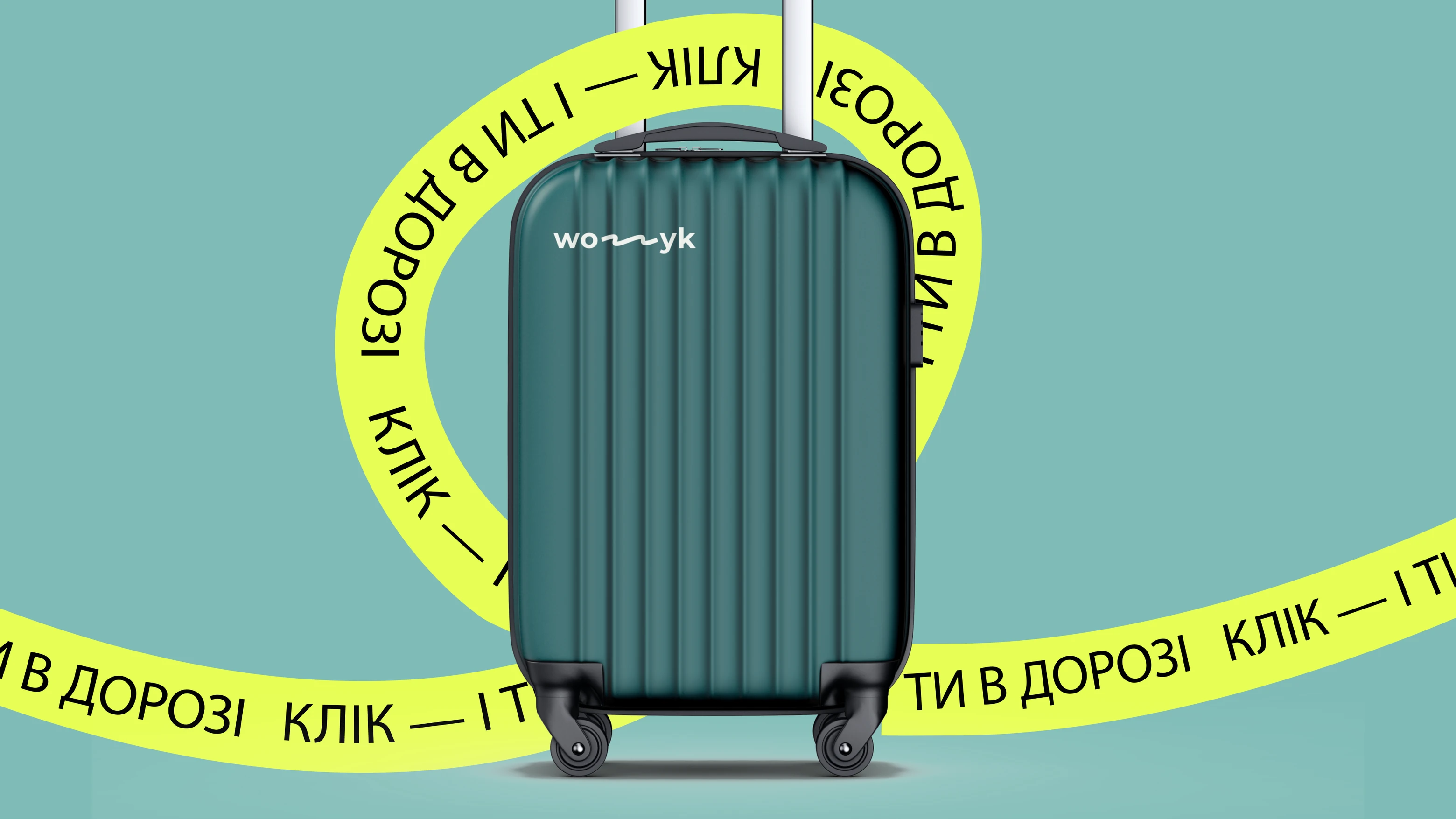
The Wozyk logo was designed around the idea of movement and connection. At the heart of the mark is a flowing line that represents direction — a simple visual metaphor for the journey itself and the ability to move from one point to another across Ukraine with Wozyk.
The wordmark combines this sense of motion with a clear, modern structure, giving the identity a character that feels dynamic without becoming overly complex.
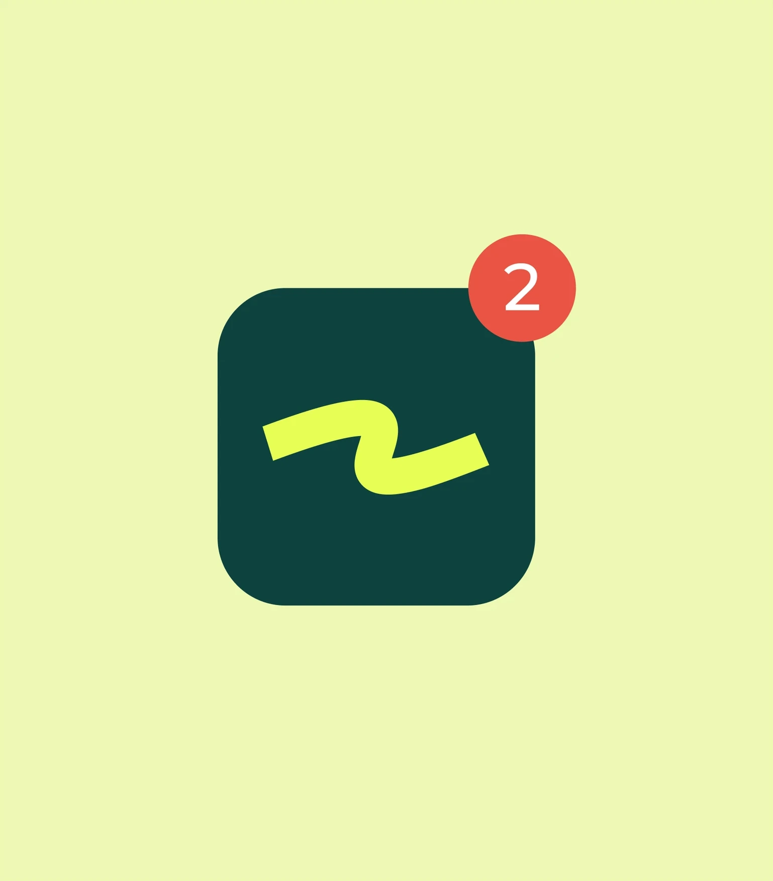
The graphic element can also work independently as a recognizable symbol, making the logo flexible across digital interfaces, transport-related applications, marketing materials, and smaller branded touchpoints while preserving the idea of movement at its core.
Colors & Typography
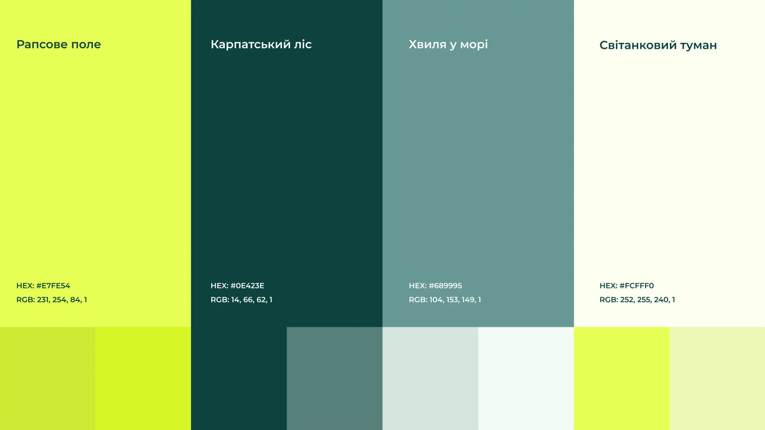
The Wozyk color palette was inspired by the Ukrainian landscape and the feeling of movement through it. Each shade refers to a familiar natural image — a rapeseed field, the Carpathian forest, a sea wave, and morning mist.
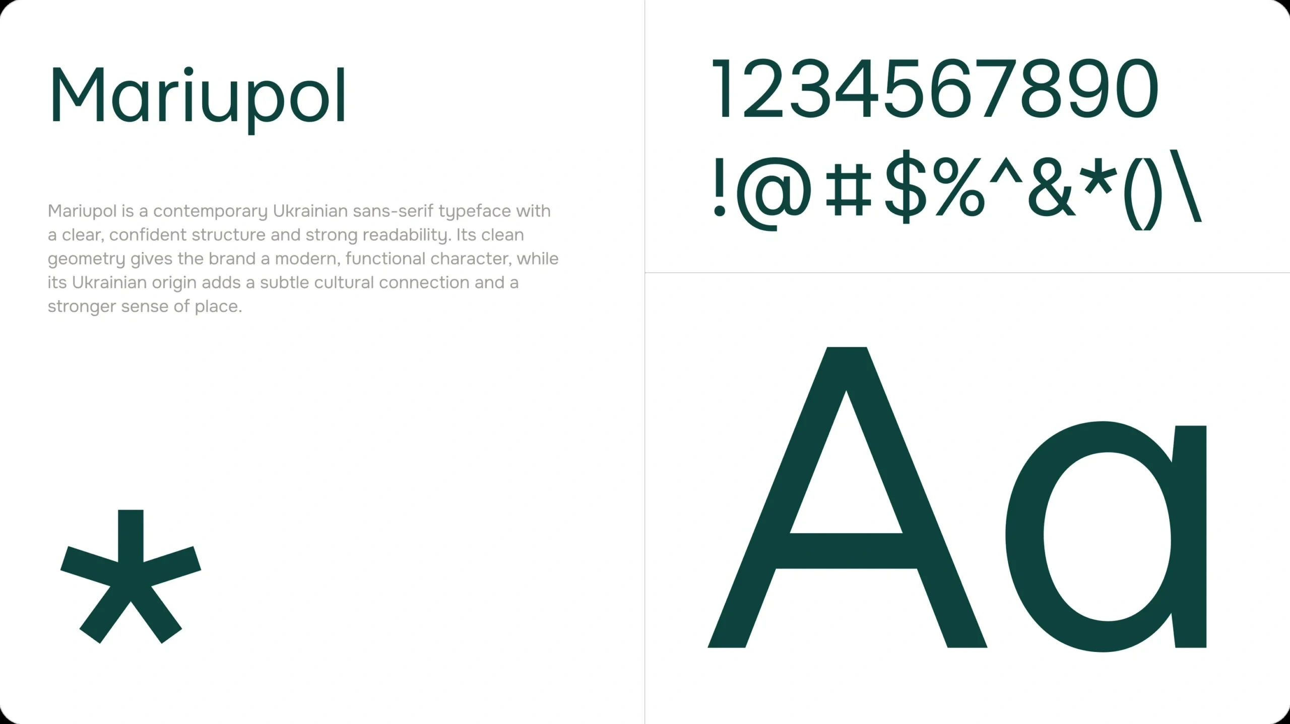
For typography, we deliberately chose Mariupol, a Ukrainian typeface, to preserve a subtle cultural connection within the identity. Its contemporary structure and strong readability support the functional needs of a digital travel service, while its origin adds an additional layer of local character. This allowed us to combine modern usability with a visual language that still feels rooted in Ukrainian context.
Merch
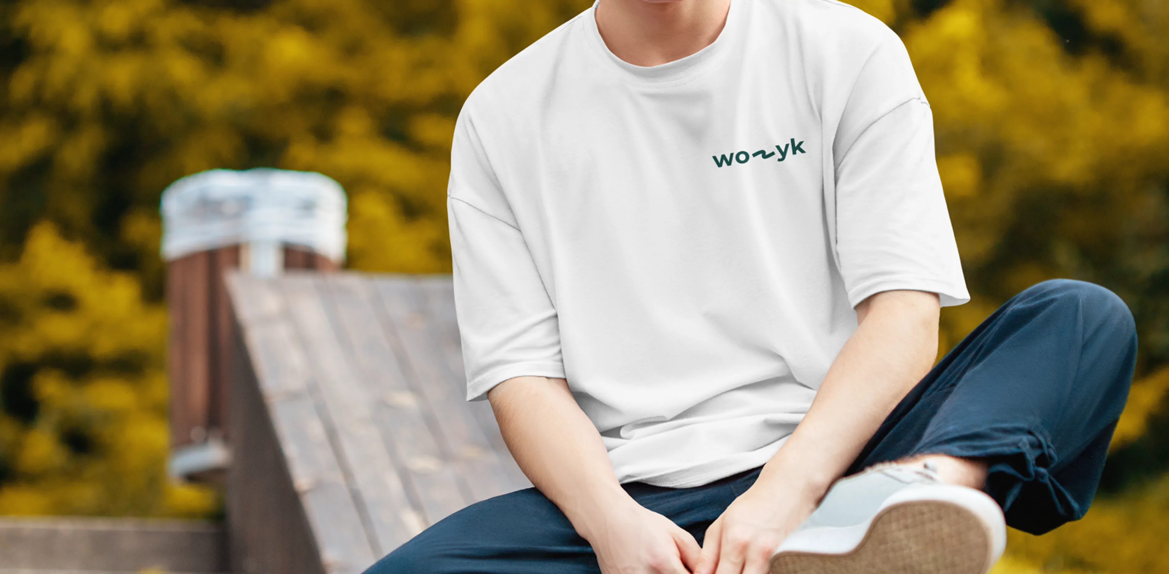
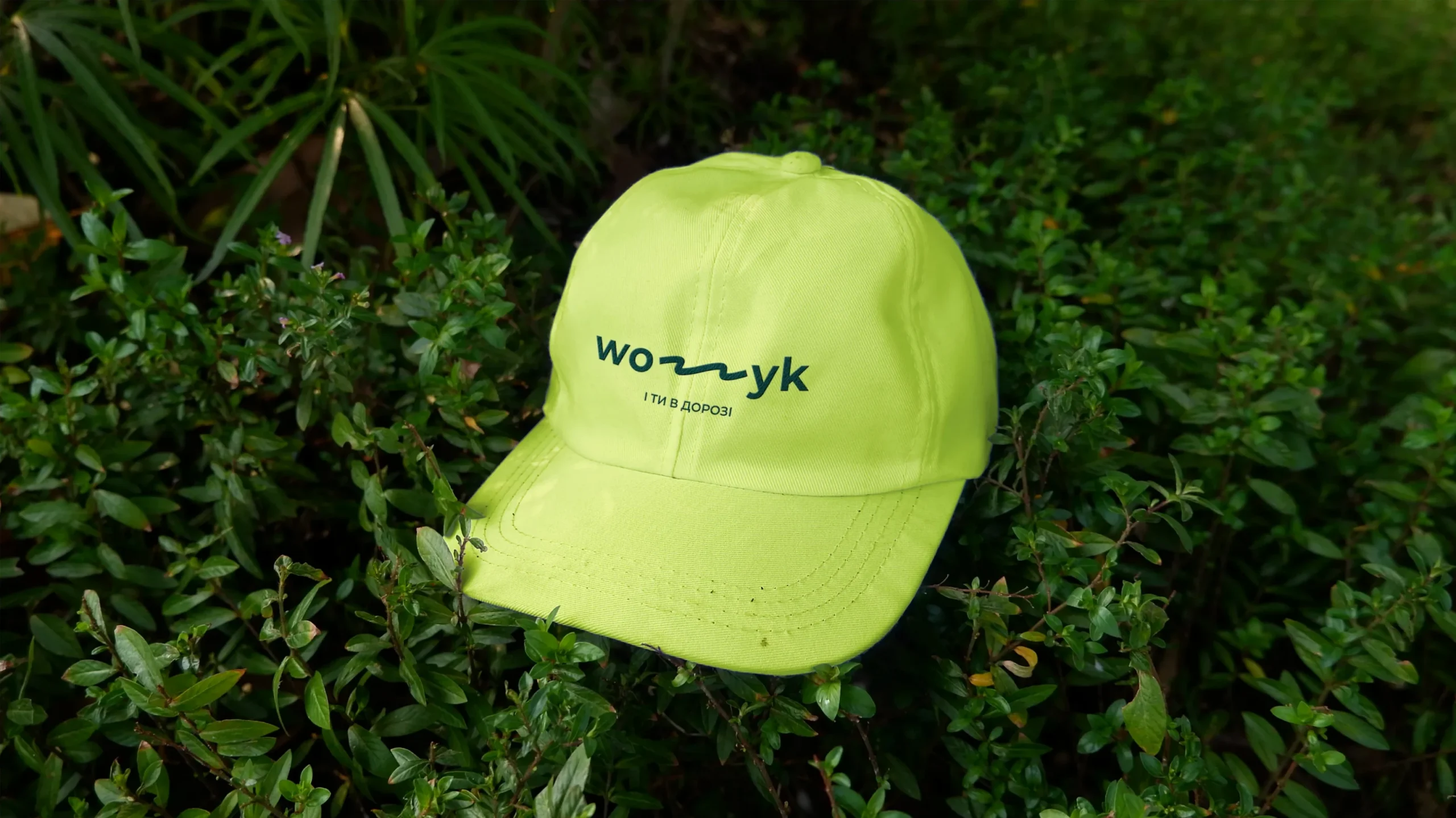
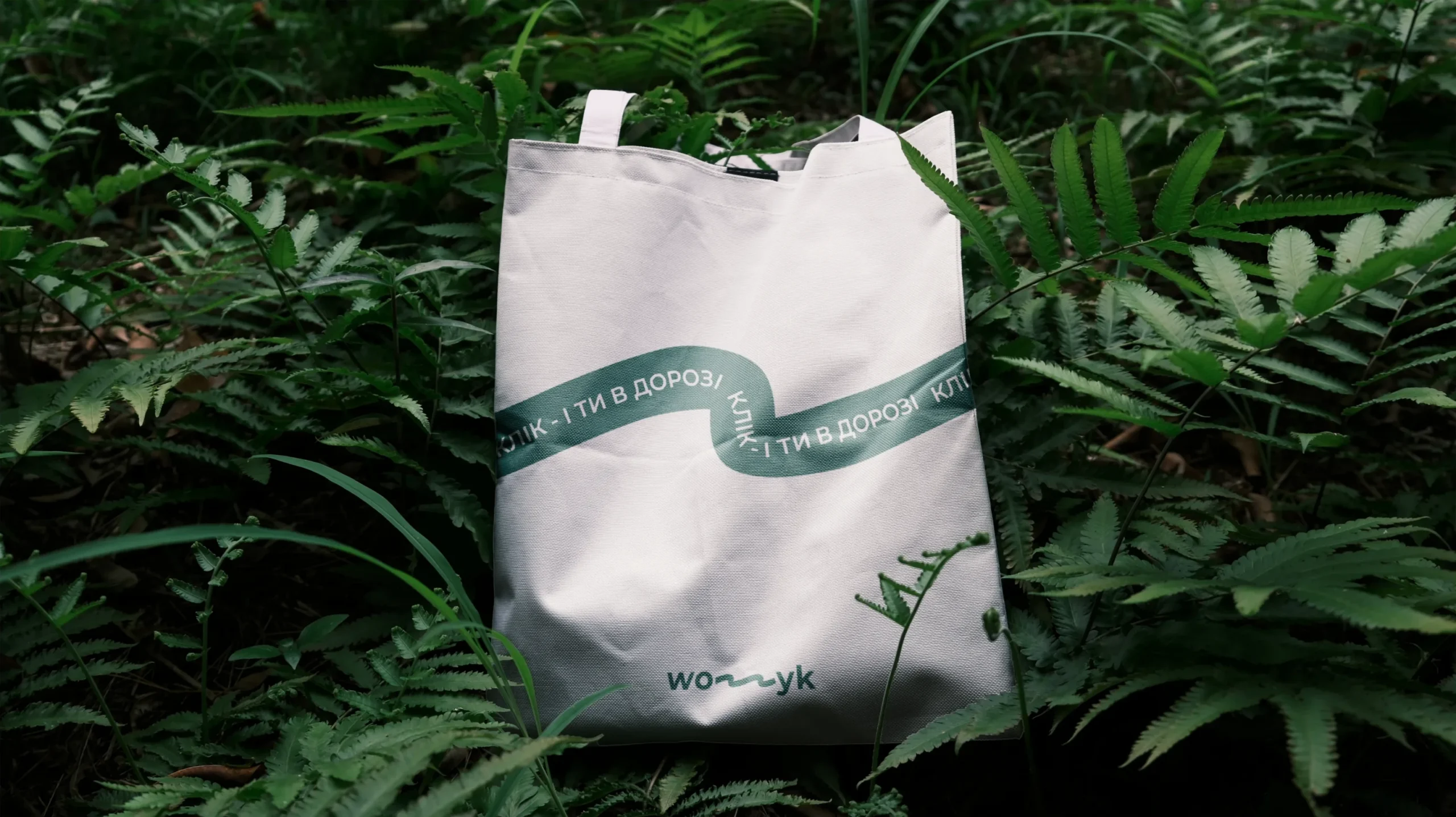
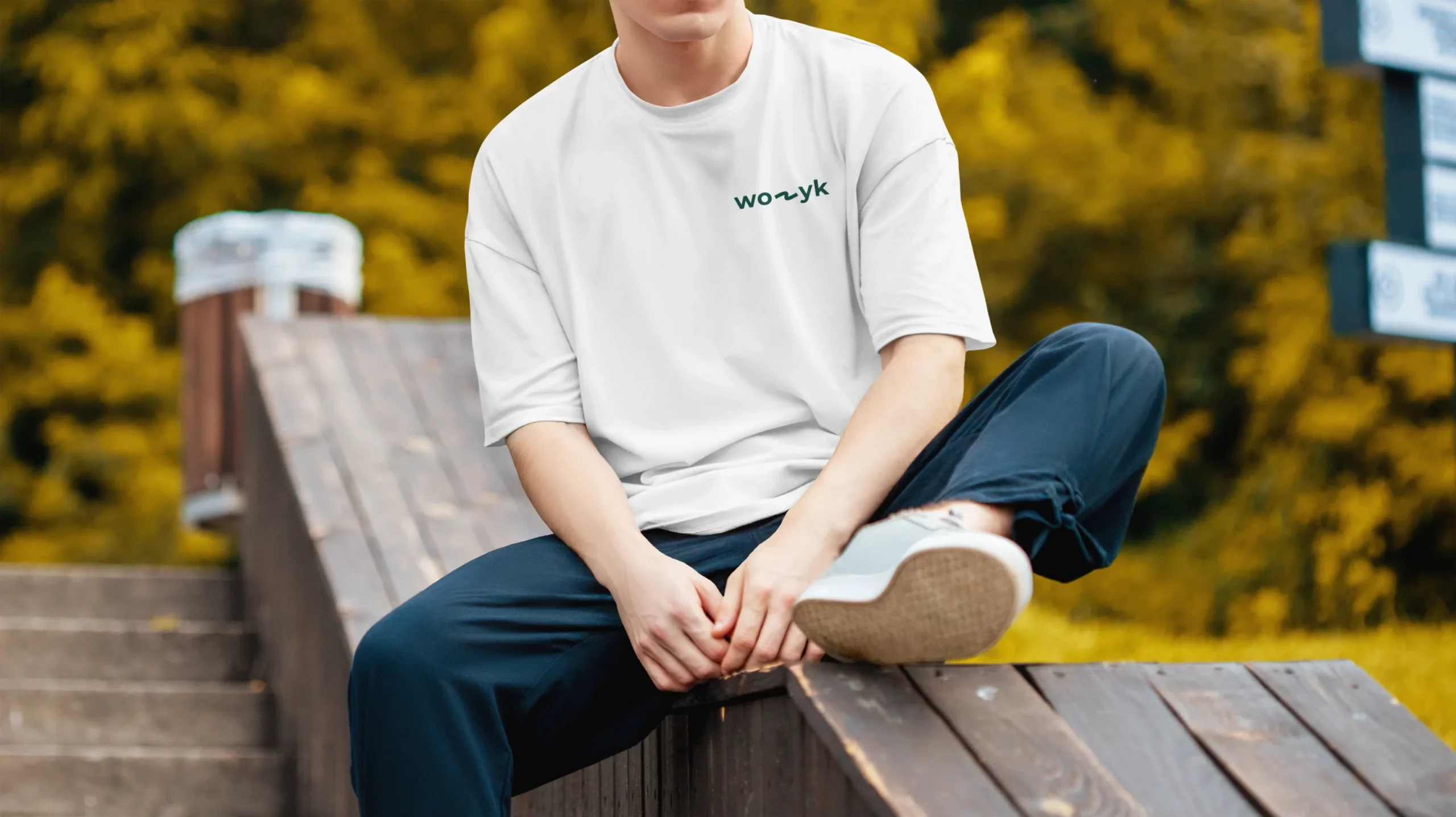
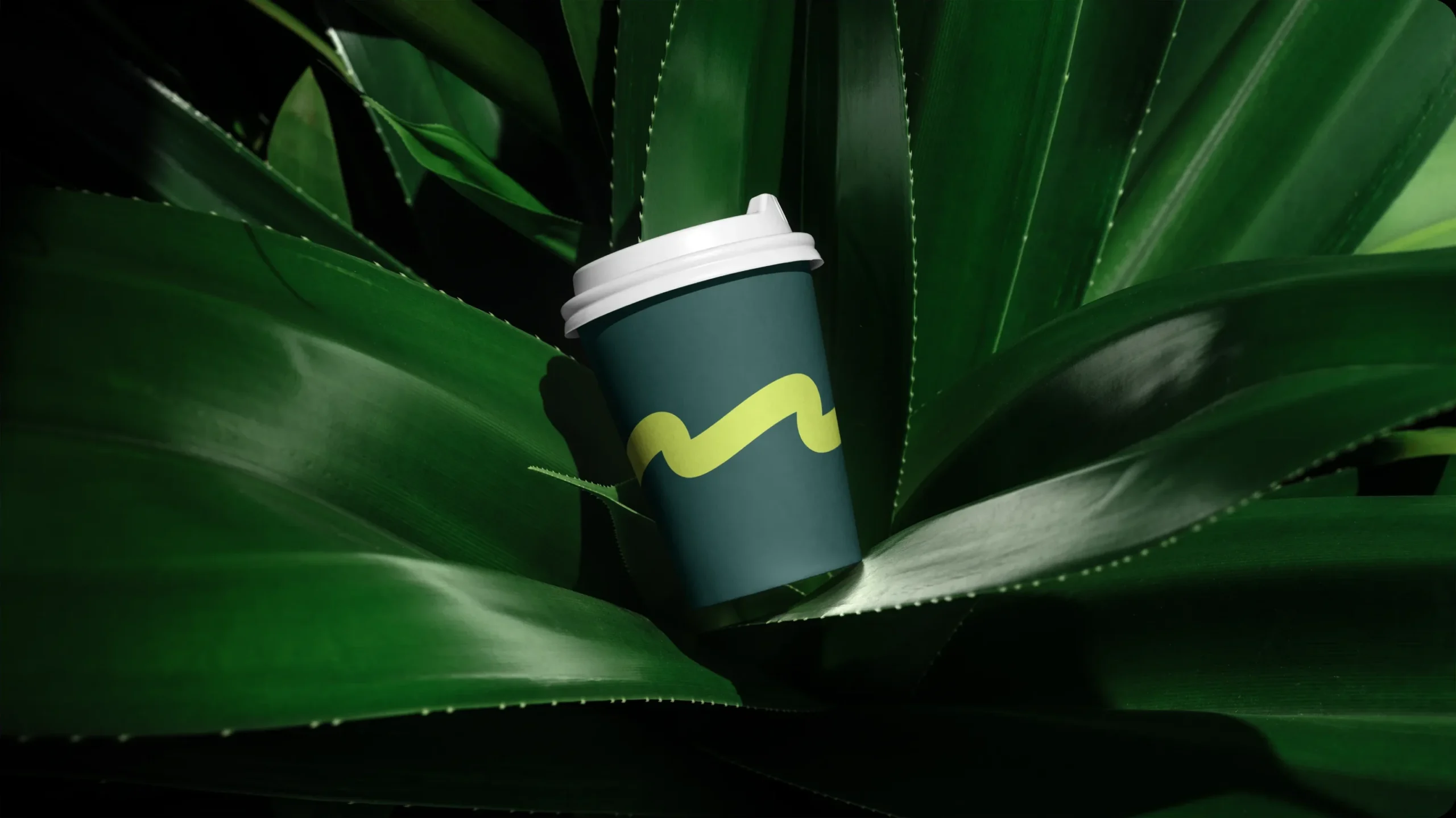
Wozyk’s merch extends the identity into everyday objects, turning the brand’s visual language into something tangible and recognizable. The signature route line, bold color palette, and logo system create a consistent look across bags, apparel, and accessories.
The result feels practical, modern, and connected to the idea of movement — keeping Wozyk present beyond the digital product and making the brand part of the journey itself.
What the Client Received
Rather than delivering isolated creative assets, we built a complete ecosystem that supports the brand at every stage of its development.
The project included brand strategy, visual identity, packaging design, e-commerce website, SEO optimization, content production, advertising materials, photography, video production, and social media design—all developed as parts of one cohesive system.
By approaching every touchpoint through a unified strategy, GOR'KA received more than a collection of deliverables. It received a brand foundation designed for long-term growth, stronger recognition, and a consistent customer experience across every channel.
What success looked like for the client:
★★★★★
"We were skeptical of another agency. MORE actually showed up and delivered. New patient bookings up 340% in four months."
Dr. Sarah M.
Healthcare · Chicago

Project Team
Project Manager — Igor Makhnovskyi
Creative Director — Bogdan Voyt
Brand Strategy & Design — Polina Volovodenko