
Mr. Euro Cleaning is a professional upholstery and furniture cleaning service for which we developed a complete visual identity.
Our goal was to move away from the typical look of cleaning companies and build a brand that feels modern, reliable, and recognizable. We created a visual system that communicates the service clearly while giving the brand a stronger sense of character and professionalism.
Mr. Euro Cleaning needed to feel like more than another cleaning company. The brand had to communicate simplicity and trust from the very first interaction — clear services, transparent communication, and as little friction as possible for the customer.
We built the identity around a sense of order, precision, and confidence. The visual language needed to be distinctive enough to build recognition, while remaining clean, functional, and easy to understand across advertising, social media, and service communication.
For us, design is never an isolated creative exercise. It is the natural outcome of strategy.
Every decision - from the smallest visual detail to the overall brand experience - was guided by research, purpose, and long-term scalability.
01Brand Discovery
02Strategic Direction
03Design Exploration
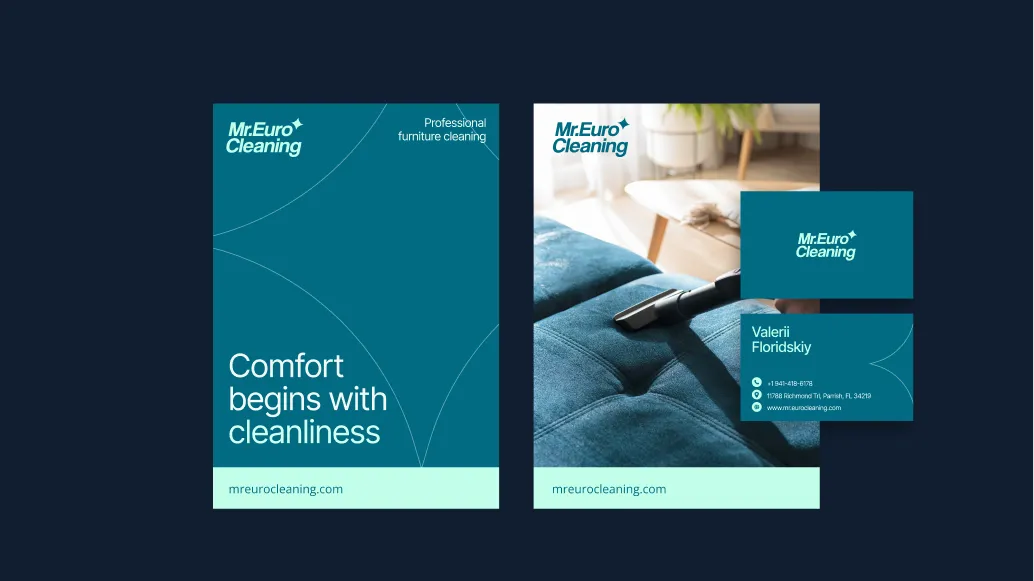
04Brand Identity Development
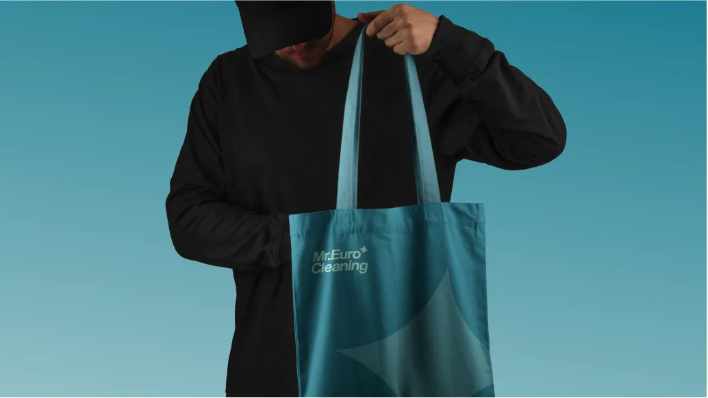
05Building the Brand System
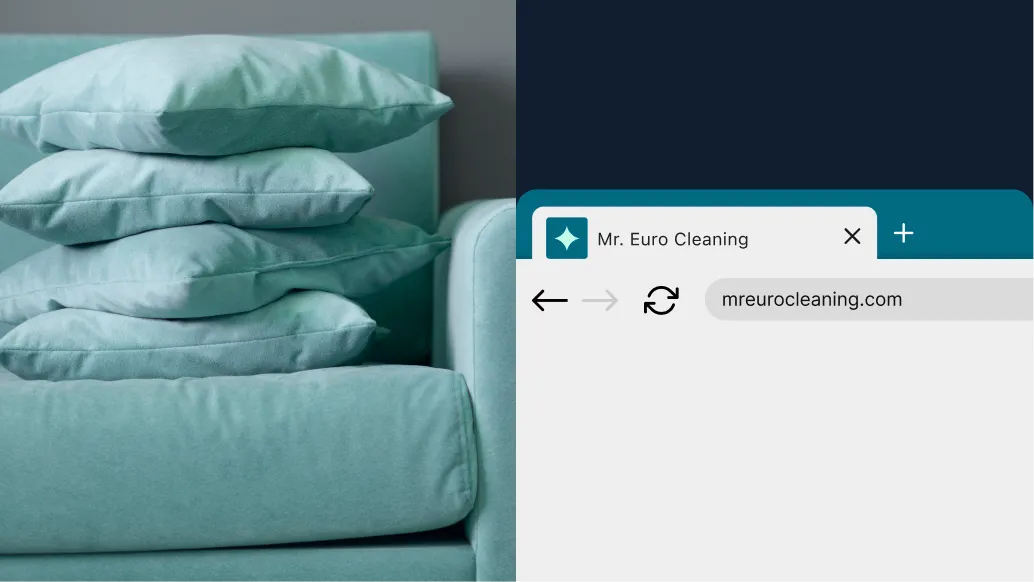
As a result, Mr. Euro Cleaning gained a cohesive brand system that helps the service feel professional, confident, and recognizable across every touchpoint.
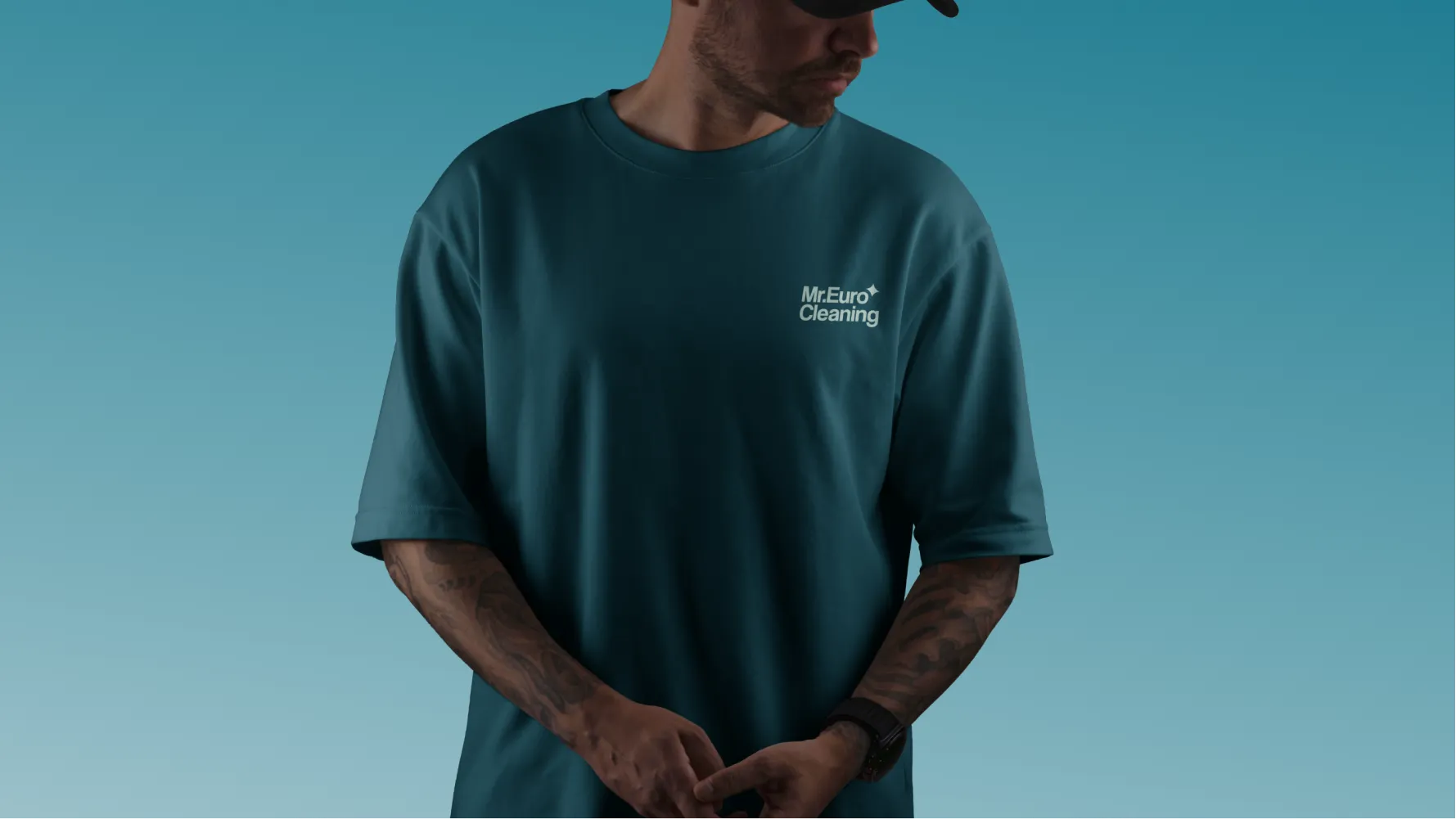
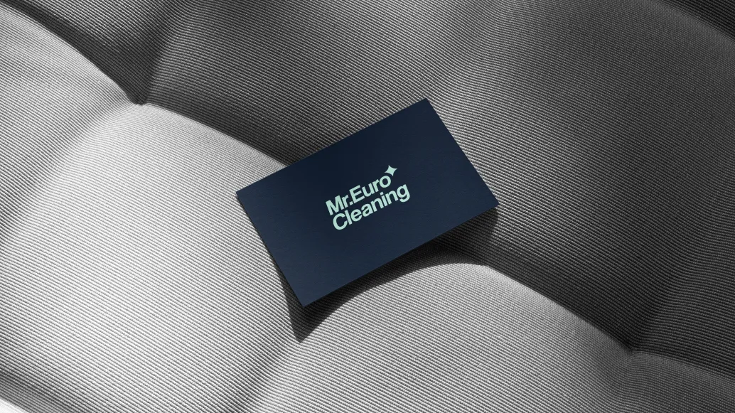
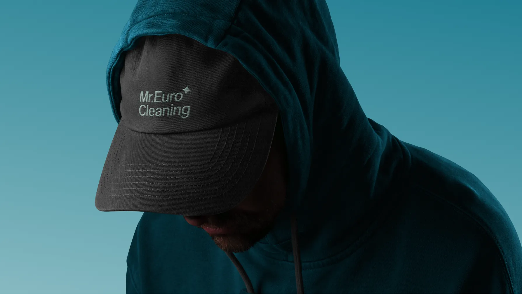
The identity brings digital communication, advertising, printed materials, and physical applications into one clear system. This gives the brand room to grow while preserving the sense of order, reliability, and simplicity at the core of the service.
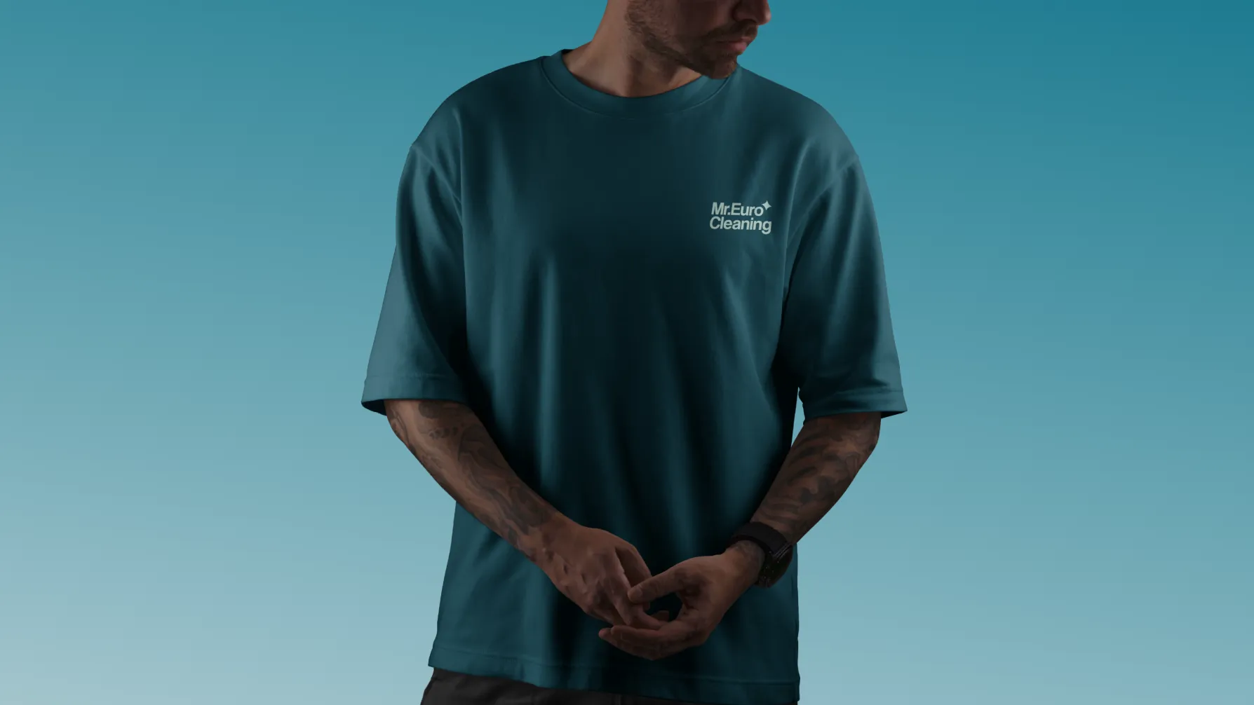
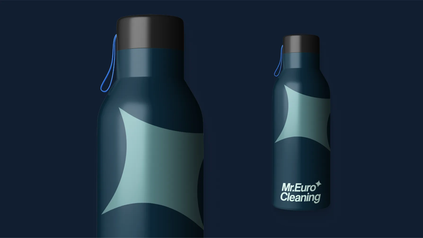
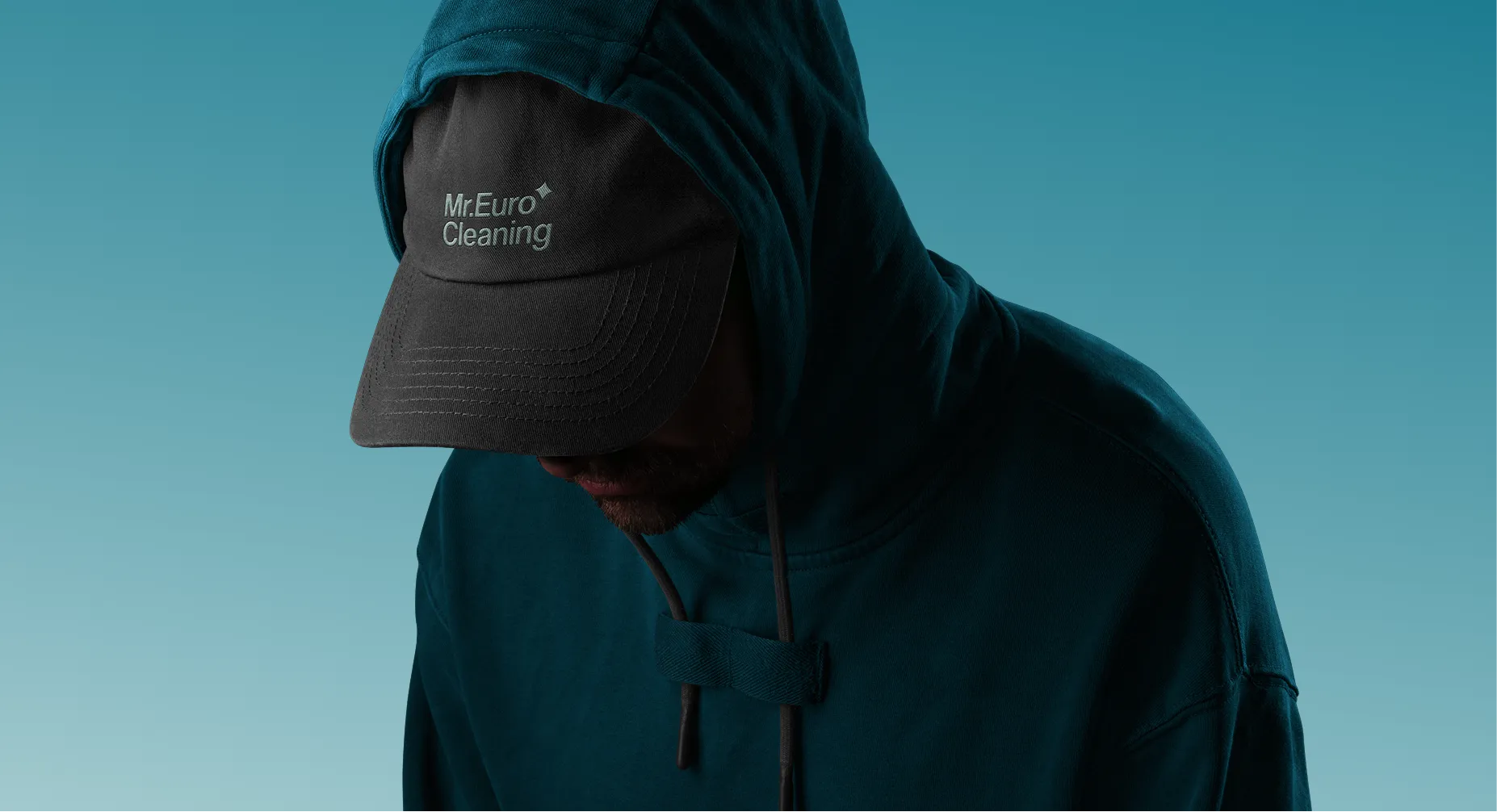
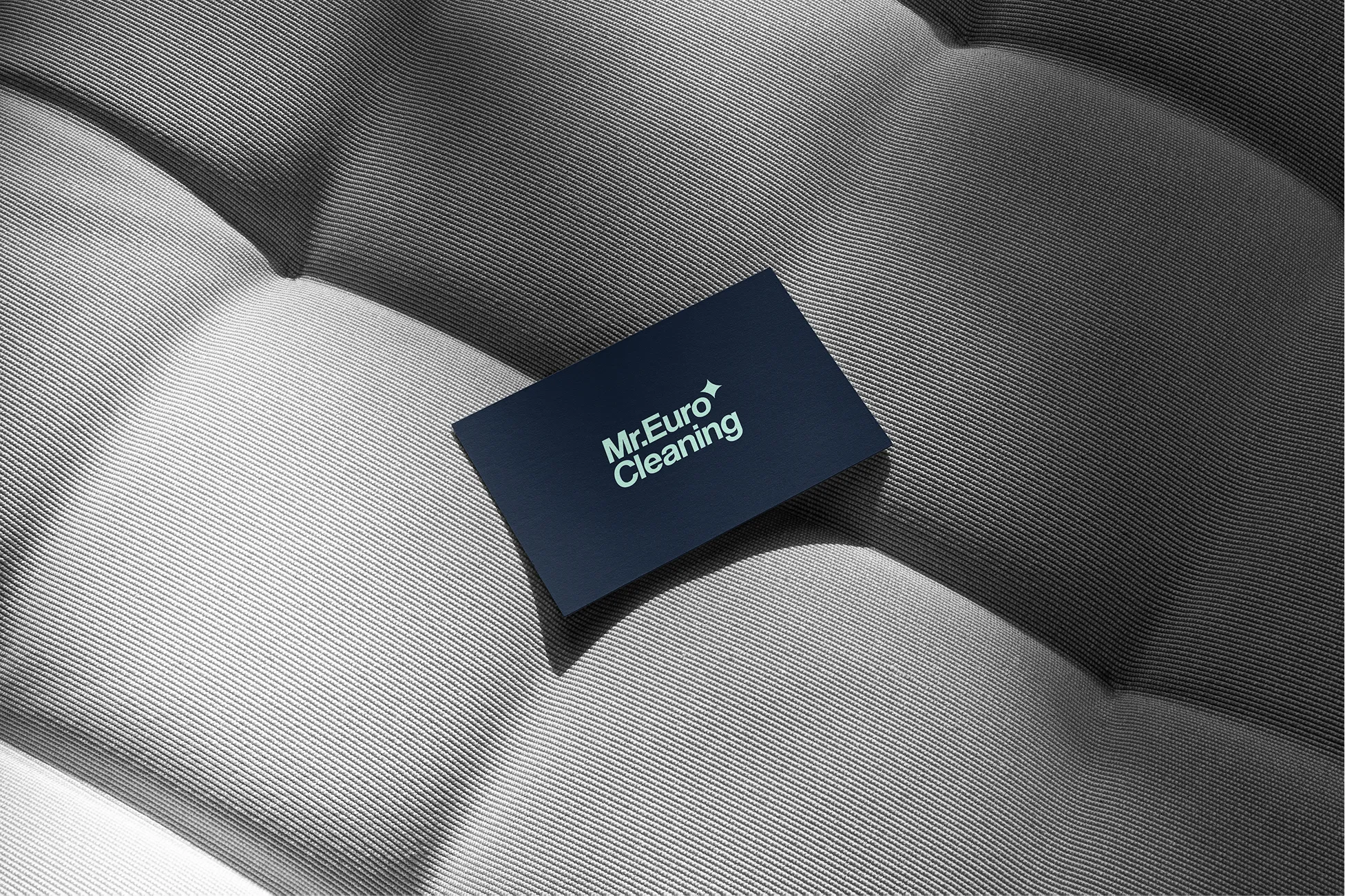
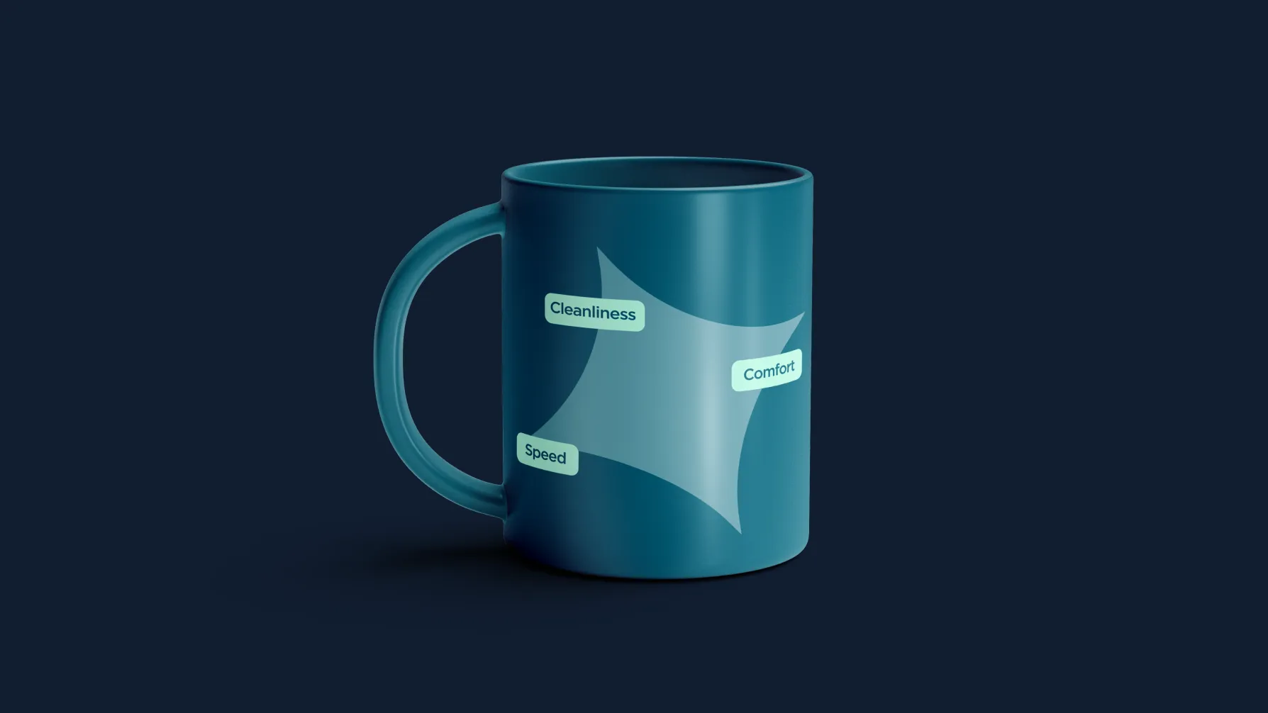
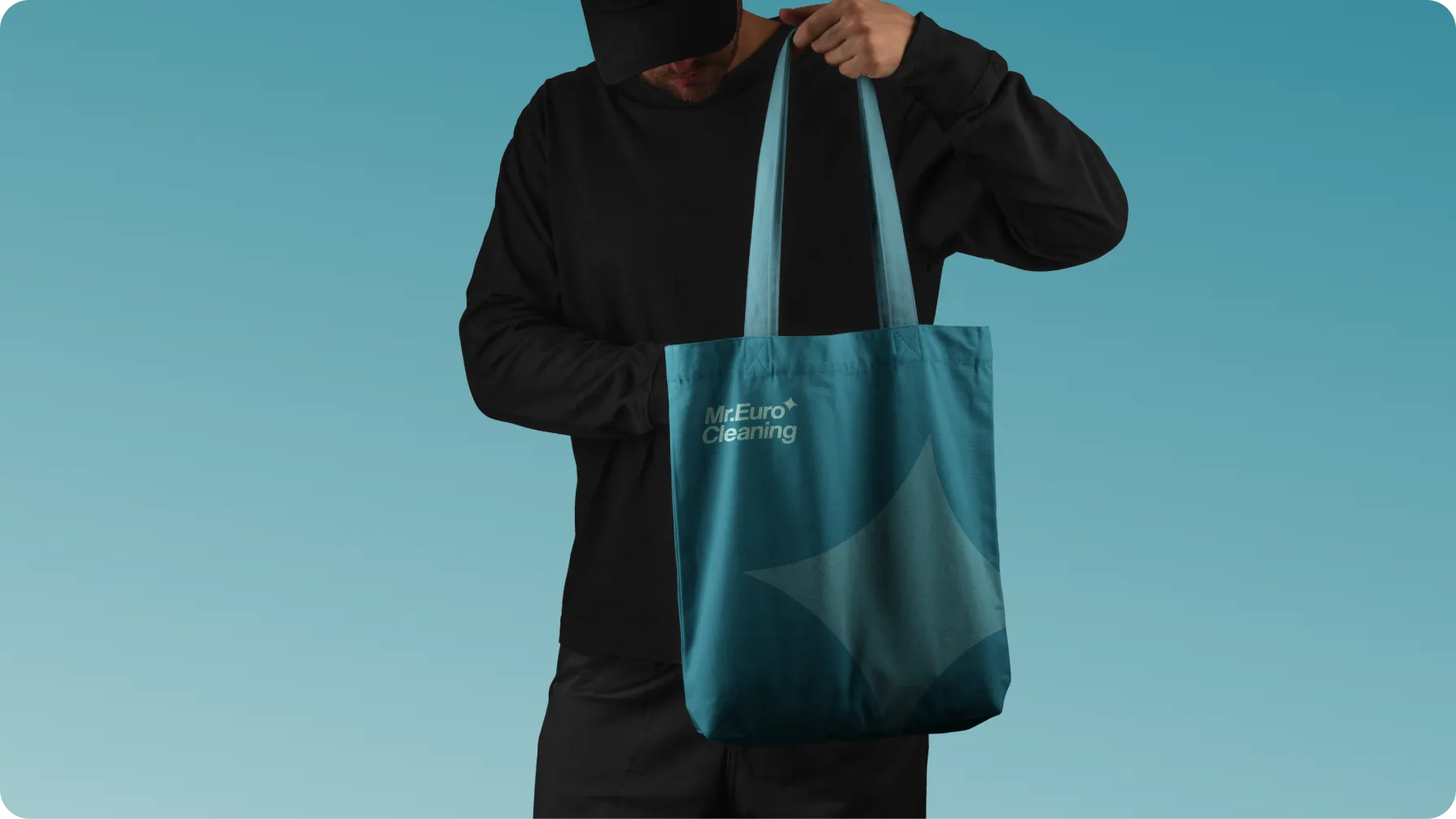
The Mr. Euro Cleaning logo is built around simple, confident typography that immediately reflects the functional nature of the service. The slanted letterforms introduce a sense of movement and energy, while the compact structure keeps the mark clear across advertising and digital applications.
A sparkle symbol became a key part of the identity — a direct visual reference to cleanliness and the result of the service. Integrated into the wordmark, it can also work independently as a recognizable brand sign. This creates a simple and flexible logo system that adapts easily from social media and advertising to uniforms and merchandise.
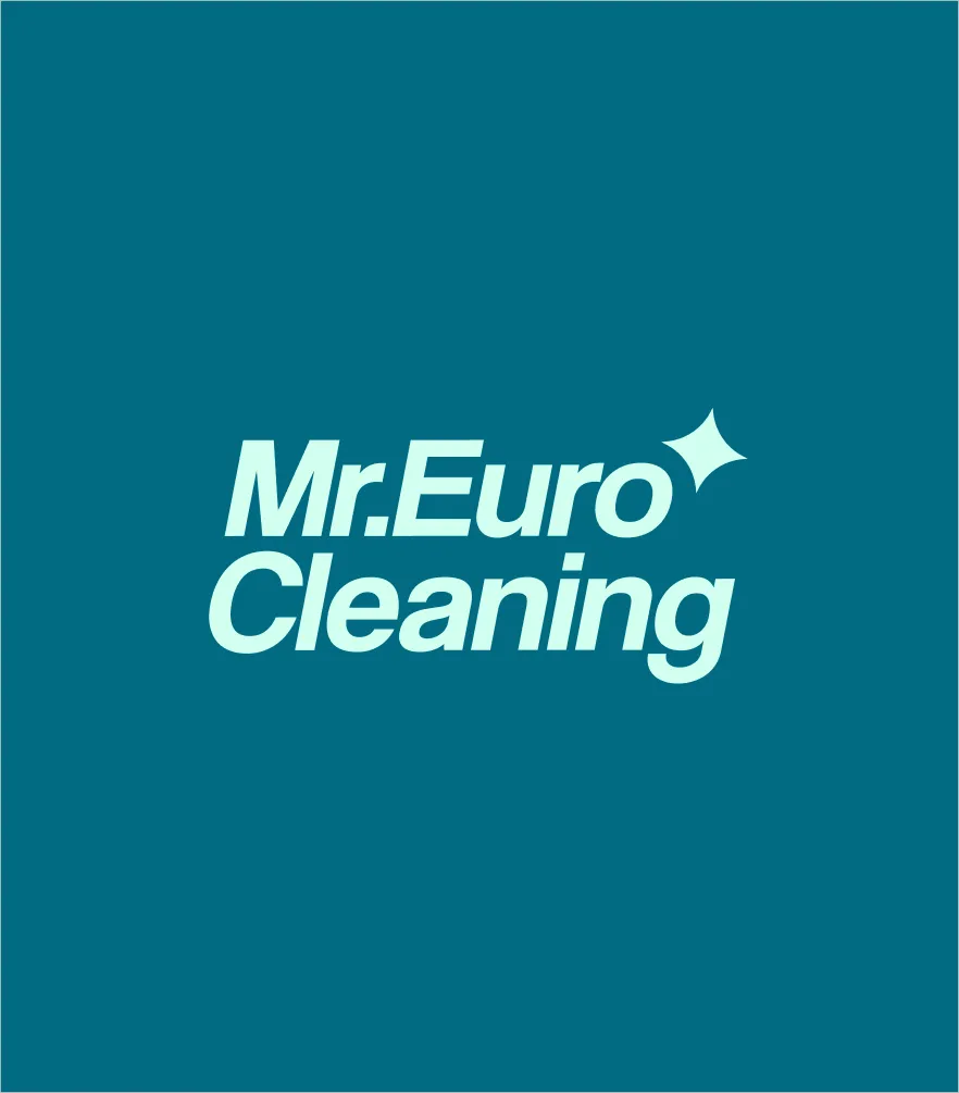

Mr. Euro Cleaning’s color system is built around cool, clean tones that reinforce associations with order, freshness, and reliability. Deep navy adds a sense of stability and professionalism, muted blue keeps the system modern and approachable, mint works as a fresh accent, and white creates space and visual clarity.
For typography, we combined Inter Tight and Coolvetica. Inter Tight brings functionality, clarity, and strong readability to everyday service communication, while Coolvetica gives the brand a more distinctive and recognizable voice. Together, they create a balance between professionalism and personality.
01
02
03
04
It is modern, clear, and highly legible.
It has a clean structure and balanced proportions, with no unnecessary decorative elements. This makes it easy to read across all formats while maintaining a sense of order and precision.
It has a distinctive, confident look with a subtle retro influence, which adds personality without compromising clarity.
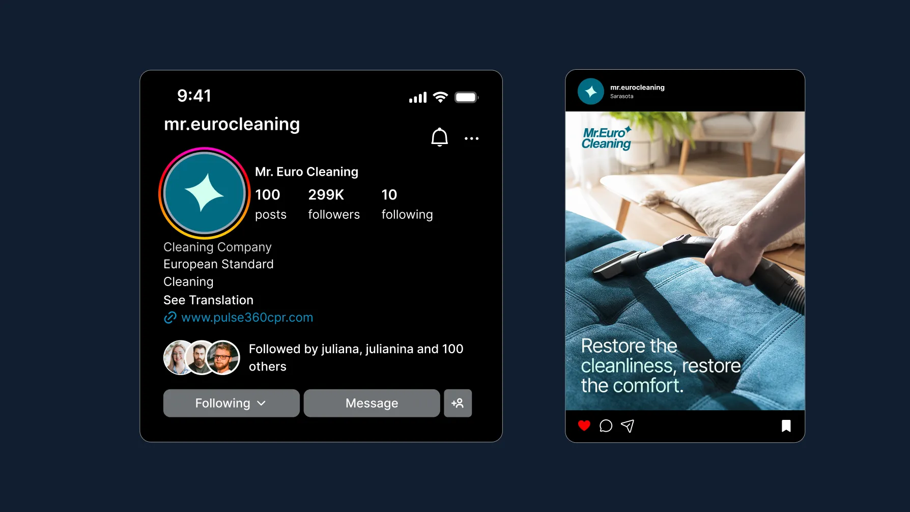
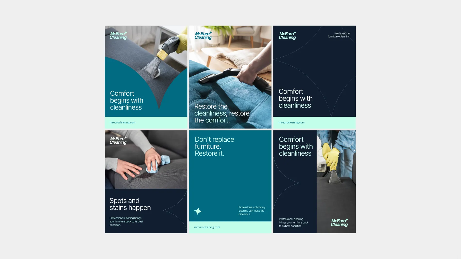
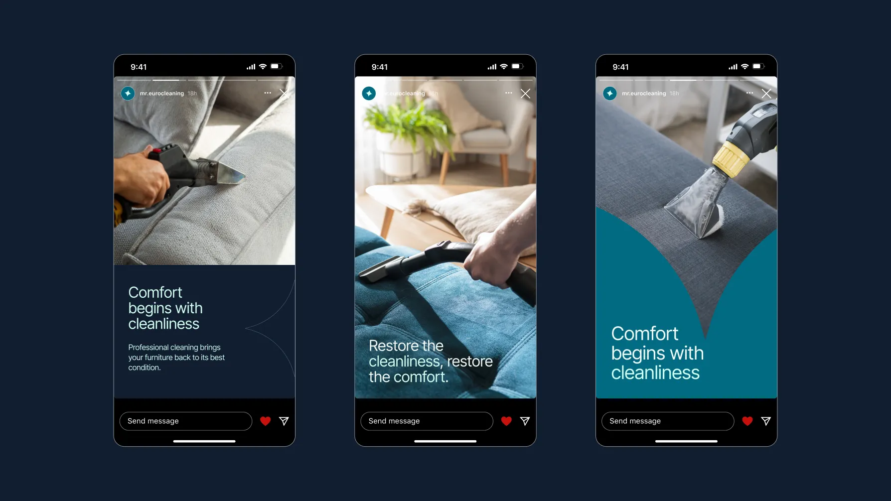
We built the system around real cleaning processes, clear messaging, brand colors, and distinctive graphic elements. As a result, the content feels consistent and professional without becoming repetitive. Posts and stories can easily adapt to different topics while maintaining the same recognizable brand character.
What success looked like for the client:
★★★★★
"We were skeptical of another agency. MORE actually showed up and delivered. New patient bookings up 340% in four months."
Dr. Sarah M.
Healthcare · Chicago
Project Manager — Igor Makhnovskyi
Creative Director — Bogdan Voyt
Brand Strategy & Design — Polina Volovodenko