
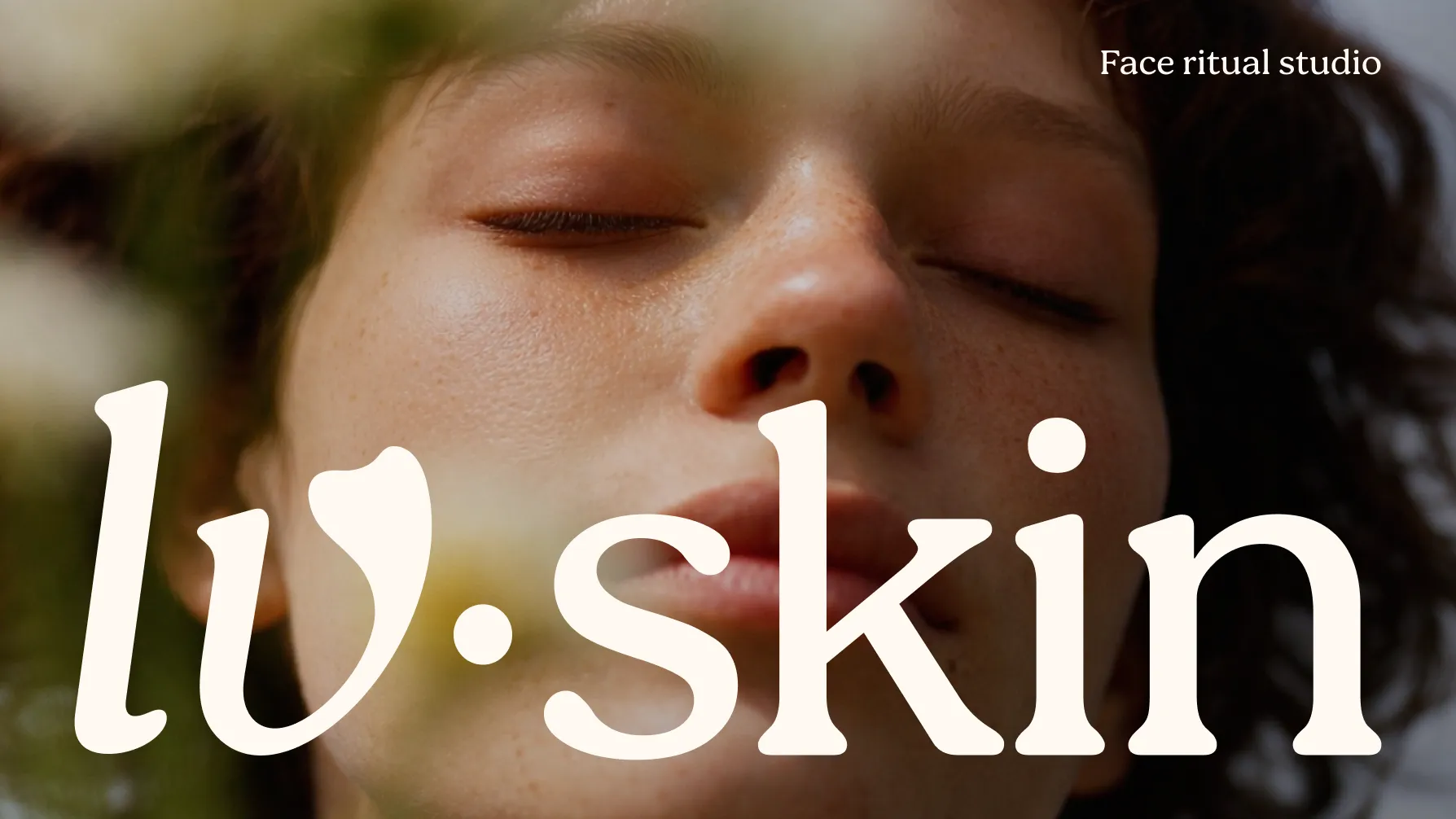
LV SKIN is a ritual care studio that brings together skincare and care for one’s inner state.
It is not only about treatments and visible results, but also about creating time for yourself — for restoration, calm, and a more mindful connection with your body.
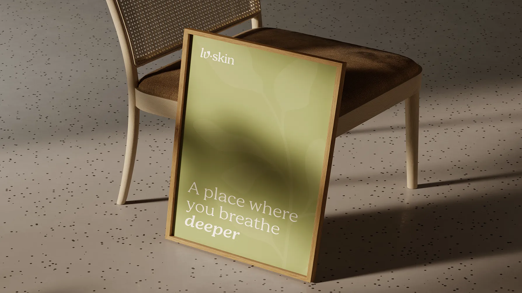
Our task was to create an identity that could reflect this multidimensional approach, combining professional care, contemporary beauty aesthetics, and a more emotional, ritual-like experience.
As a result, we developed a cohesive visual language that allows LV SKIN to speak not only about beauty, but about care as a complete experience — for the skin, the body, and the inner self.
Our task was to translate LV SKIN’s philosophy — care for both the outer appearance and inner state — into a cohesive brand language. The visual system needed to communicate professionalism, softness, and a sense of ritual without reducing the brand to skincare alone.
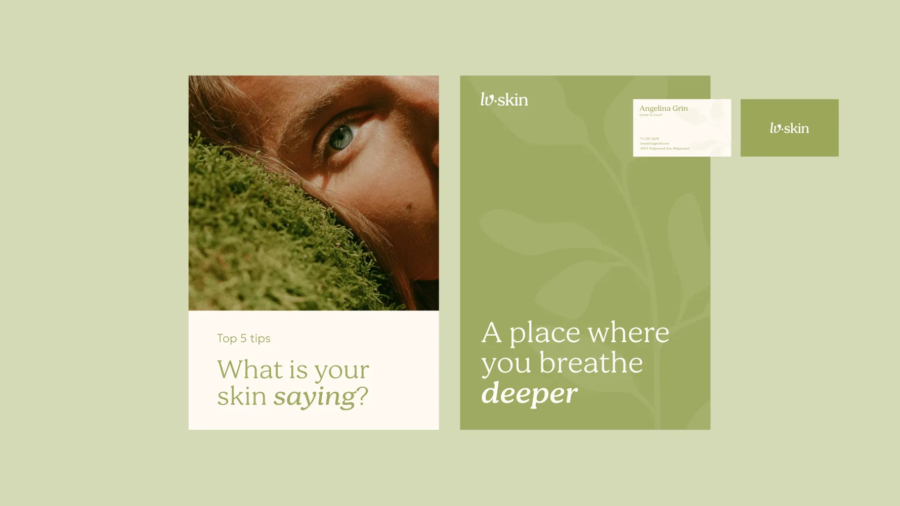
We developed an identity in which every element supports a feeling of calm, trust, and mindful self-care. As a result, LV SKIN gained a distinctive character that can adapt across different formats while maintaining a consistent brand experience at every touchpoint.
For us, design is never an isolated creative exercise. It is the natural outcome of strategy.
Every decision - from the smallest visual detail to the overall brand experience - was guided by research, purpose, and long-term scalability.
01Brand Discovery
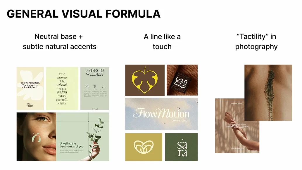
02Strategic Direction
03Design Exploration
04Brand Identity Development
05Building the Brand System
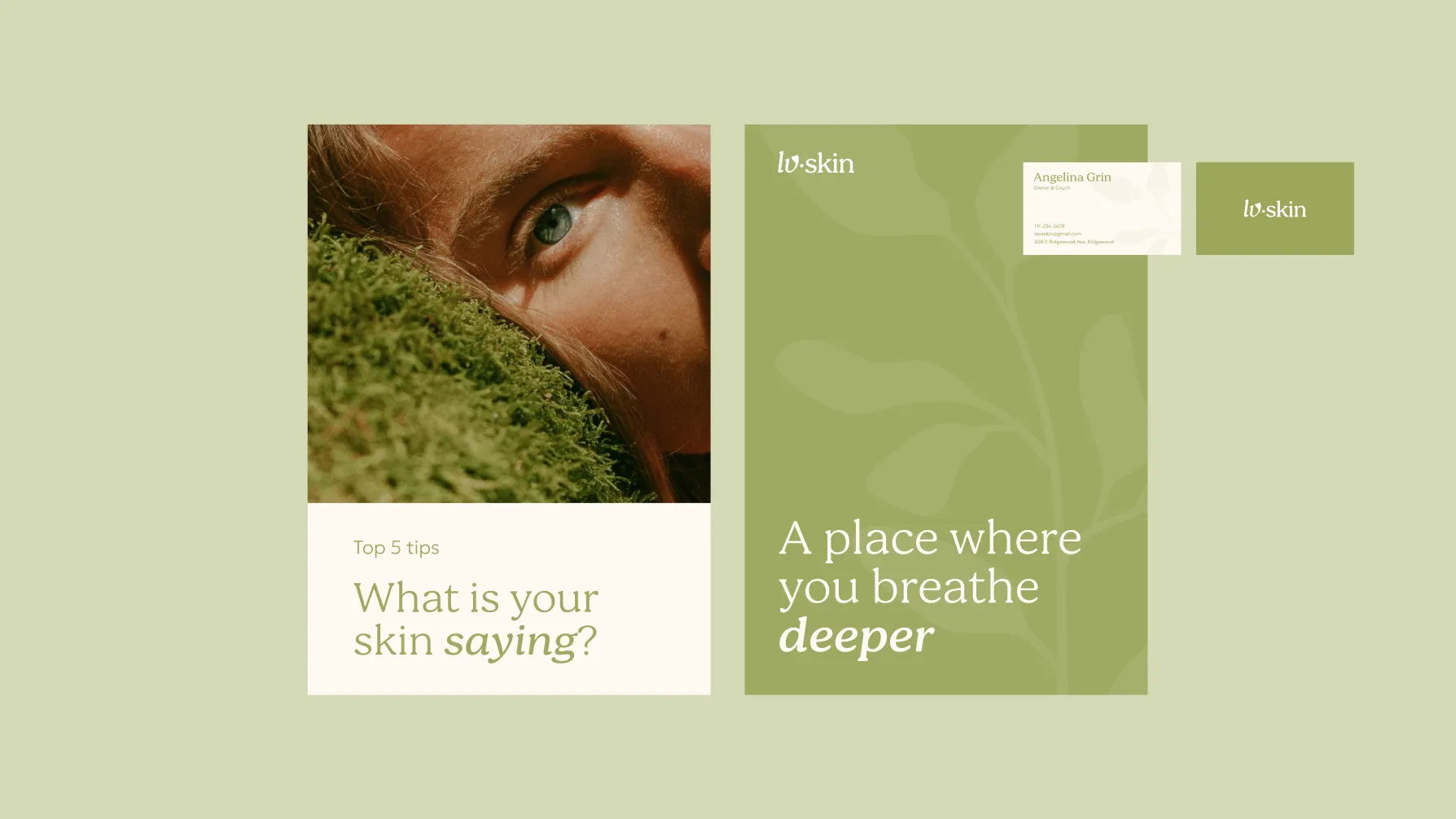
As a result, LV SKIN gained a cohesive brand system built around its core idea: self-care begins with attention — to the skin, the body, and the inner state.
The identity brings different directions of the brand into one recognizable language — from facial massage rituals and service communication to wellness practices and events. This gives LV SKIN the flexibility to grow beyo
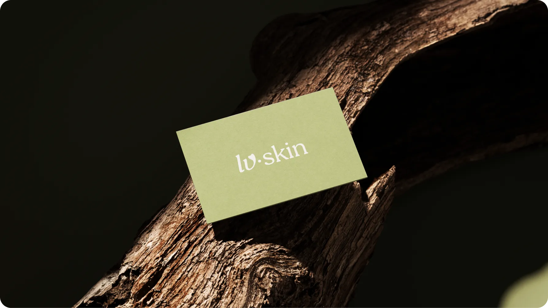
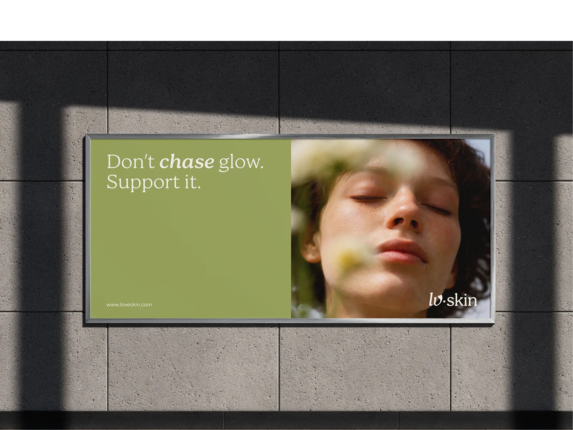
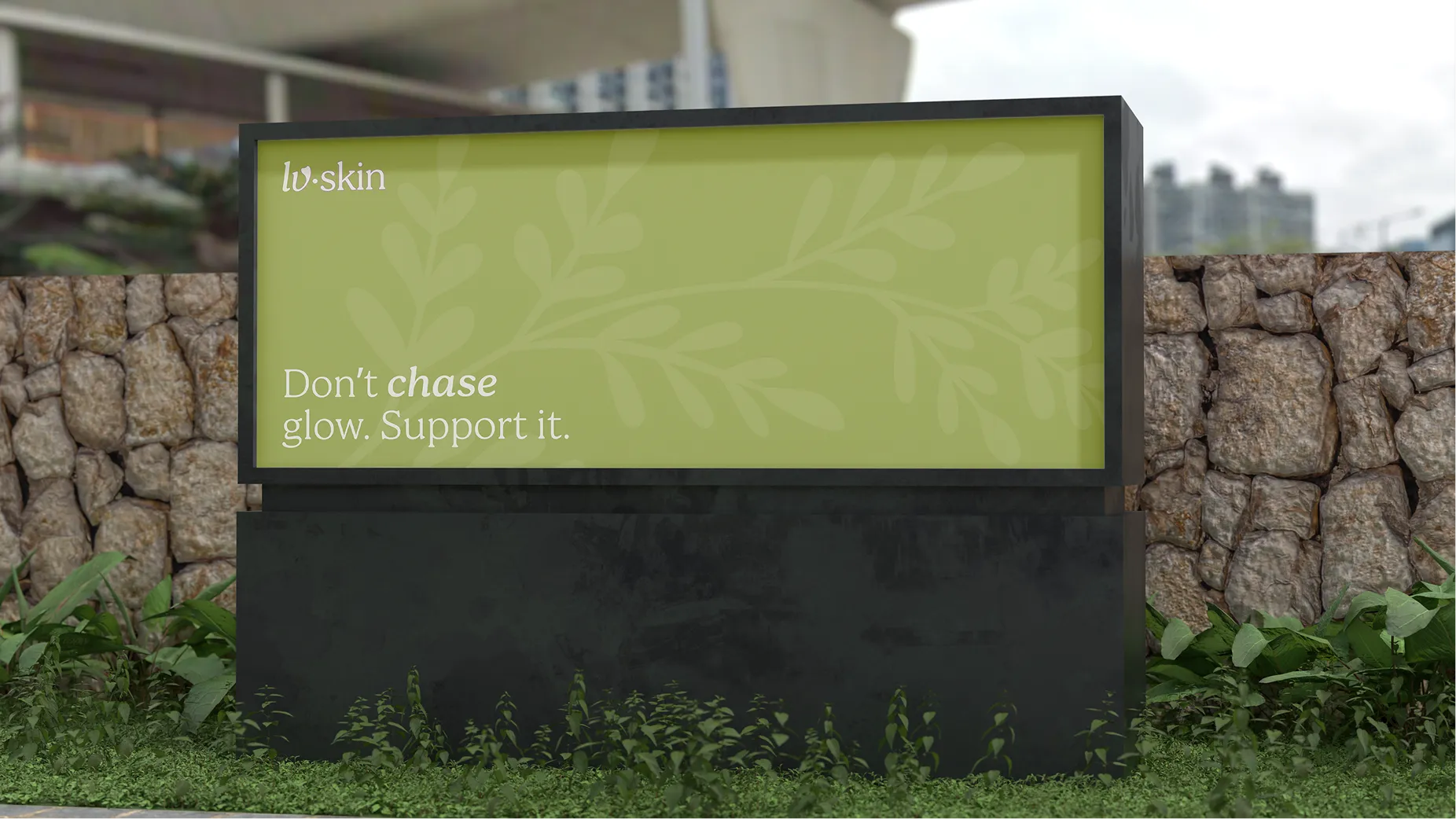
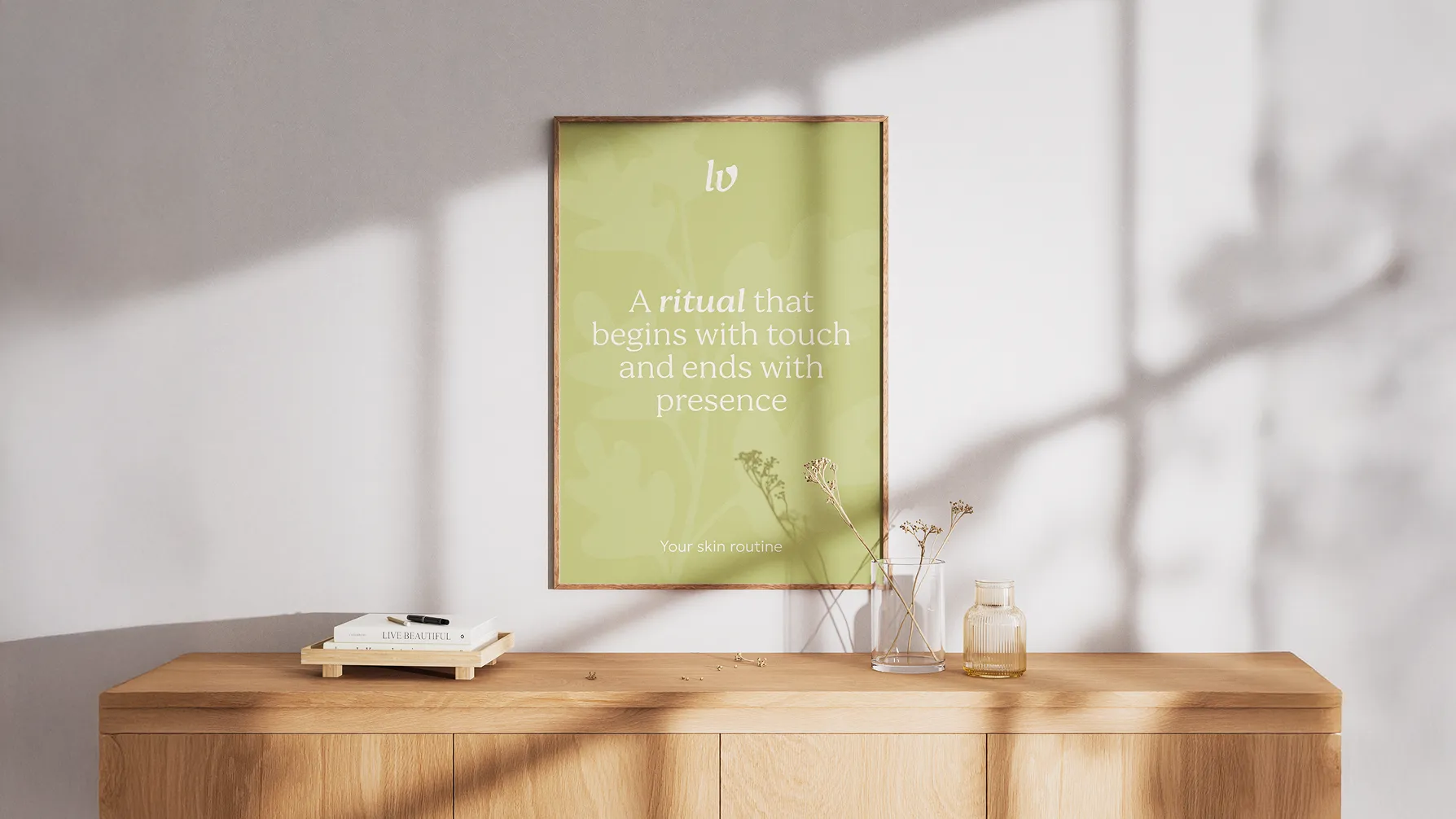
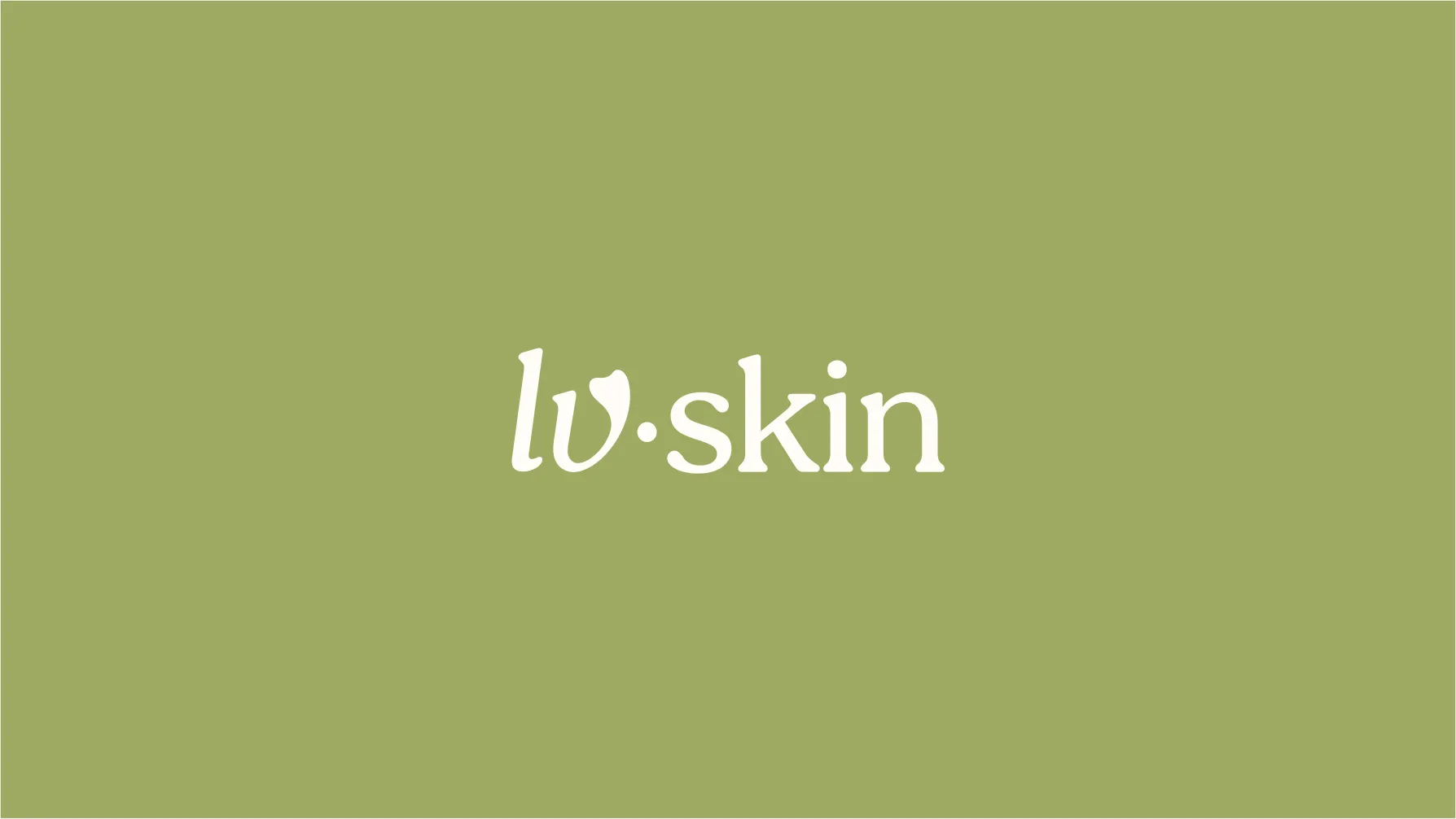
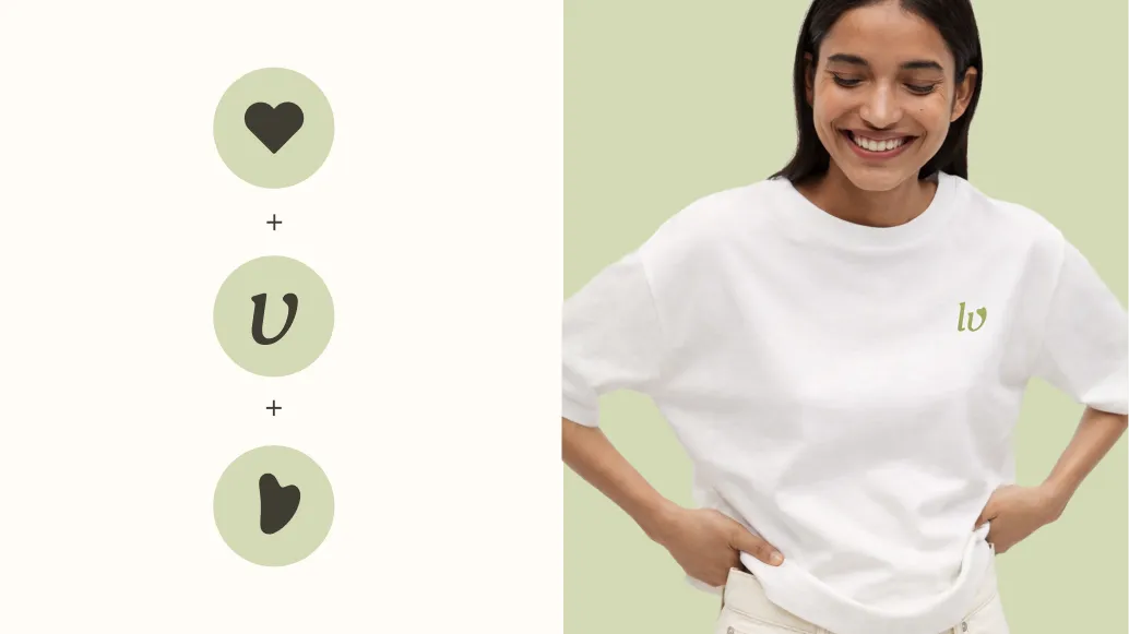
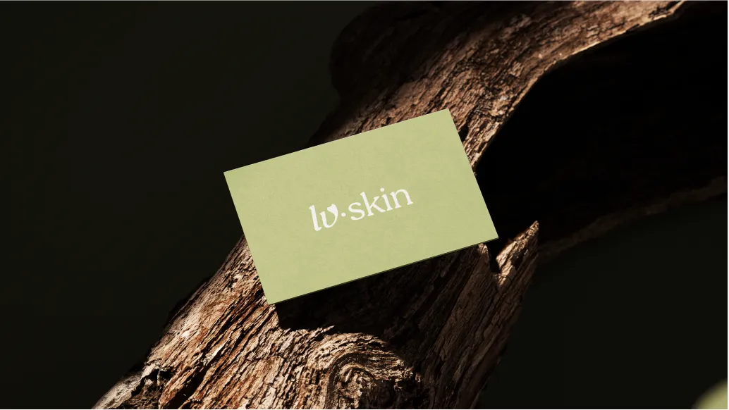
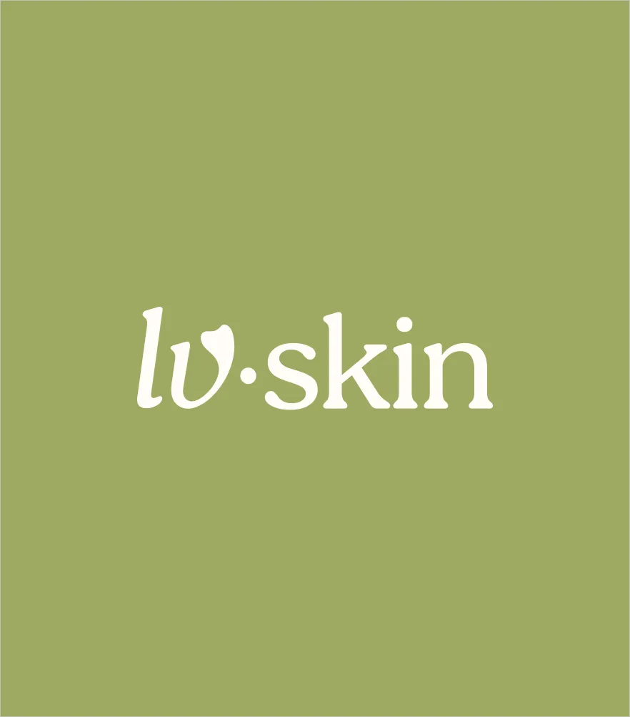
The LV SKIN logo combines softness, sensitivity, and recognizability in a form that feels simple yet distinctive. The typographic wordmark appears delicate and elegant, while the shortened lv sign works as a compact symbol that adapts easily across different formats.
A key detail is the shape of the V, which resembles a gua sha tool and creates a direct association with the brand’s core focus. This makes the logo not only visually refined, but also clearly connected to facial massage rituals, touch, and skin care.
At its core, the logo reflects the same principle as the overall identity: care, love, and tactility without unnecessary decoration. This allows it to work both as the main brand signature and as a subtle accent across digital and printed applications.
LV SKIN’s color system is built around calm, natural tones that reinforce a sense of softness, balance, and tactility. Muted greens suggest nature, restoration, and inner calm, while the light neutral shade creates space and clarity. A deep graphite tone adds contrast and confidence to the overall system.
The typography follows the same logic, combining delicacy and character with enough clarity for everyday communication. This keeps the brand language soft and sensory while still feeling professional, distinctive, and recognizable.
01
02
03
04
An expressive serif typeface with an editorial, slightly literary character. It adds intelligence, elegance, and emotion to the brand, making it ideal for headlines and expressive communication.
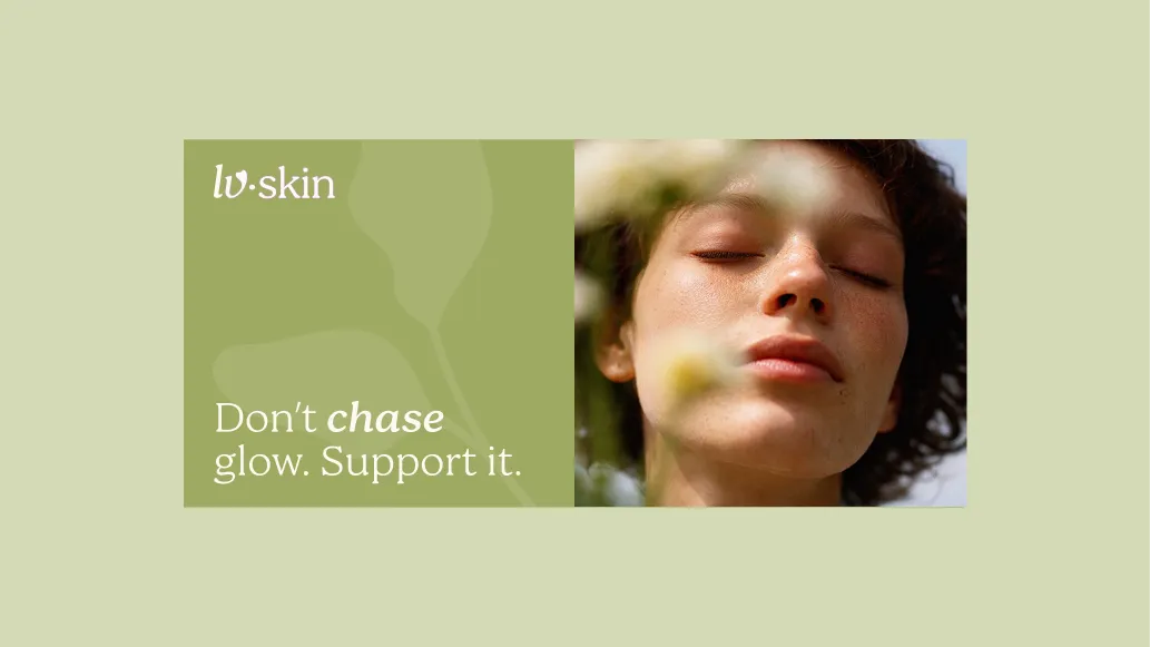
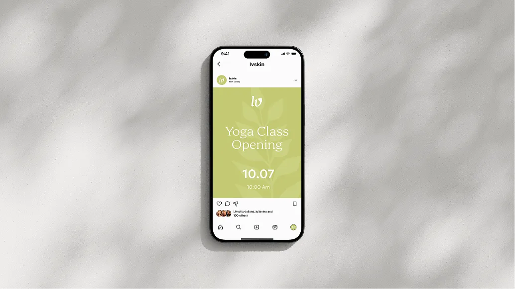
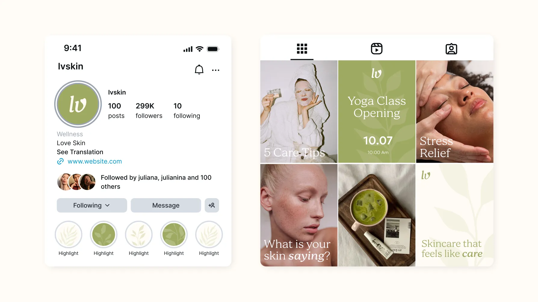
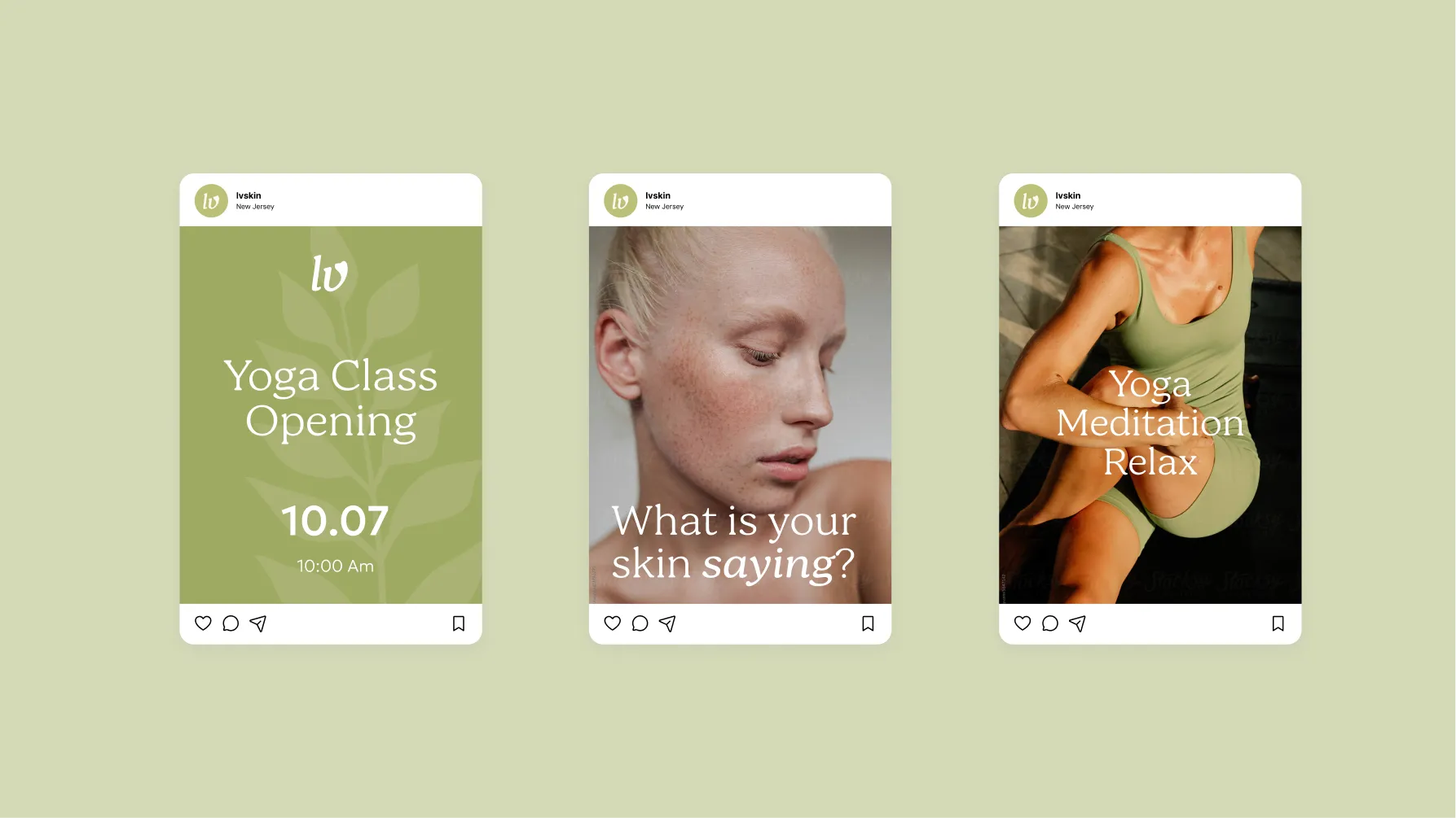
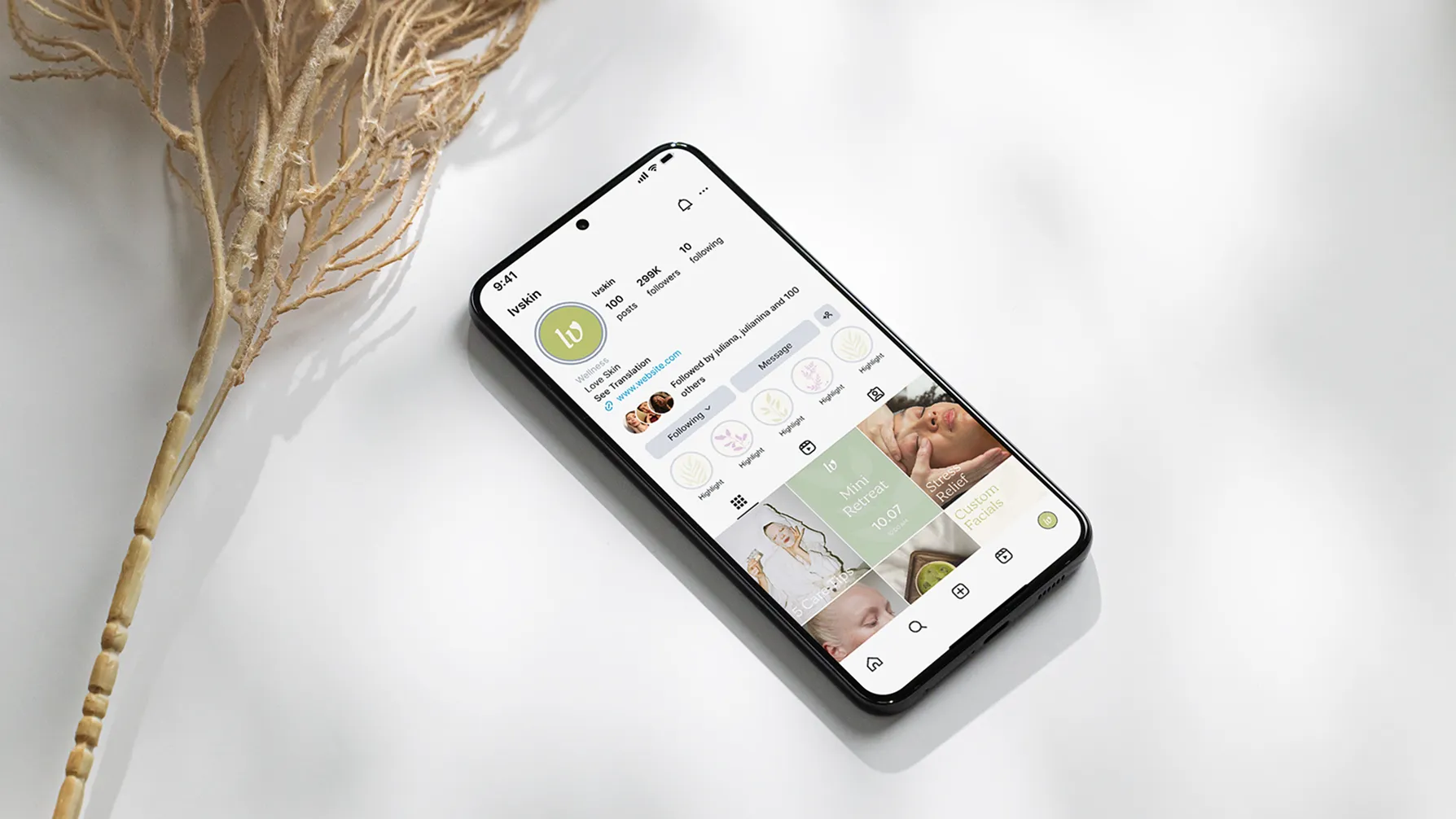
Social media became one of the key spaces where LV SKIN’s character comes to life most clearly. We combined expert content about skin, facial massage rituals, and wellness practices with soft photography, a calm color palette, and delicate typography.
The result is a feed that feels cohesive without becoming repetitive — communicating the brand’s atmosphere and supporting the idea of self-care as a complete experience.
What success looked like for the client:
★★★★★
"It's a very professional team at More Local Clients LLC! I was really impressed by the creative, detail-oriented communication process that helped build up my business. Thank you all for the great support and wonderful work you've done! I'm very satisfied and looking forward to working with your team in the future."
Angelina Grin
Wellness · New York
Project Manager — Daryna Khodanovych
Creative Director — Bogdan Voyt
Brand Strategy & Design — Polina Volovodenko