
Say Sense is an English school built around the idea that learning a language should feel clear, engaging, and connected to real communication.
Our work focused on creating a visual identity that could express the school’s personality and make the learning experience feel more approachable, modern, and memorable. We developed the core identity, typography, color system, visual language, and communication principles as one connected brand system.
The goal was to move away from the conventional image of language education and create a brand that feels confident, warm, and intelligent — one that supports the school’s teaching approach, strengthens recognition, and gives Say Sense a strong foundation for future growth.
Our task was to translate Say Sense’s teaching philosophy and approachable personality into a clear, cohesive brand language. Every touchpoint — from the first impression to social media and learning materials — needed to feel connected, confident, and easy to engage with.
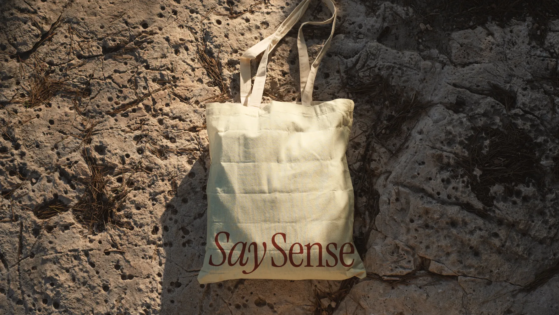
We developed a flexible identity that helps the school stand out from more conventional language-learning brands while staying warm, modern, and recognizable across different formats.
For us, design is never an isolated creative exercise. It is the natural outcome of strategy.
Every decision - from the smallest visual detail to the overall brand experience - was guided by research, purpose, and long-term scalability.
01Brand Discovery
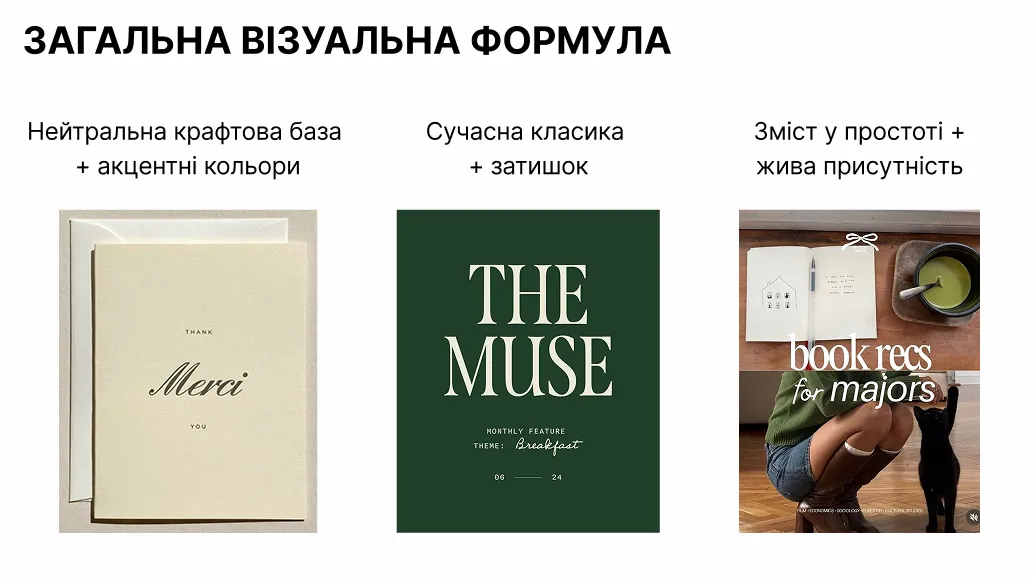
02Strategic Direction
03Design Exploration
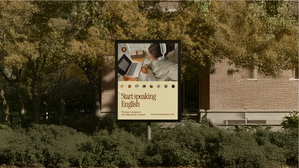
04Brand Identity Development
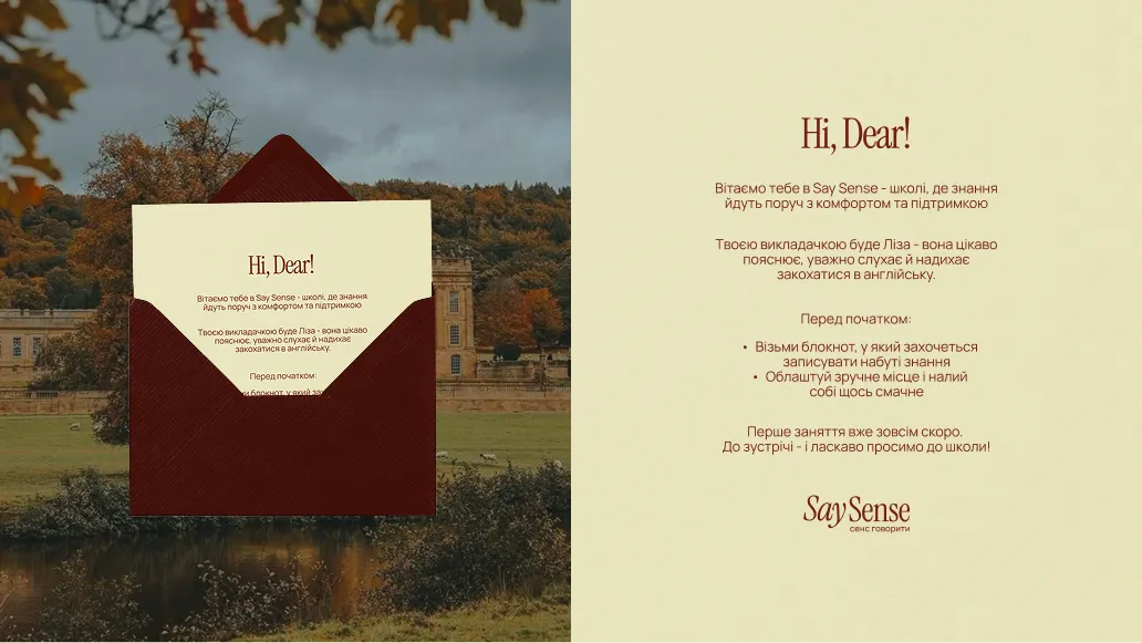
05Building the Brand System
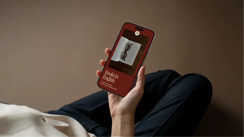
As a result, Say Sense gained a cohesive brand language that brings together modern education, an intelligent character, and warm, human communication.
The identity now works consistently across different touchpoints — from social media and learning materials to advertising and print — helping the school feel recognizable, professional, and closely connected to its audience.
Most importantly, the brand now has a strong visual foundation for future growth while preserving its atmosphere, character, and human approach.
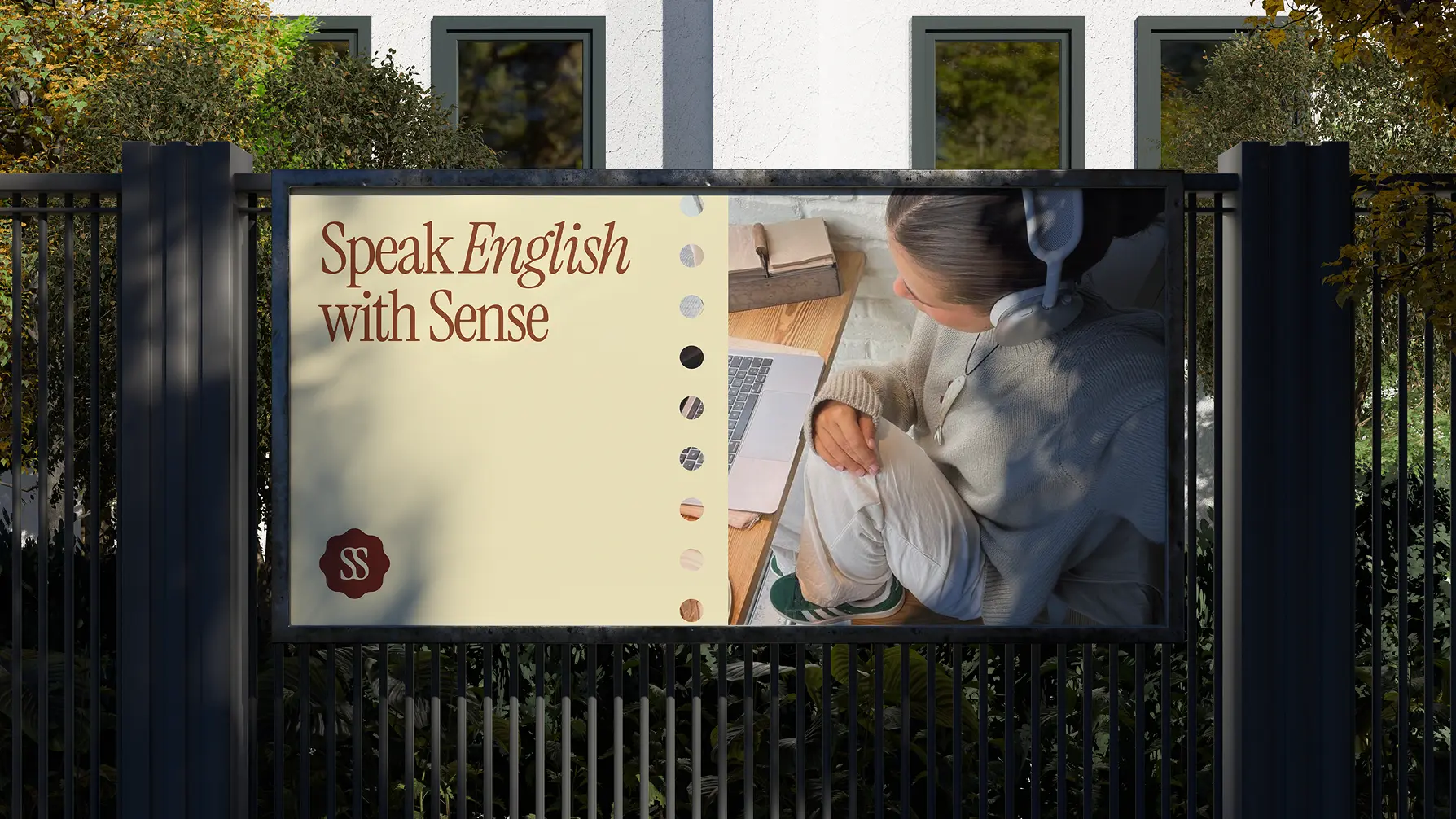
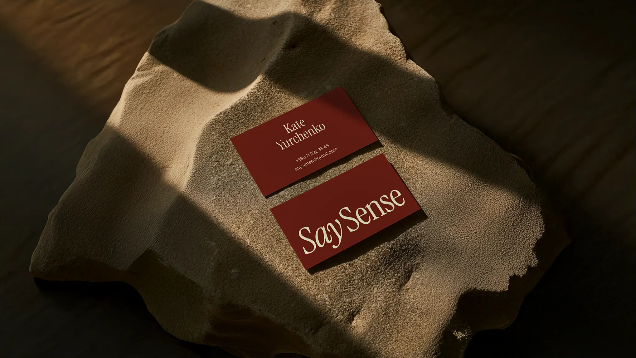
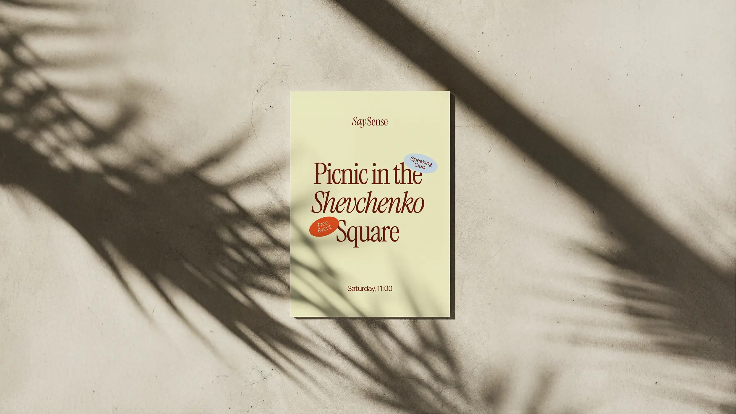
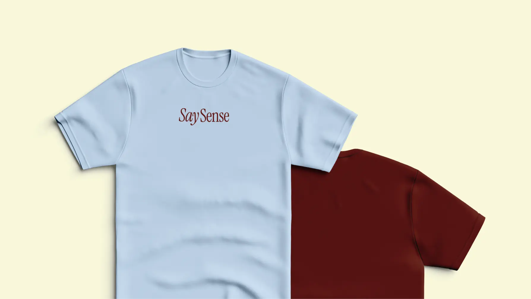
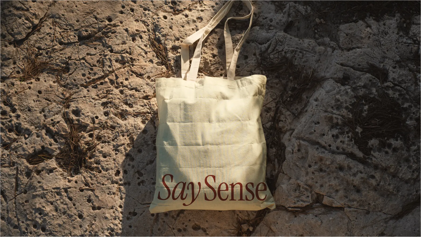
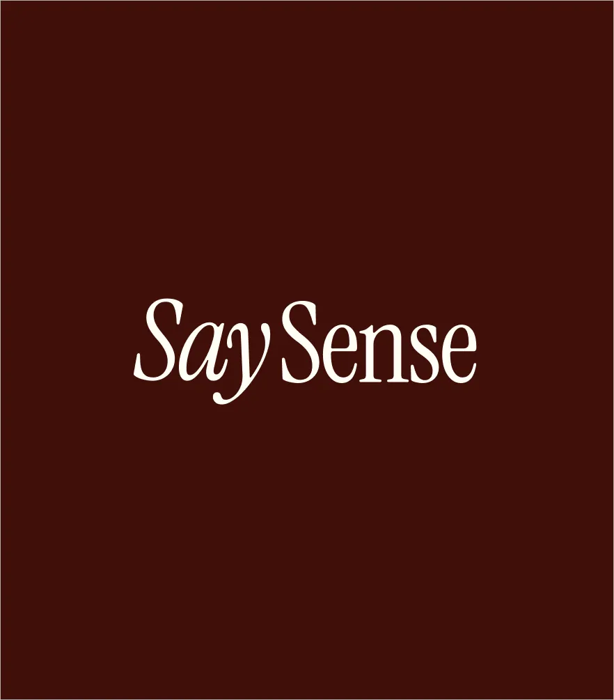
The Say Sense logo is built around expressive typography that combines an intellectual character with softness and emotion. Its refined letterforms give the identity an editorial, almost literary quality, reinforcing the brand’s connection to language, learning, and reading culture.
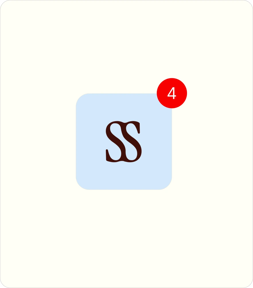
We also developed an SS monogram as a compact and recognizable symbol for digital formats, social media, and smaller applications. Together, the wordmark and monogram create a flexible logo system that preserves the brand’s character across different scales and touchpoints.
Say Sense’s color system combines deep, warm, and light tones to create a sense of comfort, intelligence, and contemporary communication. Deep burgundy adds confidence and depth, soft cream creates a calm foundation, light blue brings freshness, and orange works as an energetic accent. Together, they form a recognizable palette that feels mature and expressive without becoming overly academic.
For typography, we combined Instrument Serif and Mulish. The expressive serif brings an editorial, almost literary character to the identity and reinforces the brand’s connection to language, reading, and culture. Mulish provides clarity, functionality, and ease across everyday communication. This contrast allows Say Sense to feel intelligent, modern, and approachable at the same time.
01
02
03
04
An expressive serif typeface with an editorial, slightly literary character. It adds intelligence, elegance, and emotion to the brand, making it ideal for headlines and expressive communication.
A clean, contemporary sans-serif that brings clarity and functionality to the system. Its simple structure works well for longer texts and balances the more expressive character of Instrument Serif.
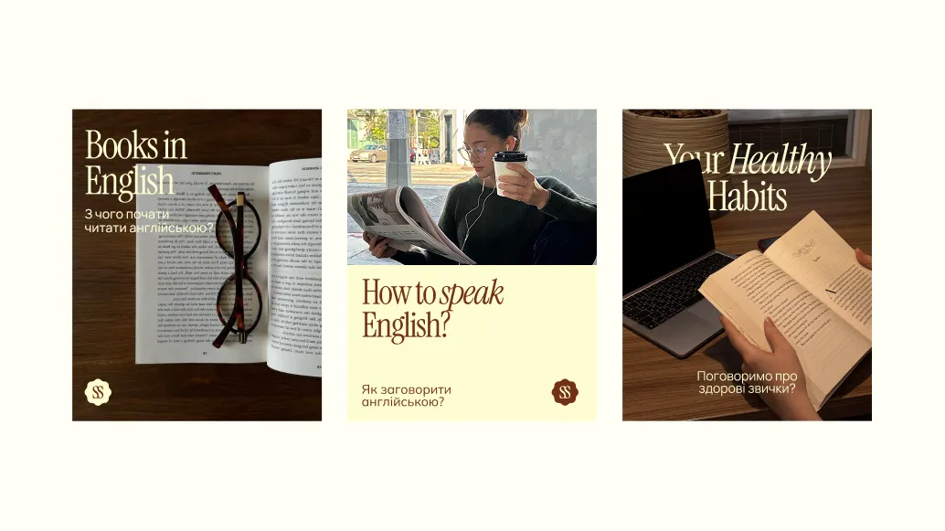
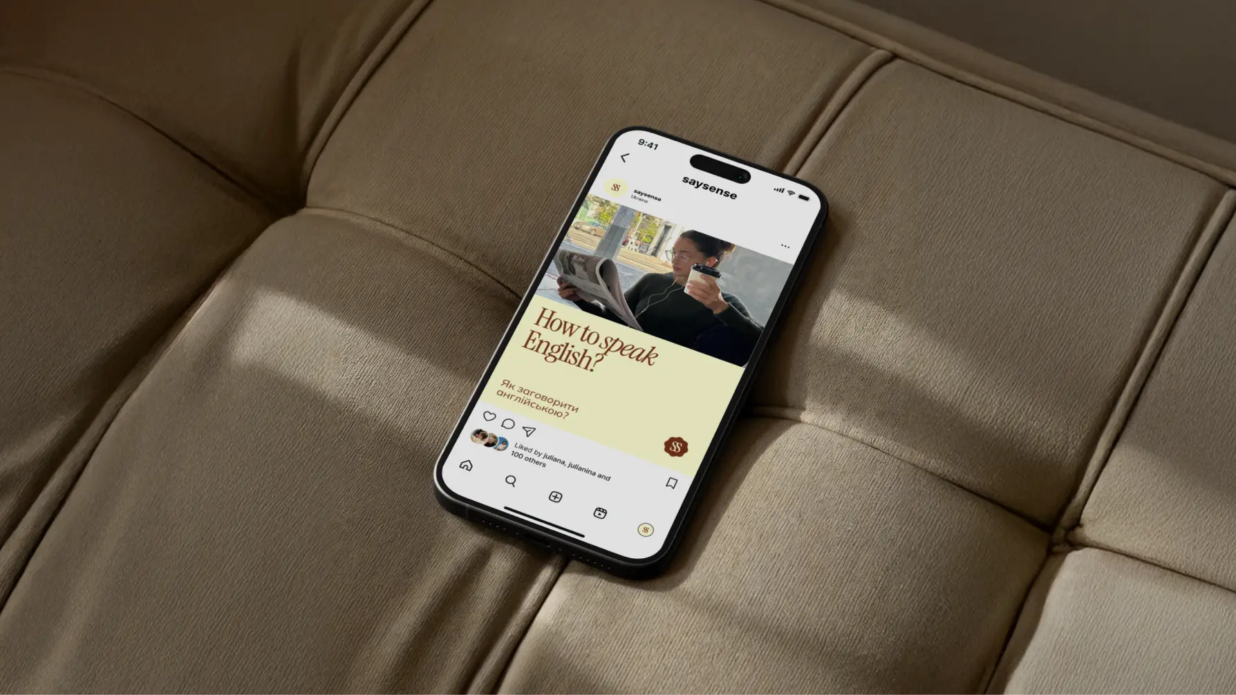
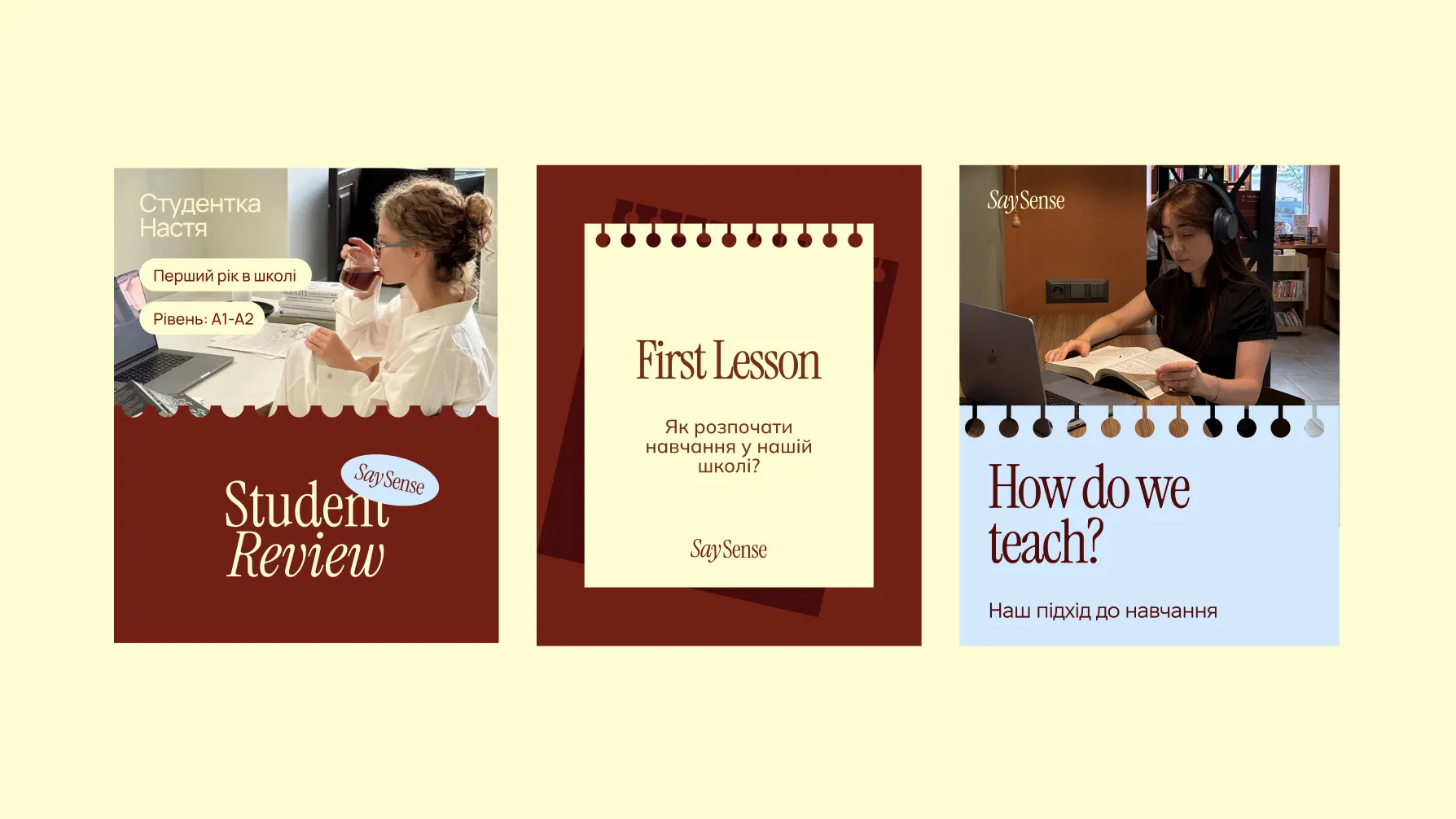
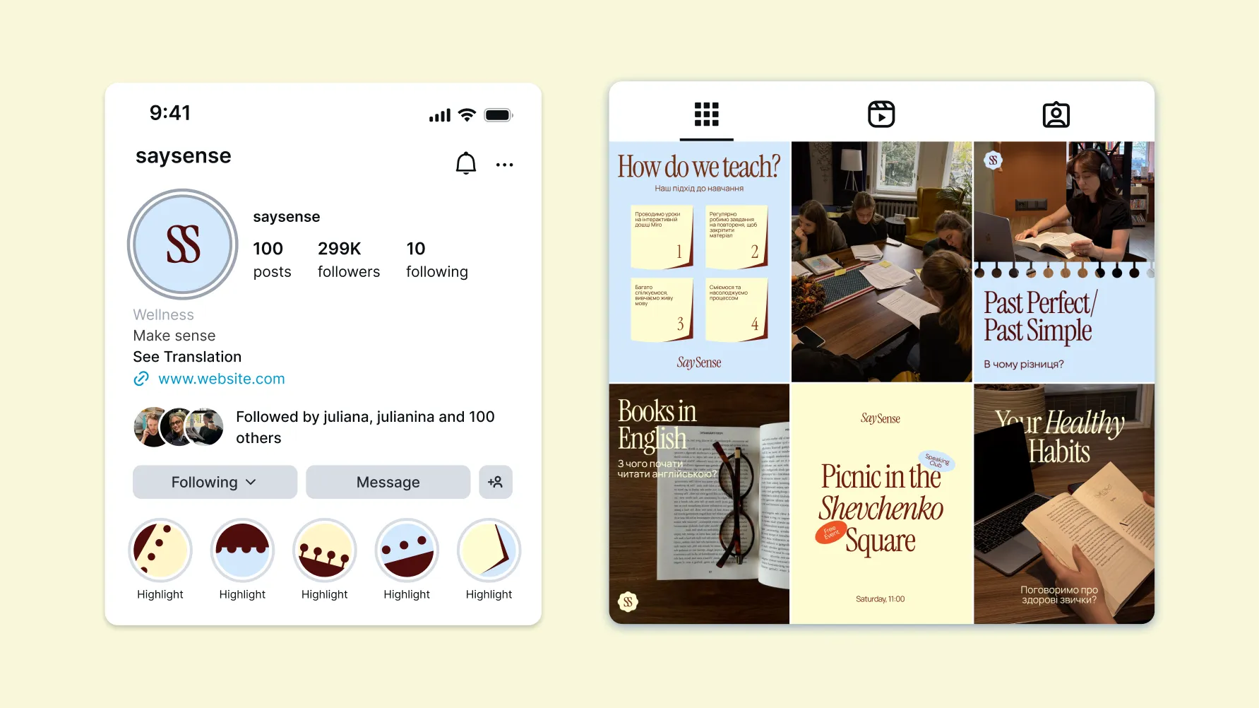
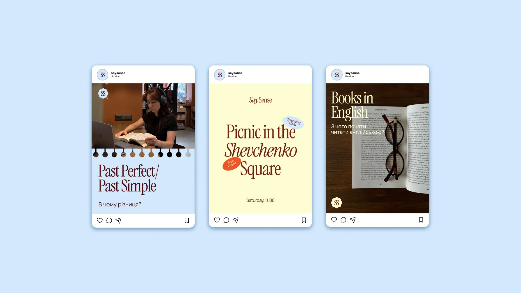
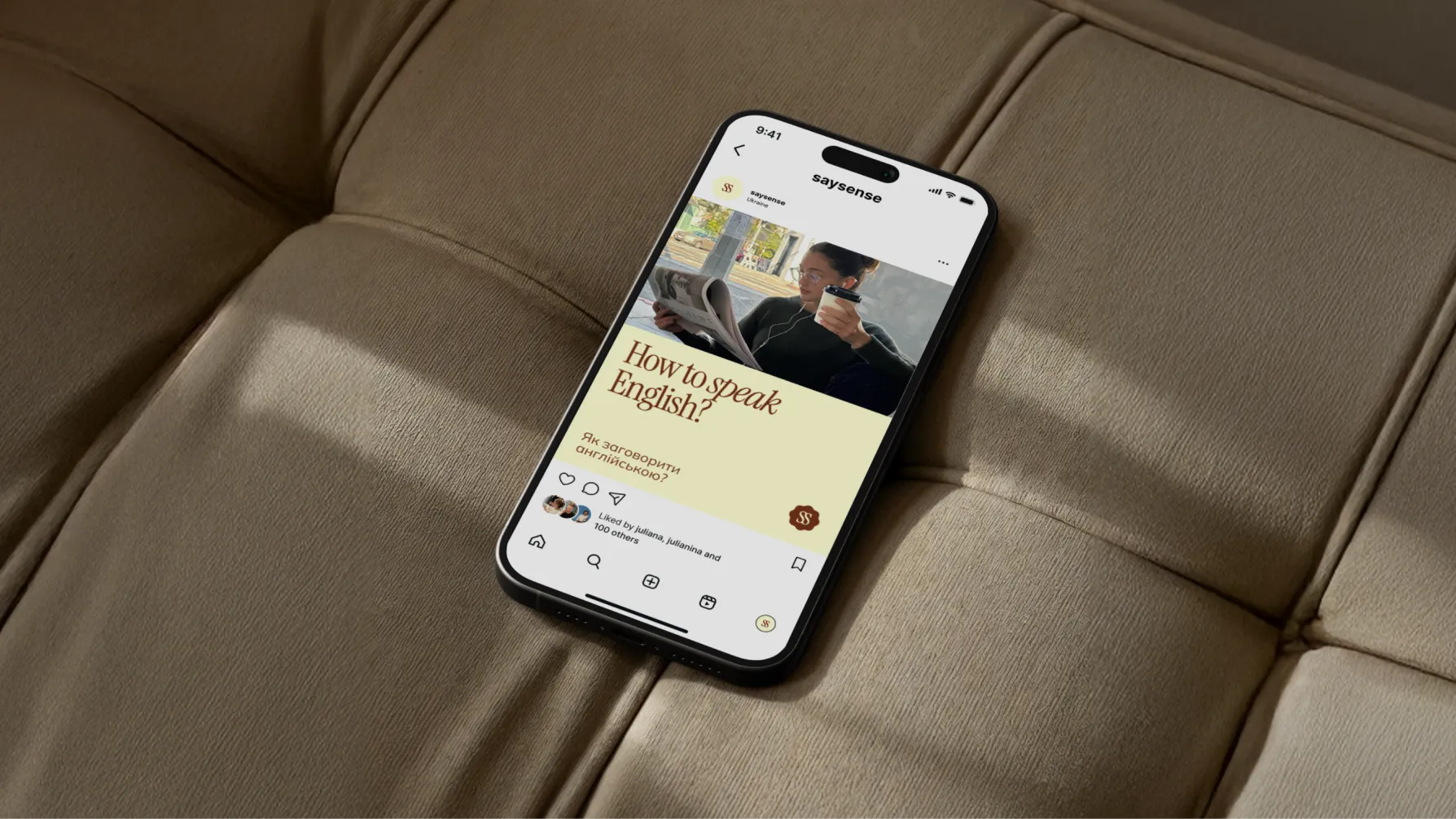
Since social media is Say Sense’s primary communication channel, we developed a cohesive visual system. The goal was to create a recognizable feed that remains flexible enough for different formats — from useful learning content and announcements to everyday communication with students.
What success looked like for the client:
★★★★★
"We were skeptical of another agency. MORE actually showed up and delivered. New patient bookings up 340% in four months."
Dr. Sarah M.
Healthcare · Chicago
Project Lead — Vladyslav Trusov
Creative Director — Bogdan Voyt
Brand Strategy & Design — Polina Volovodenko
Project Manager — Vladyslav Trusov