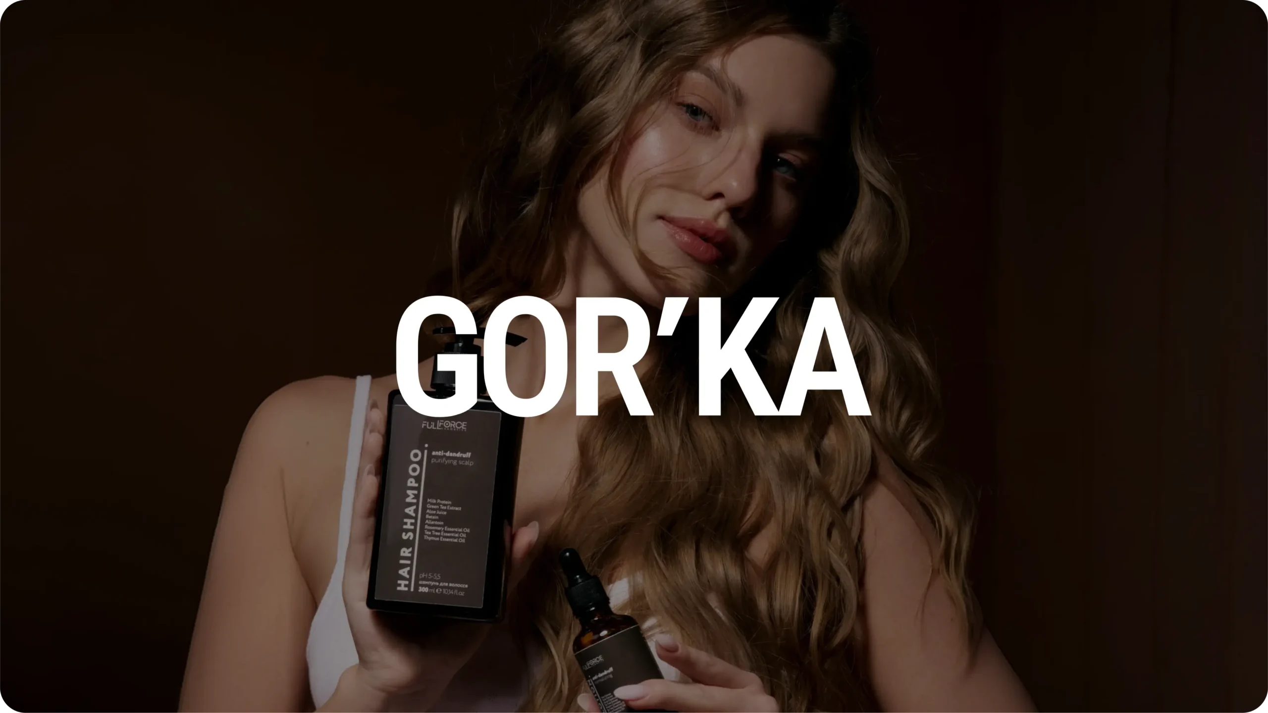
GOR’KA – a beauty brand people remember

Beauty and Care

|

ukraine

|

2025

About the project

GOR’KA is a project where we supported the business from the earliest strategic decisions to the development of a complete, scalable brand system.

Our team developed the brand identity, e-commerce platform, SEO strategy, advertising assets, photo and video production, as well as the brand's digital communications. None of these elements were created in isolation - they were designed as interconnected parts of a single system.

Our objective was never just to create a beautiful brand. We set out to build an identity that inspires trust, reinforces expertise, and gives the business a solid foundation for sustainable growth.
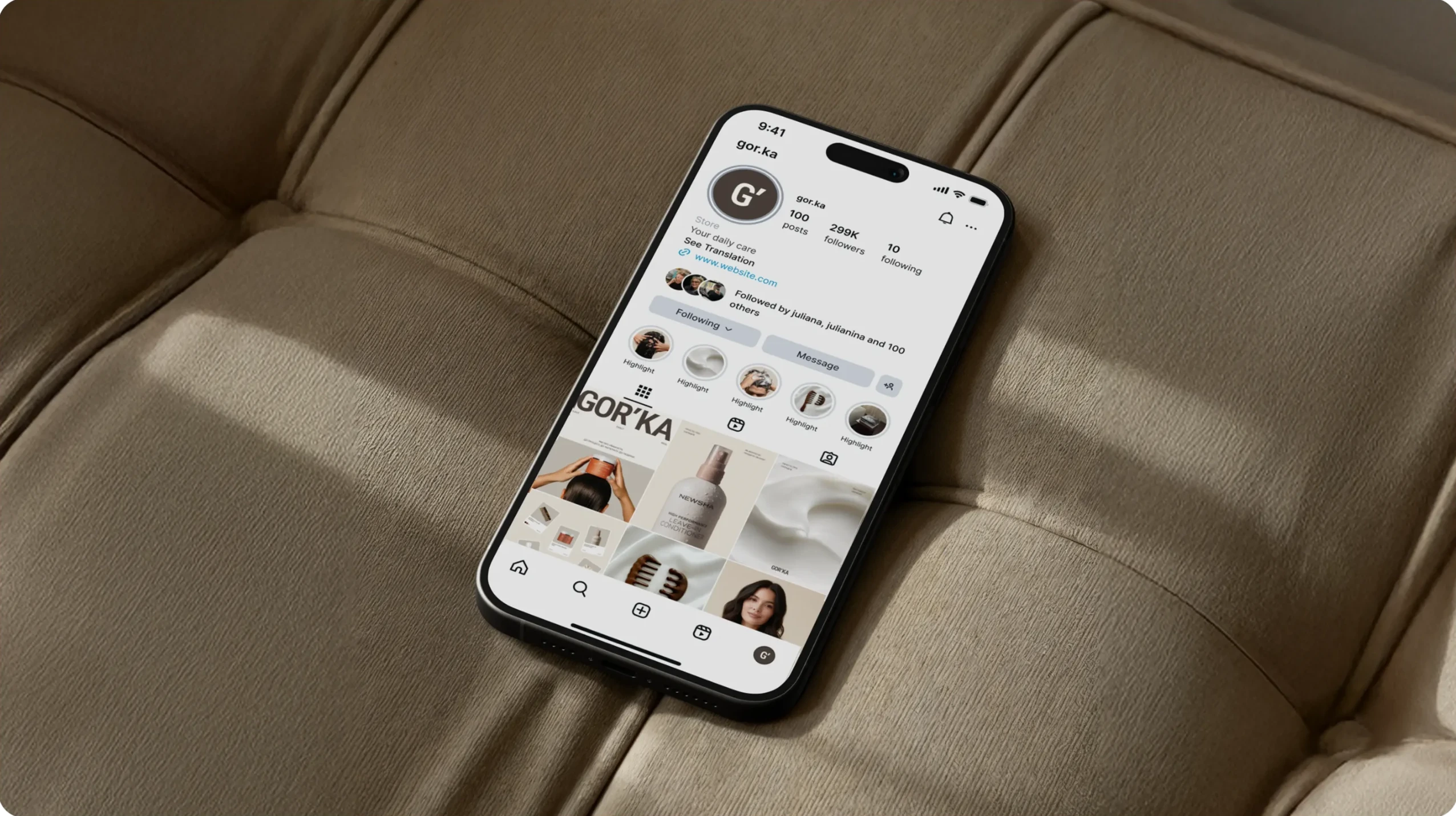
Brand Identity Development
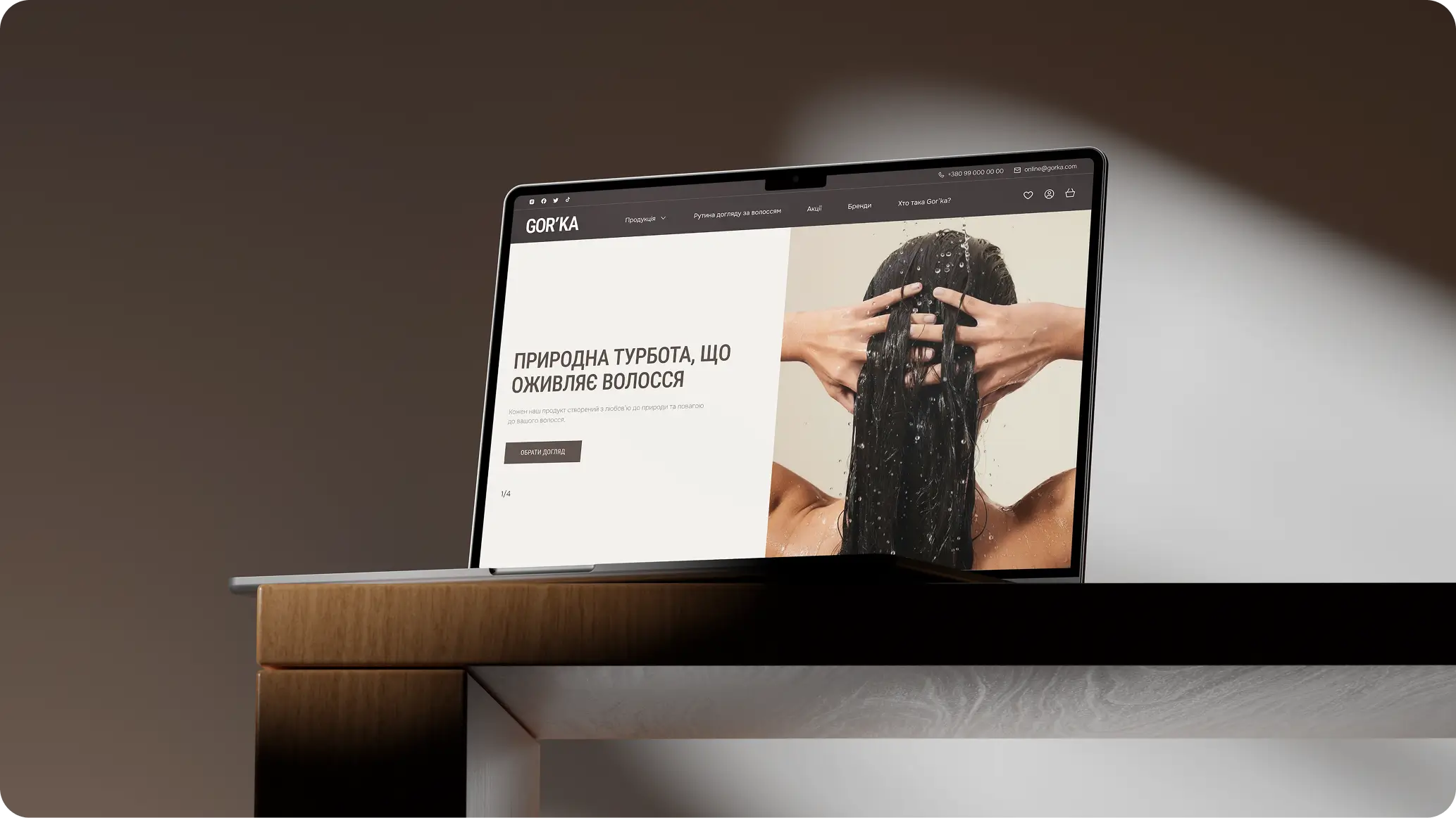
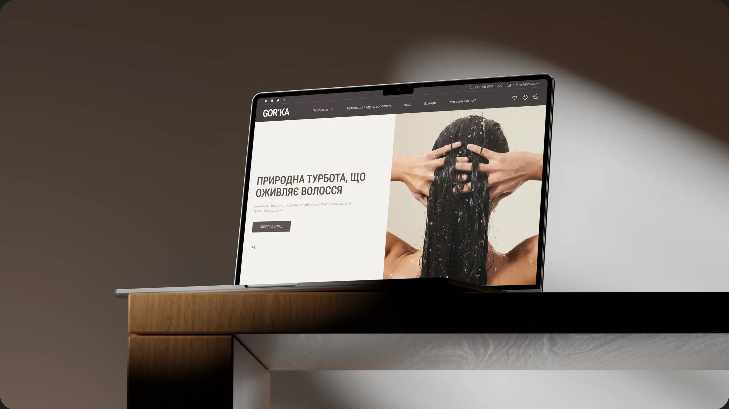
E-commerce Store Development
1444 clean

Building a Brand

Many businesses gradually accumulate marketing materials - a logo, a website, packaging, social media content, advertising. Yet without a shared visual and strategic language, these pieces remain disconnected, making it difficult to build lasting recognition.

That was the core challenge behind GOR'KA.

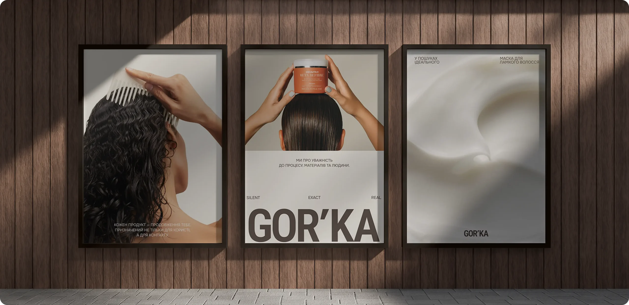
Our task was to create a cohesive brand system where every customer touchpoint - from the very first impression to purchasing a product or booking a consultation - felt consistent and unmistakably connected. Every interaction needed to reinforce the same perception of quality, professionalism, and care.

Rather than designing individual assets, we built a foundation that allows the brand to grow while maintaining a clear and recognizable identity.
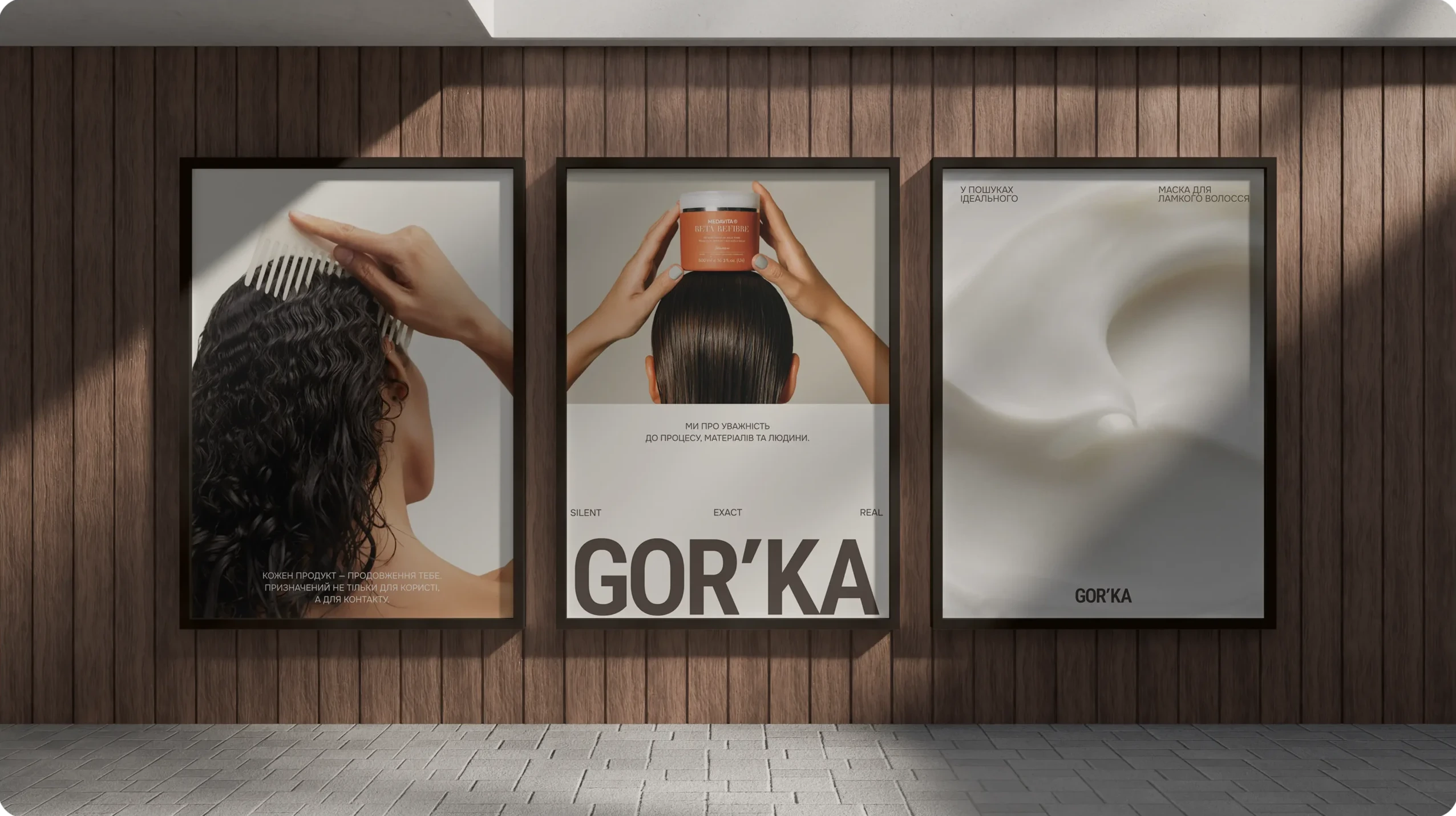
1445 clean

From Strategy to a Brand Language

For us, design is never an isolated creative exercise. It is the natural outcome of strategy.

Every decision – from the smallest visual detail to the overall brand experience – was guided by research, purpose, and long-term scalability.

01Brand Discovery

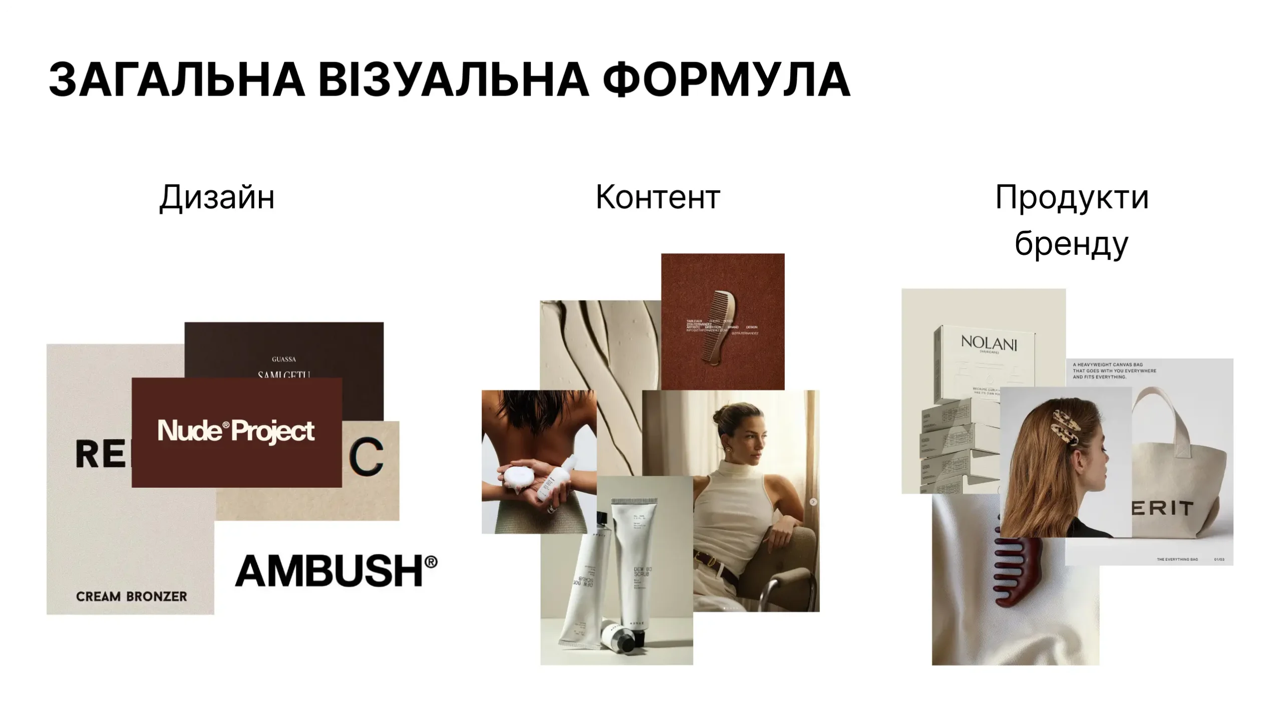
Through an extensive exploration of visual references, typography, color palettes, and composition, we refined the creative direction until a clear visual language emerged – one that balances medical credibility with contemporary beauty aesthetics while remaining timeless, elegant, and approachable.

10 scaled 1
The research helped us develop a clear vision of what GOR’KA should be. It is a knowledgeable guide — a brand that understands what it recommends, explains complex things simply, and helps people find care tailored to their individual needs. This became the foundation for the brand’s positioning, values, personality, and tone of voice.
240265
Based on our research, we shaped GOR’KA’s visual direction around a balance of naturalness, professionalism, and contemporary aesthetics. The palette is built on warm, natural tones inspired by hair, product textures, and gentle care. For typography, we chose modern and functional typefaces that give the brand a confident and professional character.
Frame 66 scaled 1
We systemized all of the developed design solutions and brought them together into a complete visual identity. We defined how color, typography, photography, composition, graphic elements, and layout principles should work together to keep the brand cohesive across different formats. Particular attention was given to the relationship between these elements. The system needed to be flexible enough to work across the website, social media, packaging, advertising, and print while maintaining GOR’KA’s recognizable character. As a result, the brand received not just a set of visual assets, but a clear framework that allows the identity to scale without losing consistency.
Frame 2147239649
The final stage was transforming the identity into a complete brand system designed to work not only within individual layouts, but across the real needs of the business. We adapted the visual principles for the website, packaging, social media, advertising, photography, and video, while establishing guidelines that help maintain consistency across every new touchpoint. As a result, GOR’KA gained a system built to evolve alongside the brand — flexible enough to support new formats and challenges, yet structured enough to preserve its recognizability, character, and a consistent brand experience at every stage of the customer journey.
10

Results

The outcome of this project extends far beyond a new visual identity. GOR’KA received a complete brand ecosystem where every touchpoint works together to create a consistent customer experience.

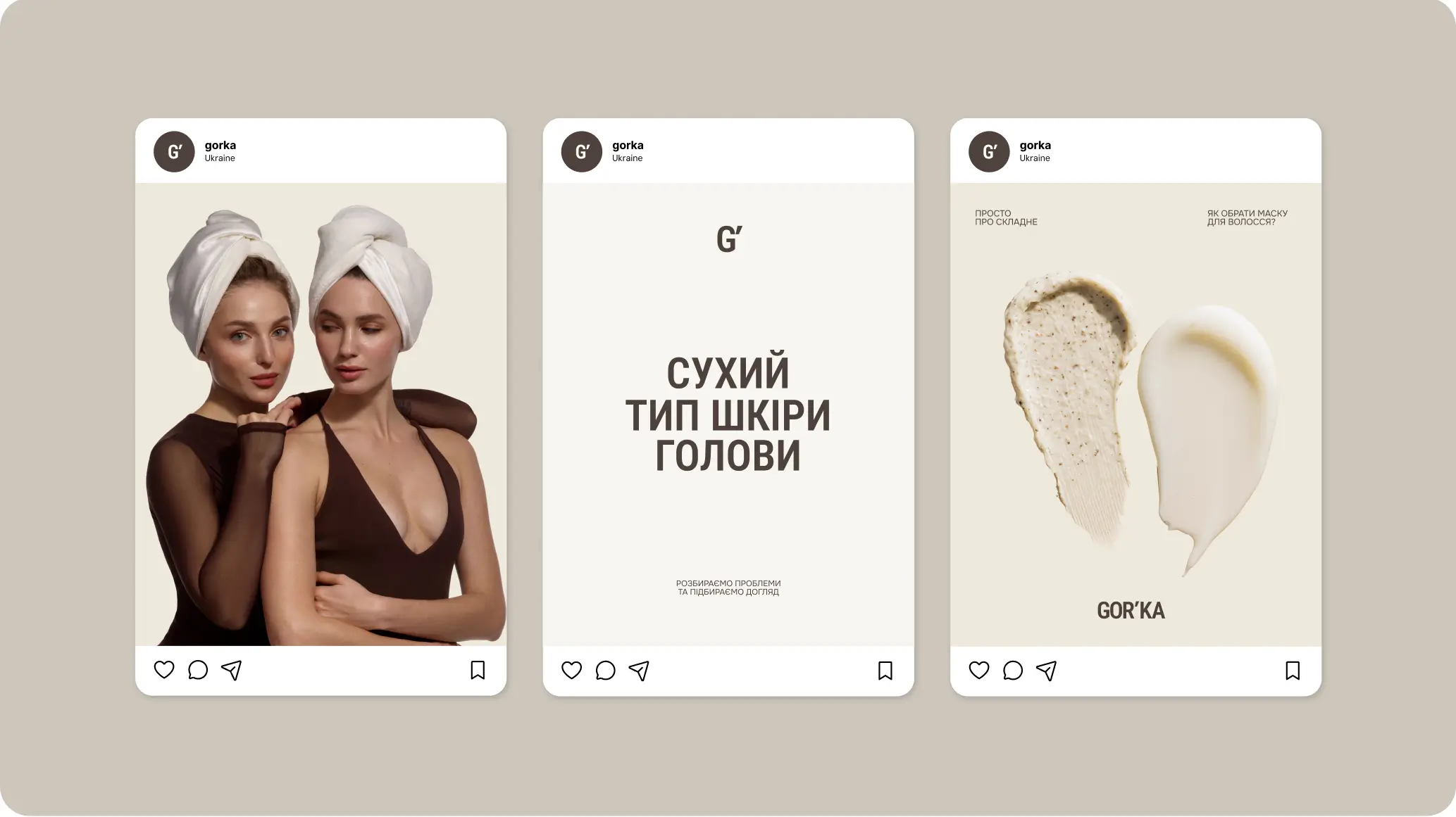
From the first impression on social media to the moment a customer opens the product packaging, every interaction reinforces the same values – professionalism, trust, quality, and care.

By combining strategy, branding, digital experience, content production, and marketing into one unified system, we created a foundation that allows the brand to grow confidently while remaining instantly recognizable.

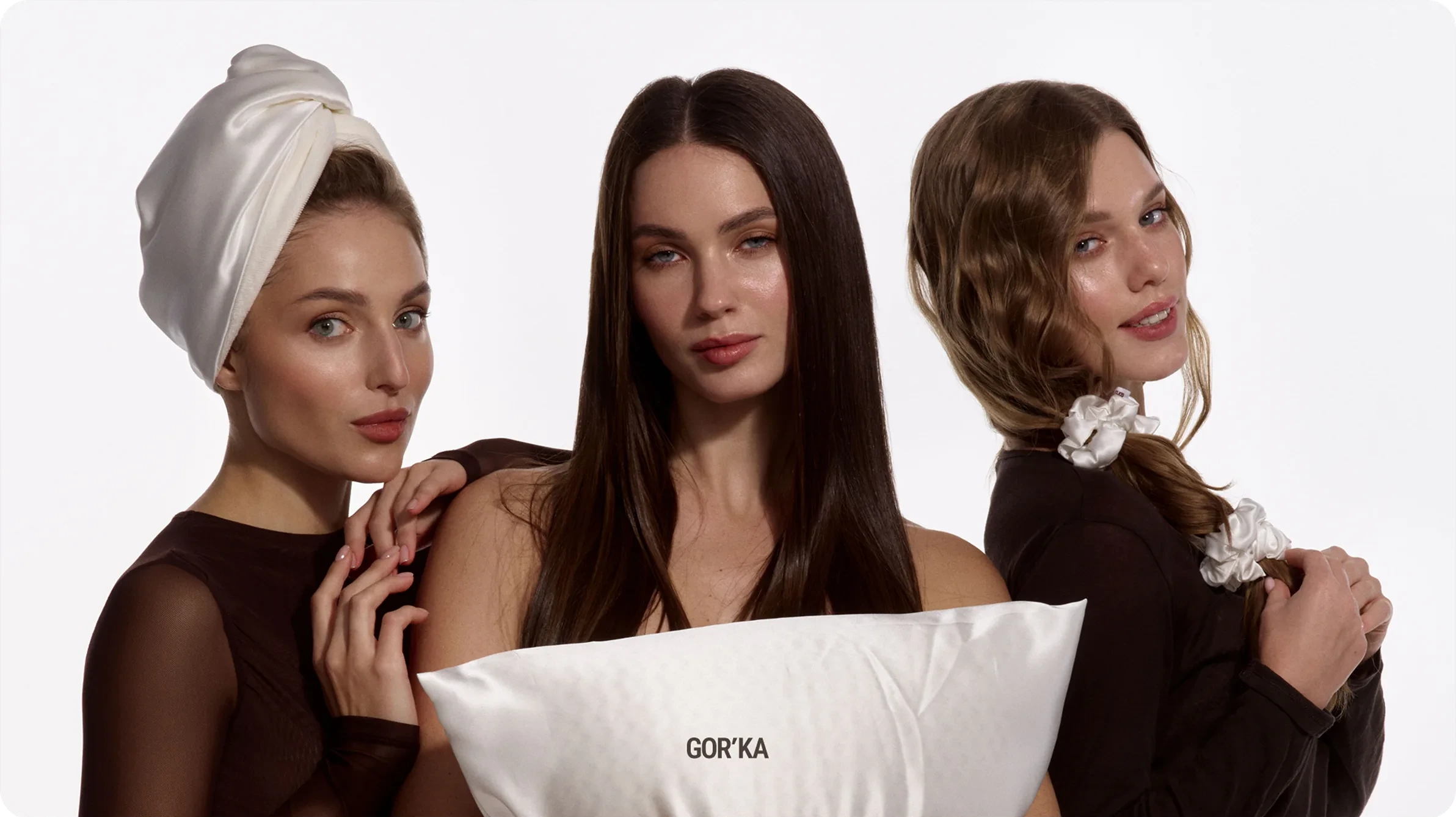
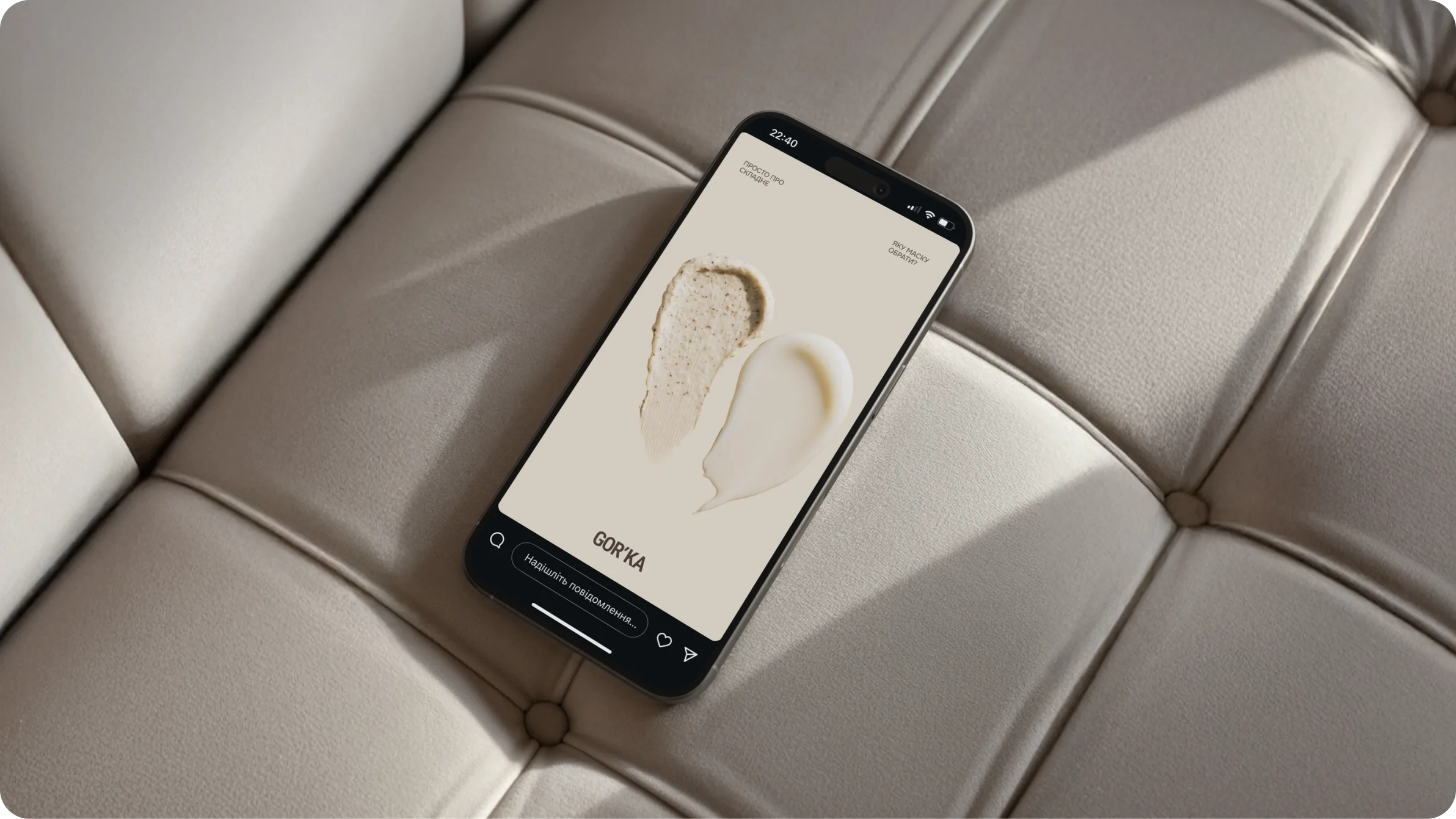
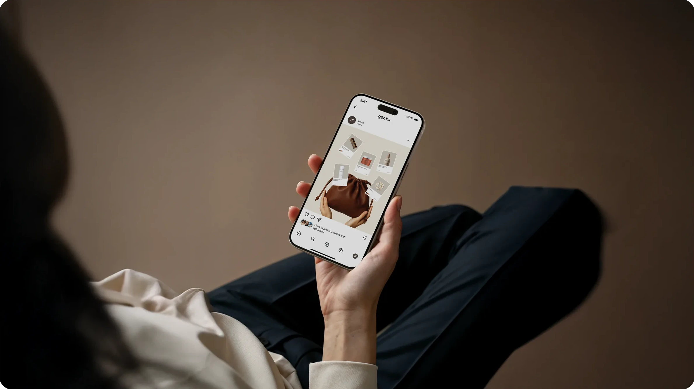
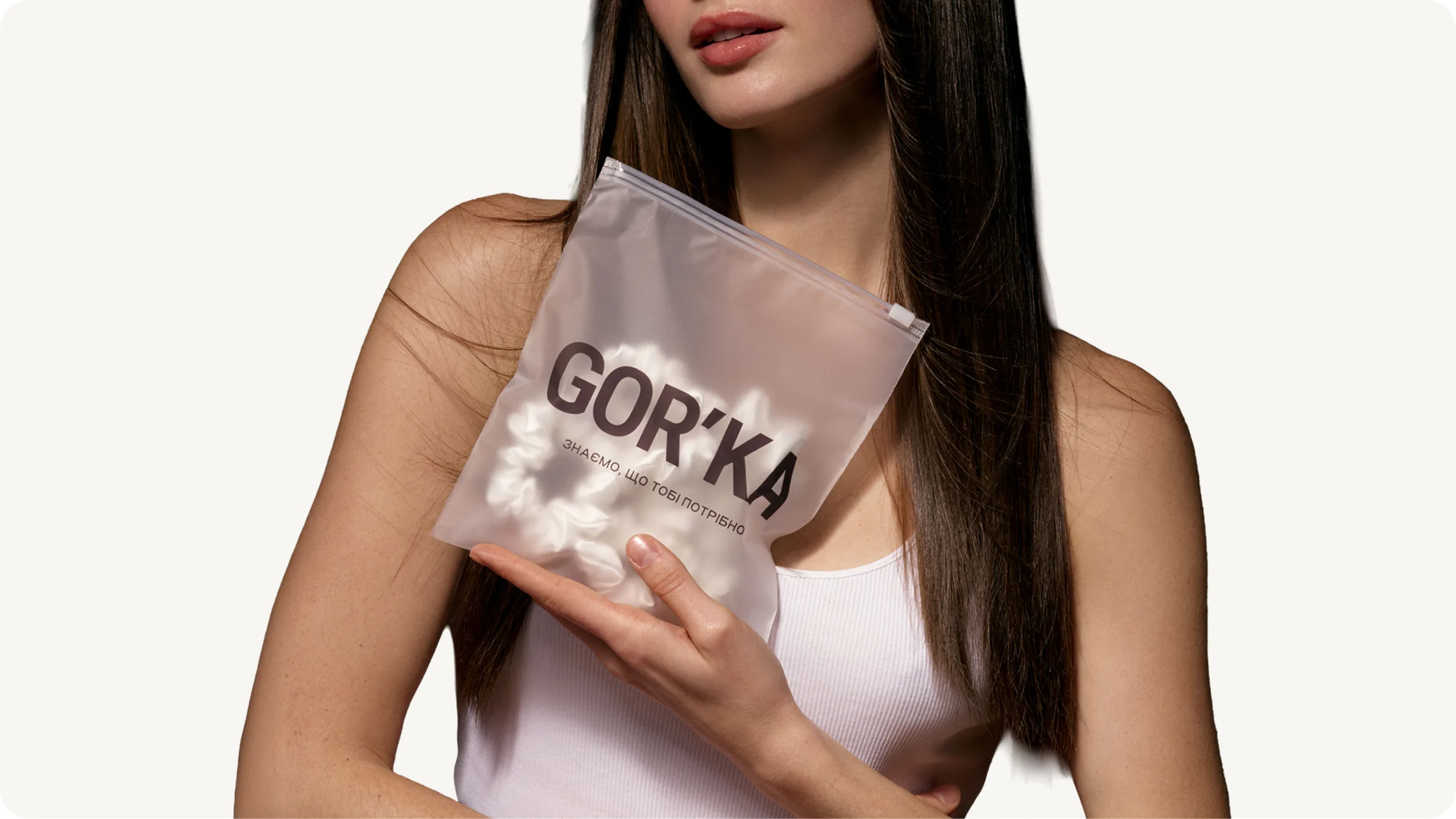
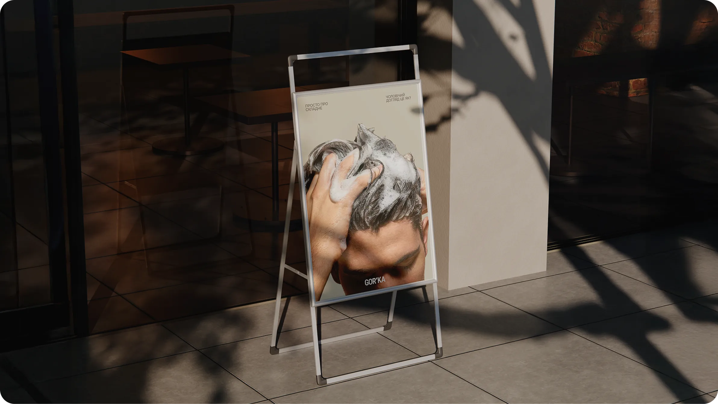
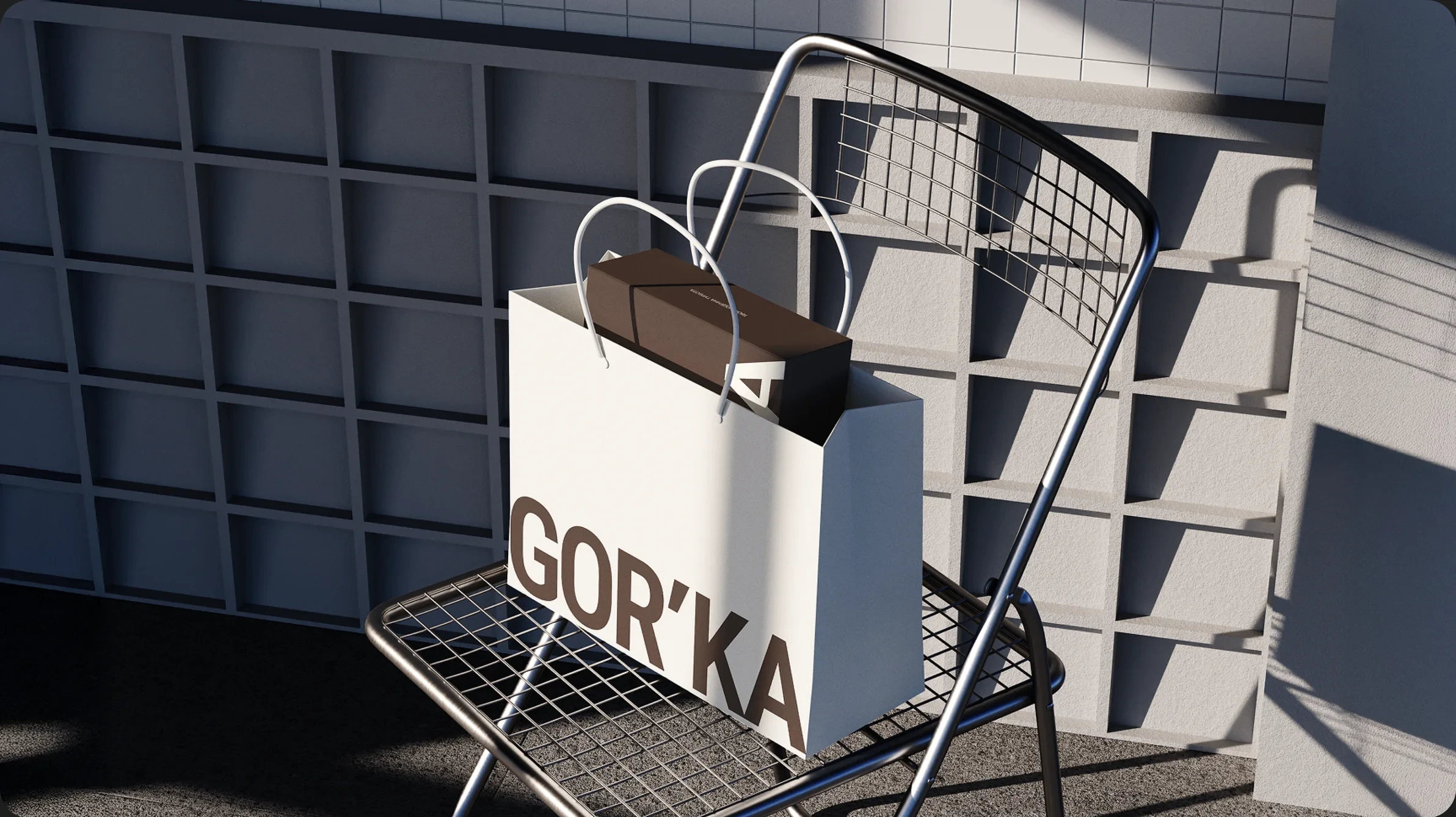
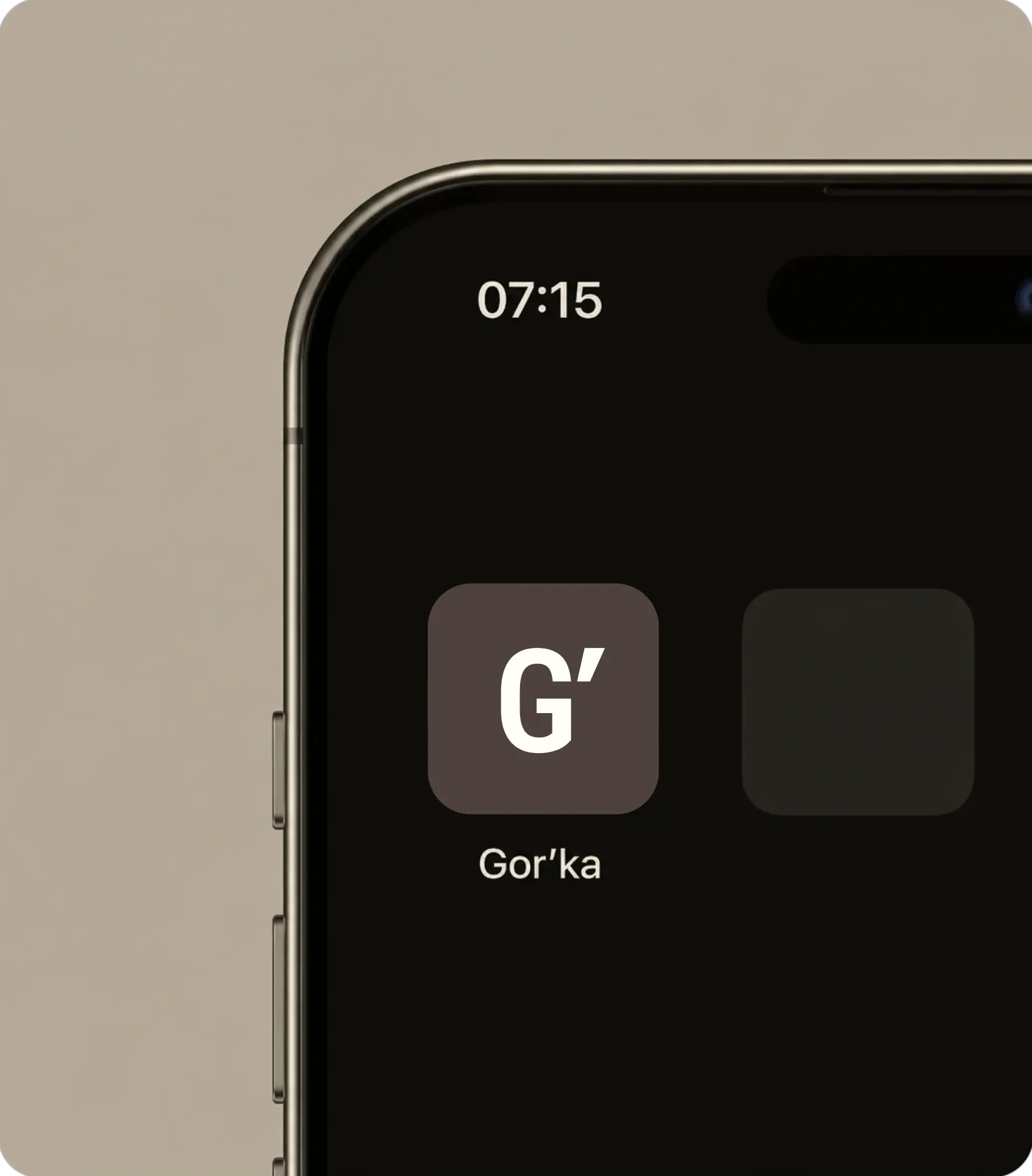
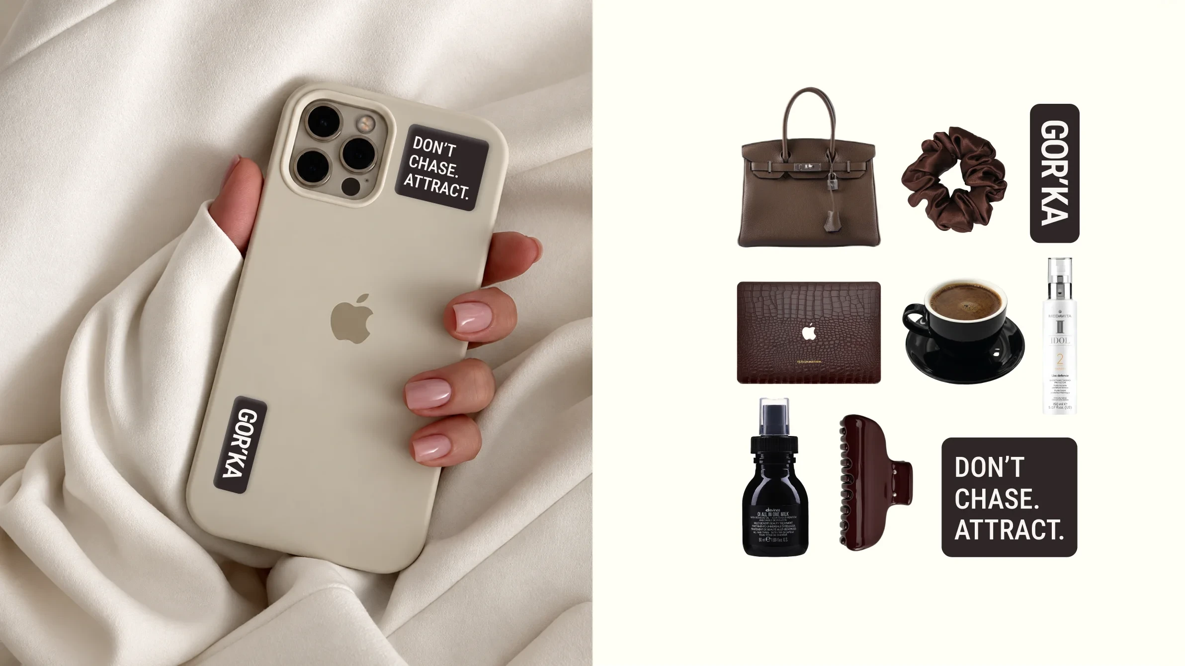
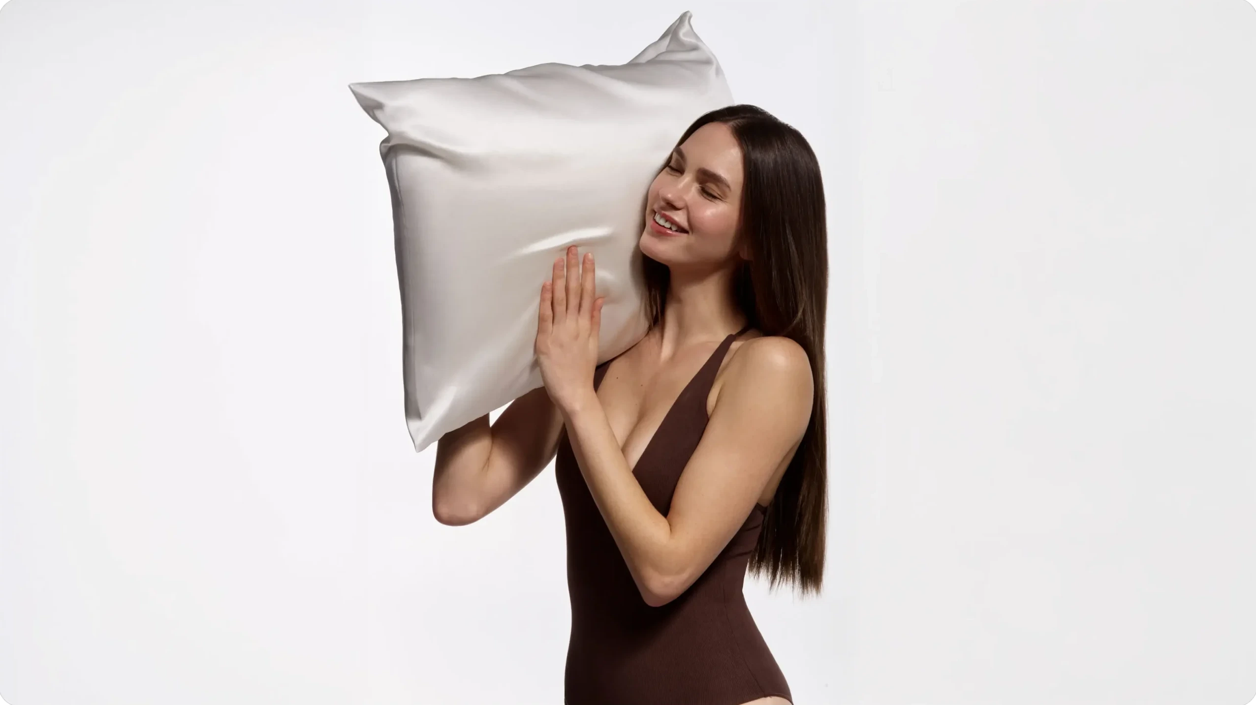
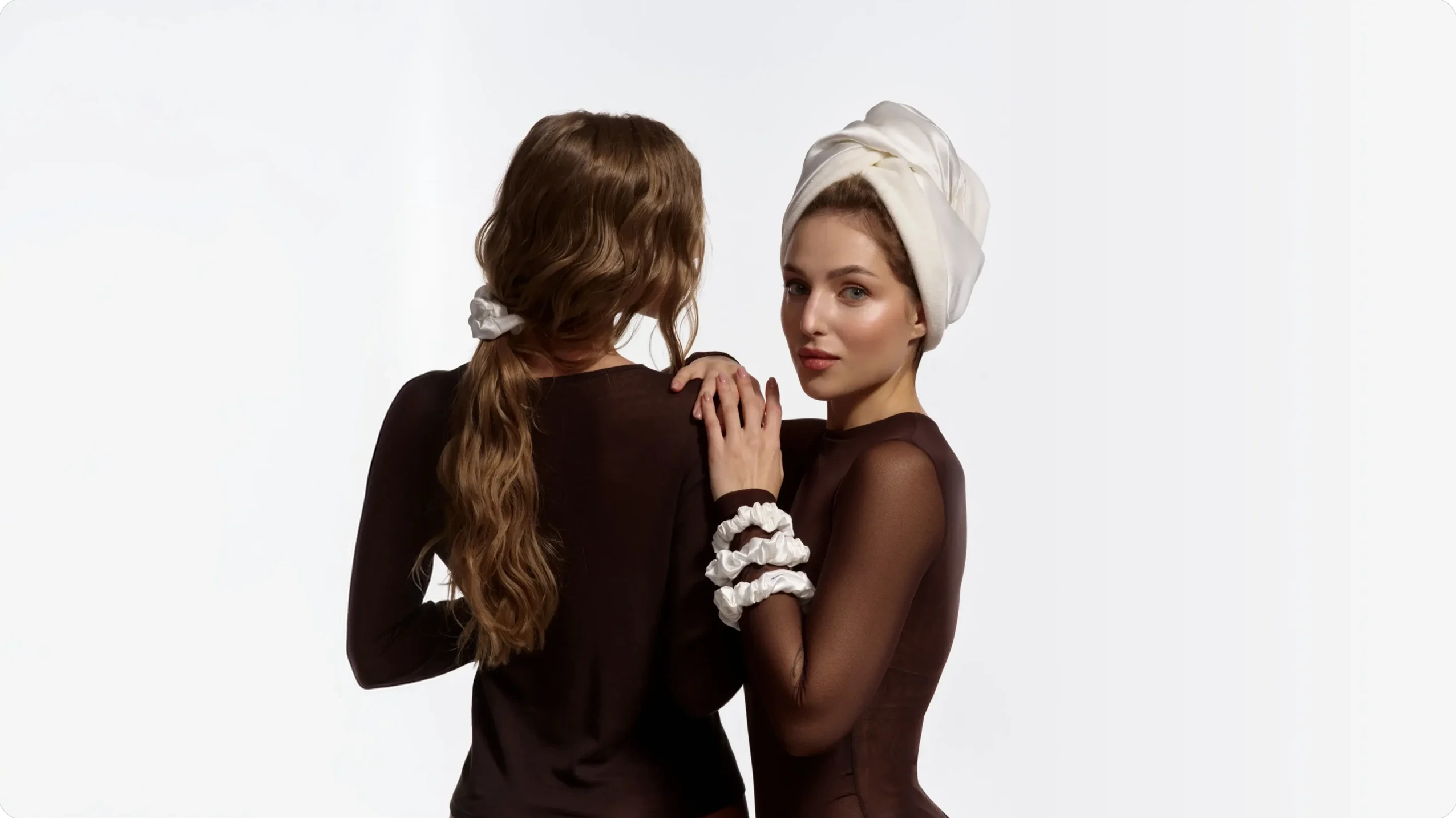
GOR'KA: three models with a branded pillow GOR'KA app on a phone GOR'KA website on a laptop GOR'KA Instagram on a phone Model holding a GOR'KA pouch GOR'KA poster on an A-frame stand GOR'KA shopping bag

Logo

The GOR’KA logo was designed to express confidence through simplicity. Rather than relying on decorative elements, we focused on clean geometry, balanced proportions, and a distinctive silhouette that remains recognizable across every application.

Its restrained character reflects the brand’s professional expertise while maintaining the elegance expected from a premium beauty company.

Whether placed on packaging, digital interfaces, printed materials, or environmental graphics, the logo performs consistently and confidently at every scale.

121 clean
122 clean
120 scaled

Colors & Typography

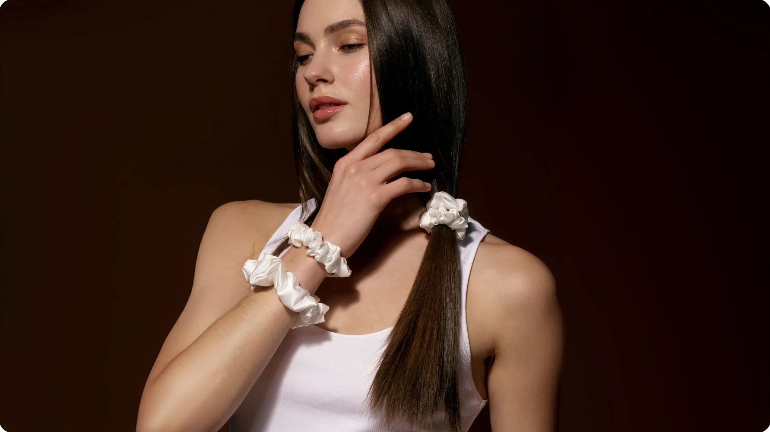
GOR’KA’s color system is built around warm, natural tones inspired by hair, care rituals, and the tactile qualities of cosmetic products. Soft milky and beige shades create a sense of cleanliness, calm, and delicacy, while deep browns add contrast, confidence, and visual depth. Together, they form a restrained and natural palette that balances professional expertise with a sense of care.

The typography follows the same principle. Onest serves as the primary communication typeface — soft and contemporary, with open forms and a clear structure. It allows the brand to feel professional while remaining human and approachable. Roboto Condensed introduces a more precise, structured geometry and is used as a distinctive element of the logo, giving the identity a recognizable visual accent.

Roboto
Condensed

This is a modern typeface with a clear rhythm and confident geometry. It is minimalist but not cold—it conveys a sense of structure, discipline, and restrained energy. This typeface effectively conveys a sense of modernity and trust. It has no unnecessary details, only clarity, balance, and precision.

*
1234567890
!@#$%^&*()\
Aa
01
02
03
04
05
Onest

This is a soft, approachable sans-serif font with a modern character. It combines simplicity and humanity: its rounded forms create a sense of warmth and openness, while its clear structure conveys confidence and professionalism. This font has a clean, harmonious appearance; it is easy to read and conveys an atmosphere of trust, honesty, and calm.

#
1234567890
!@#$%^&*()\
Bb

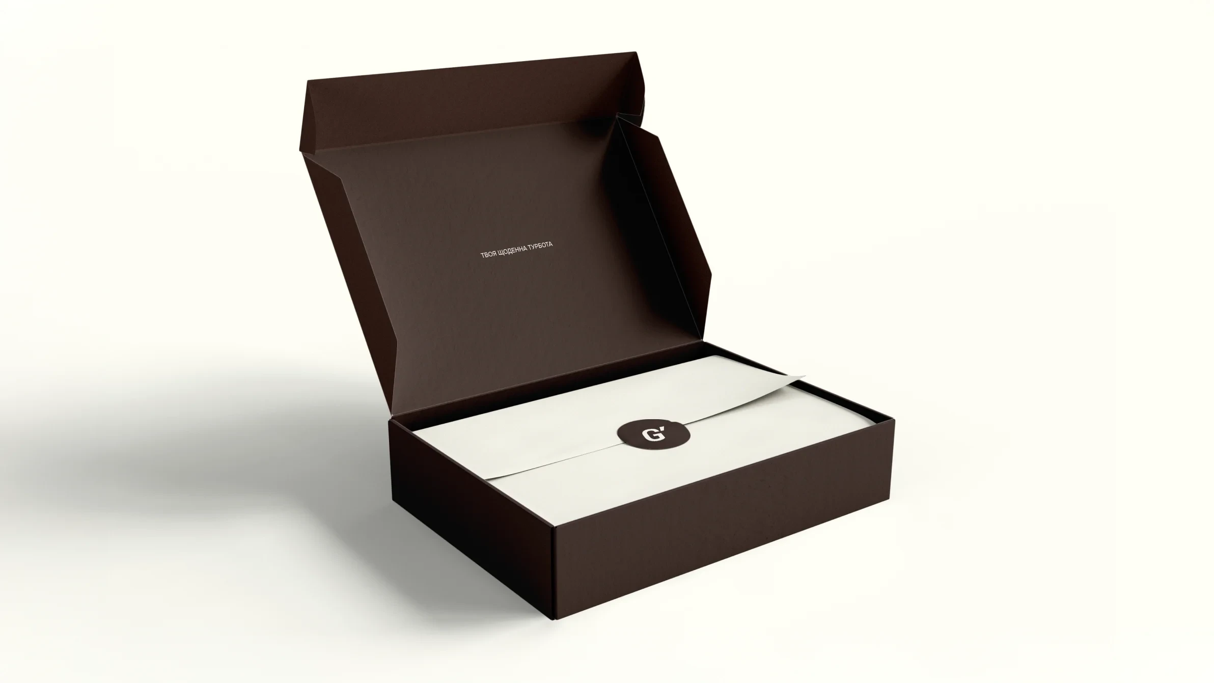
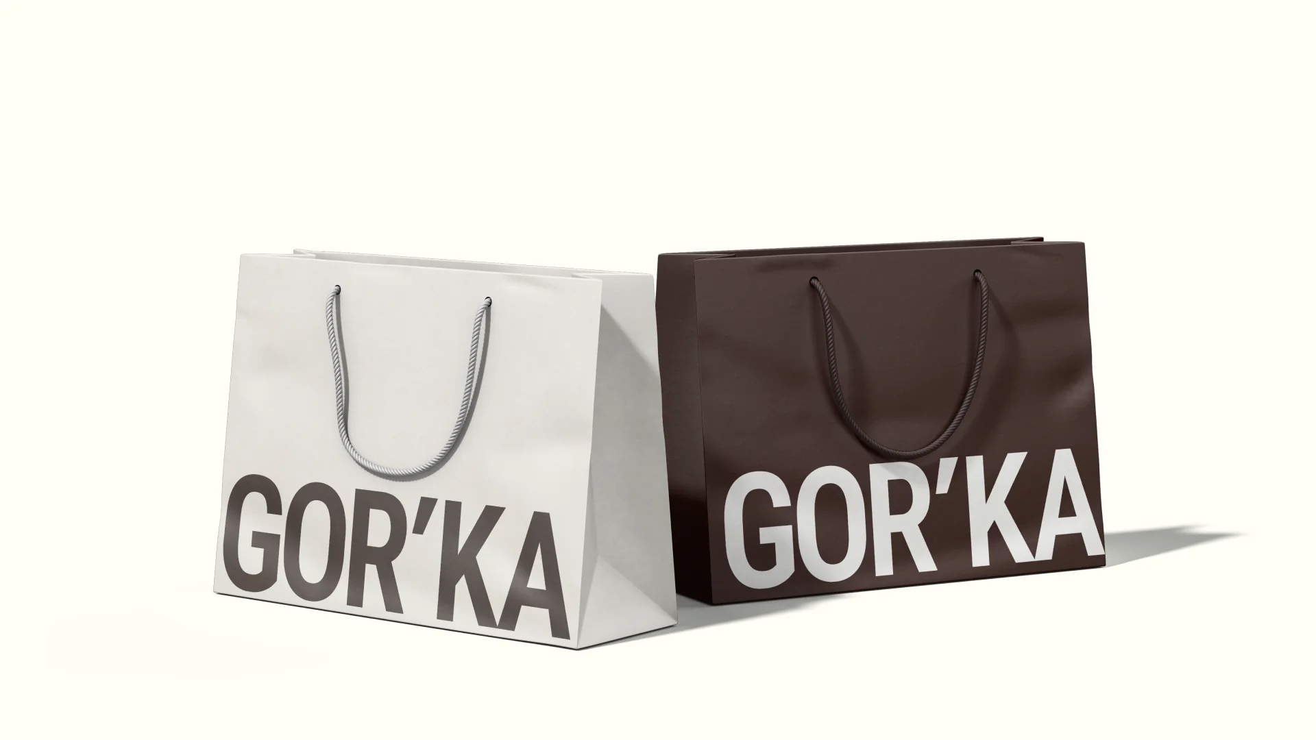
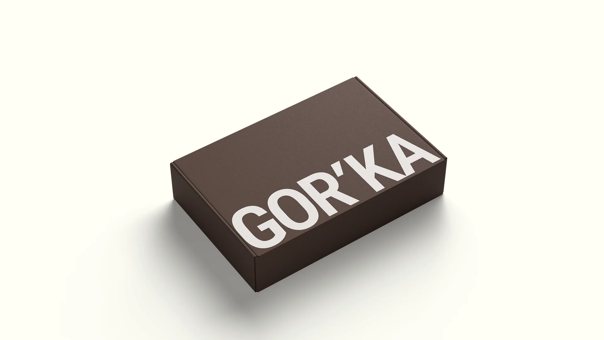
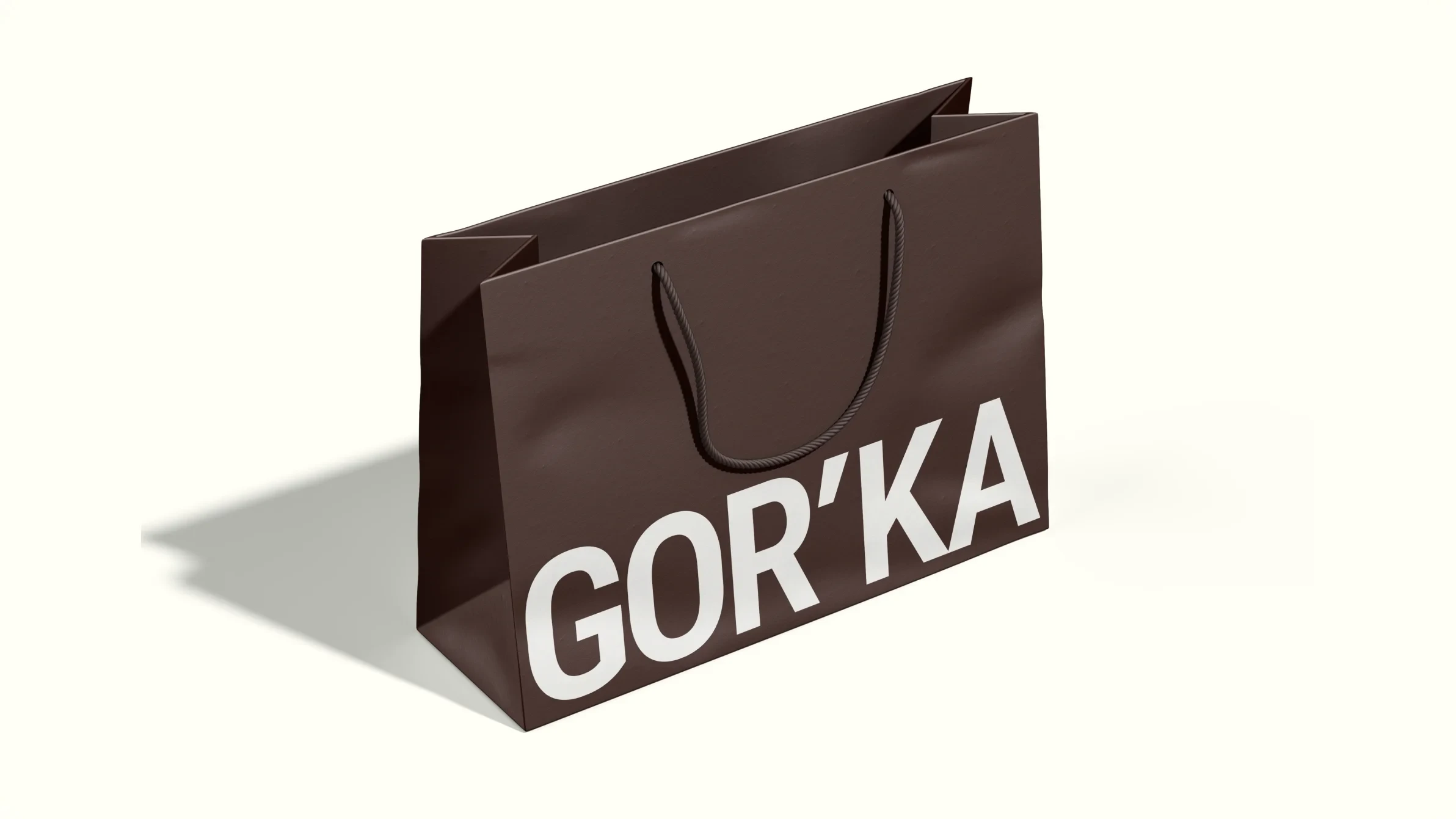
Packaging

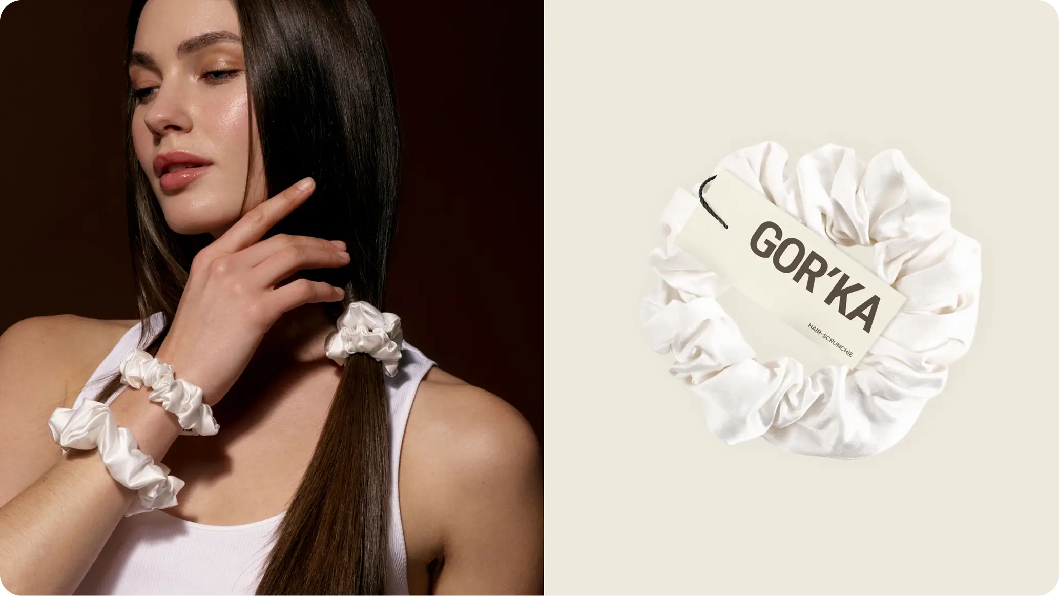
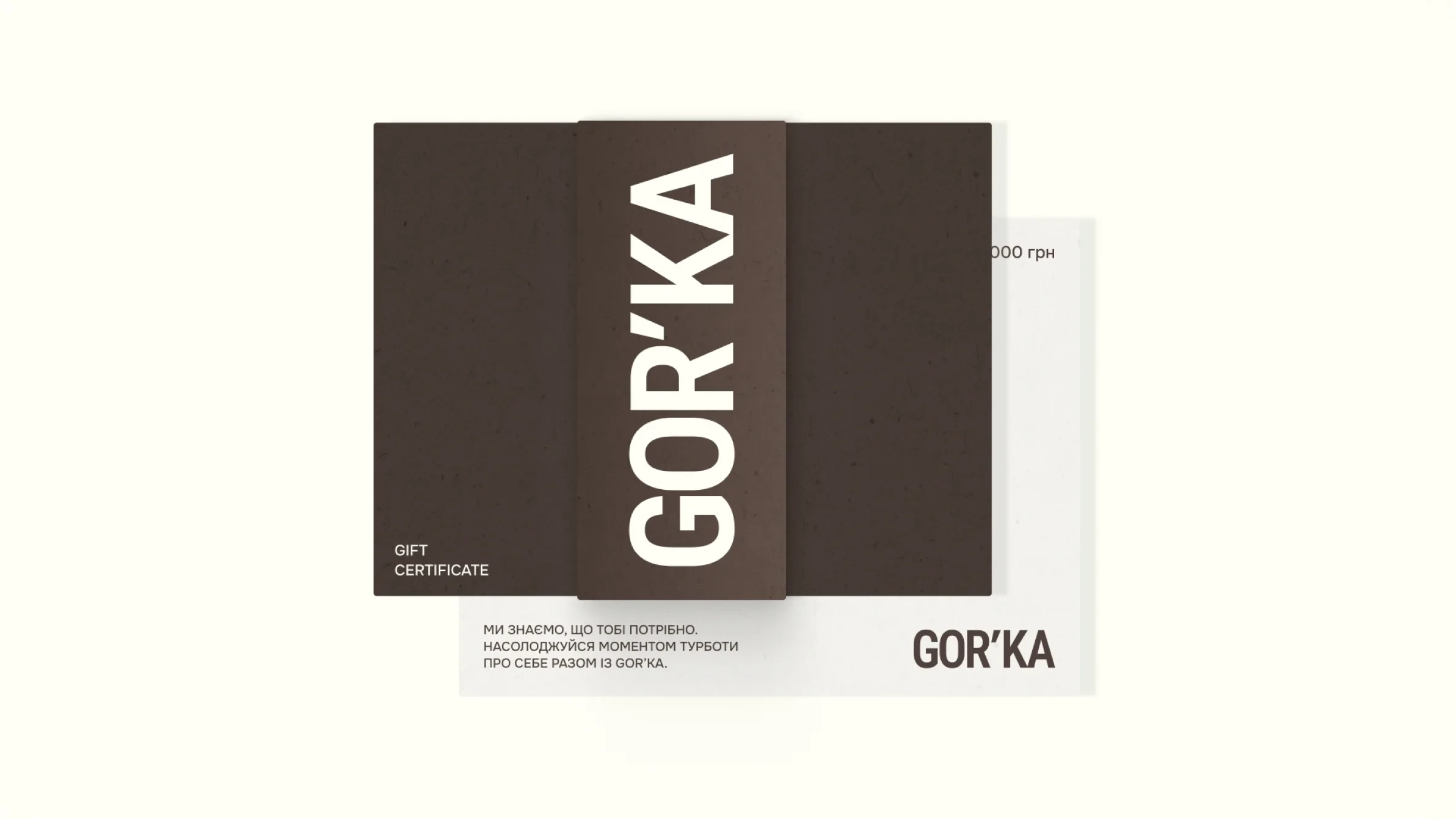
Packaging became one of the most important expressions of the GOR’KA brand.

Our goal was to create a system that feels premium without becoming overly decorative—clean, confident, and immediately recognizable on the shelf. Every label, layout, and graphic element follows the same visual principles established within the brand identity, ensuring consistency across the entire product range.

More than simply protecting the product, the packaging communicates quality, professionalism, and attention to detail before a customer even experiences what’s inside.

GOR'KA brand items
GOR'KA mailing box
GOR'KA shopping bags
GOR'KA box
GOR'KA shopping bag
GOR'KA box with card

Product line

As the product range expanded, maintaining visual consistency became essential.

We developed a flexible design system that allows new products to be introduced without compromising brand recognition. Instead of treating each package as a separate design, we created a scalable framework where hierarchy, color, typography, and layout remain consistent while clearly distinguishing individual product categories.

This approach makes the collection easy to navigate, strengthens shelf presence, and allows the brand to grow naturally over time.

1447 clean
1446 clean
1443 clean

What the Client Received

Rather than delivering isolated creative assets, we built a complete ecosystem that supports the brand at every stage of its development.

The project included brand strategy, visual identity, packaging design, e-commerce website, SEO optimization, content production, advertising materials, photography, video production, and social media design—all developed as parts of one cohesive system.

By approaching every touchpoint through a unified strategy, GOR’KA received more than a collection of deliverables. It received a brand foundation designed for long-term growth, stronger recognition, and a consistent customer experience across every channel.

What success looked like for the client:

★★★★★

"We were skeptical of another agency. MORE actually showed up and delivered. New patient bookings up 340% in four months."

Dr. Sarah M.

Healthcare · Chicago
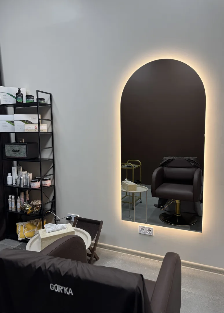
GOR’KA salon interior with an arched backlit mirror

Project Team

Project Lead — Vladyslav Trusov


Creative Director — Bogdan Voyt

Brand Strategy & Design — Polina Volovodenko

Project Manager — Vladyslav Trusov

Ready to be our next success story?

Other Successful Projects

Ready to work with an agency that gets it?

Let's spend 30 minutes together — no pitch, no pressure, just a real conversation about your growth. Walk away with a clear strategy whether you hire us or not.