GOR’KA: Web Development Case Study

Beauty and Care

|

ukraine

|

2025

About the project

GOR'KA is project, where we supported the business from the earliest strategic decisions to a complete, scalable brand system.

Our team developed the brand identity, e-commerce platform, SEO strategy, advertising assets, photo and video production, as well as the brand's digital communications. None of these elements were created in isolation - they were designed as interconnected parts of a single system.

Our objective was never just to create a beautiful brand. We set out to build an identity that inspires trust, reinforces expertise, and gives the business a solid foundation for sustainable growth.

Brand Identity Development
E-commerce Store Development

User-Centred Design Process

01Discovery Research

The project began with a discovery phase to understand the company’s goals, target audience, and existing eCommerce challenges. The primary objective was to create an online shopping experience that simplifies product discovery while increasing conversion rates.

A stakeholder workshop helped define business priorities, key success metrics, and technical requirements. This ensured that every design decision aligned with both customer expectations and business objectives.

A competitive analysis was conducted to identify industry standards, UX patterns, and opportunities for differentiation. Both local and international tactical apparel and outdoor equipment websites were analysed. The research focused on navigation systems, product catalogue organisation, filtering experience, product presentation, checkout flows, and promotional strategies to identify best practices and usability gaps.

The customer journey visualised every stage of the purchasing process—from discovering the website to receiving an order. This helped identify opportunities to improve the overall shopping experience.

Pain points such as difficult product comparison, excessive scrolling, or uncertainty during checkout were identified and addressed early in the design process.

The website structure was designed to make browsing intuitive despite the large number of products and categories. Information architecture focused on reducing cognitive load and improving product discoverability.

Navigation labels, category hierarchy, and filtering logic were carefully organised to support both browsing and targeted product searches.

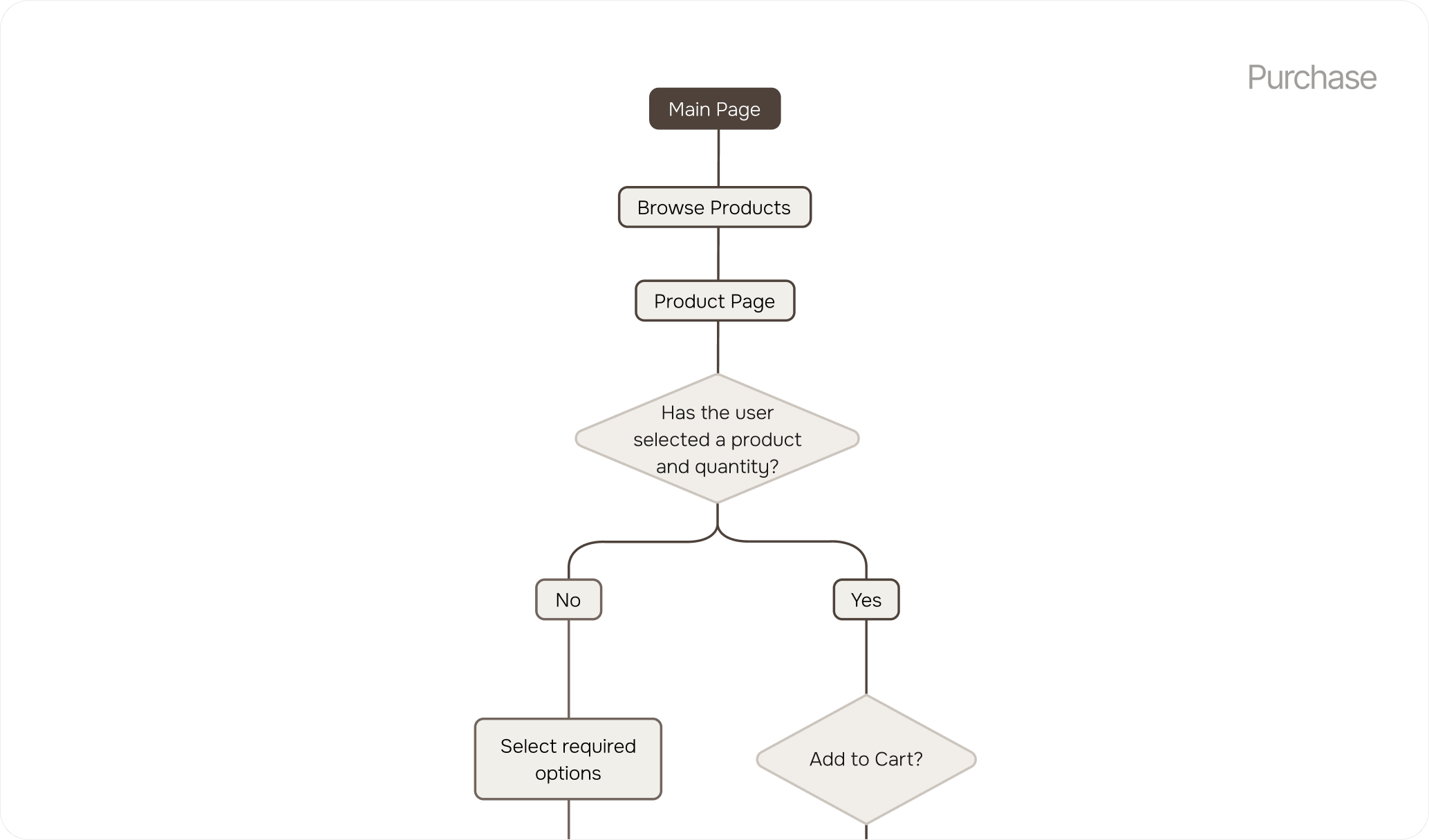
The user flow was designed around the most common customer behaviours, from landing on the homepage to completing a successful purchase. Every interaction was carefully mapped to create a smooth and predictable experience.

Navigation paths were simplified to help users move naturally between categories, product pages, the shopping cart, and checkout. Clear calls to action and logical page relationships minimise confusion and improve task completion.

User flow

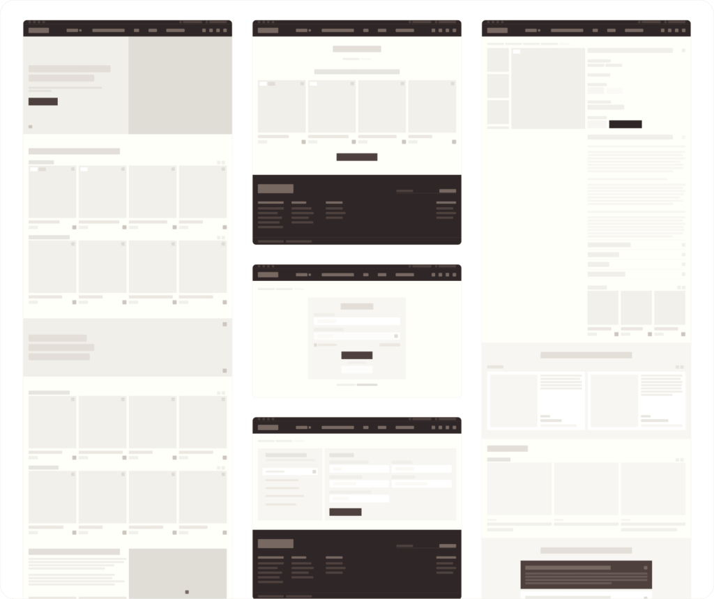
Wireframes were created to establish the structural foundation of the website before moving into high-fidelity design. This stage focused on layout, content hierarchy, and the placement of key interface elements. Each page was organised to highlight the most important information first, ensuring users could easily scan products, promotional content, and navigation without visual distractions.

Wireframes

Results

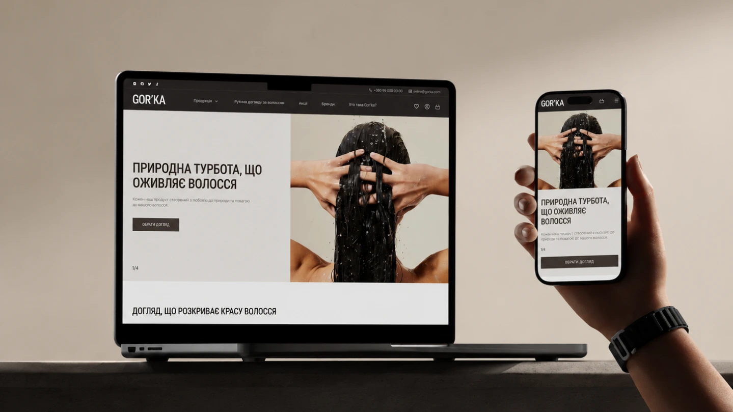
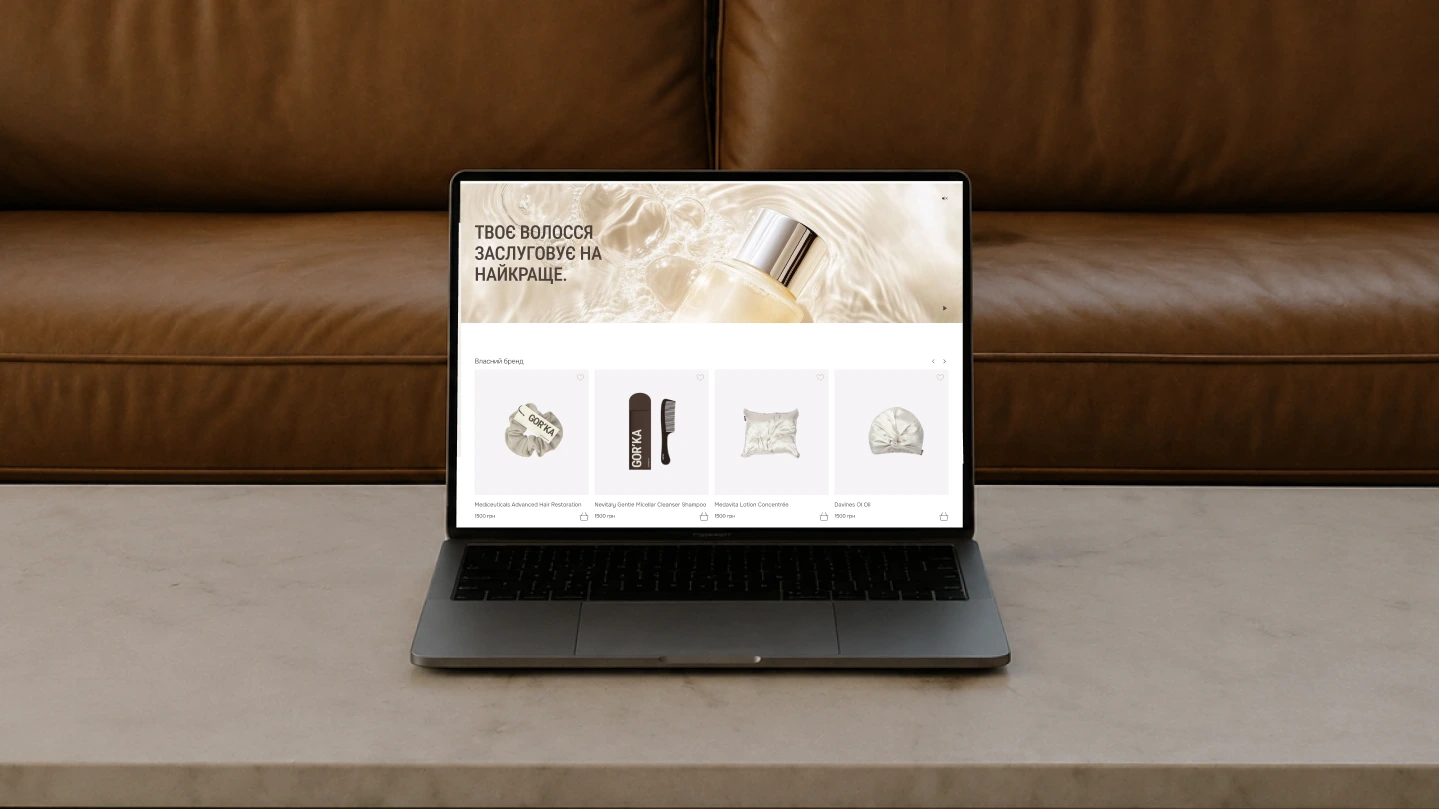
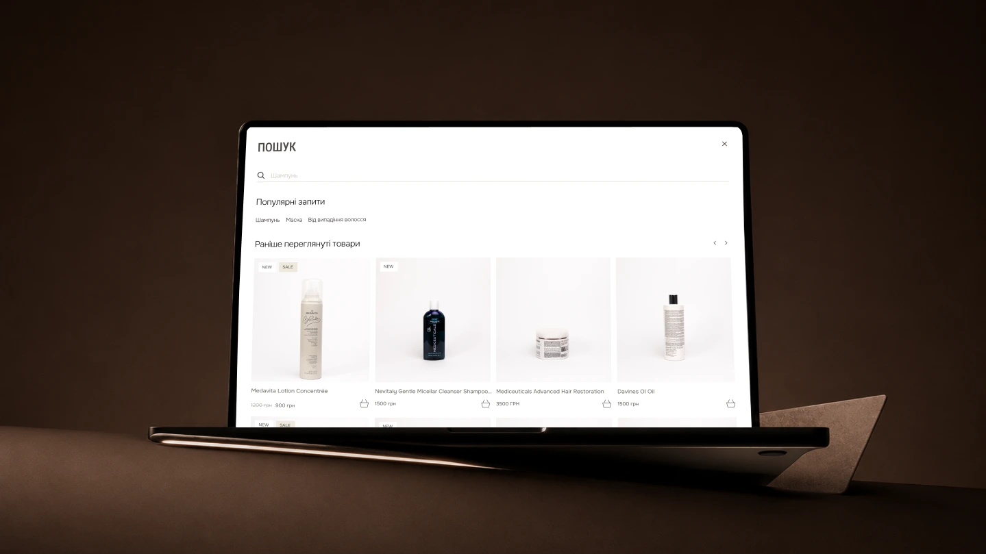
The result is a modern eCommerce store featuring an engaging homepage, intuitive navigation, well-organised product pages, and a visually consistent interface that makes browsing effortless and enjoyable.

A streamlined checkout, powerful product filtering, responsive layouts, and performance-focused development create a fast, frictionless shopping experience across all devices, providing a scalable foundation for future growth.
gorka web gallery 1 raw gorka web gallery 2 raw gorka web gallery 3 raw

ui design

Personal Account

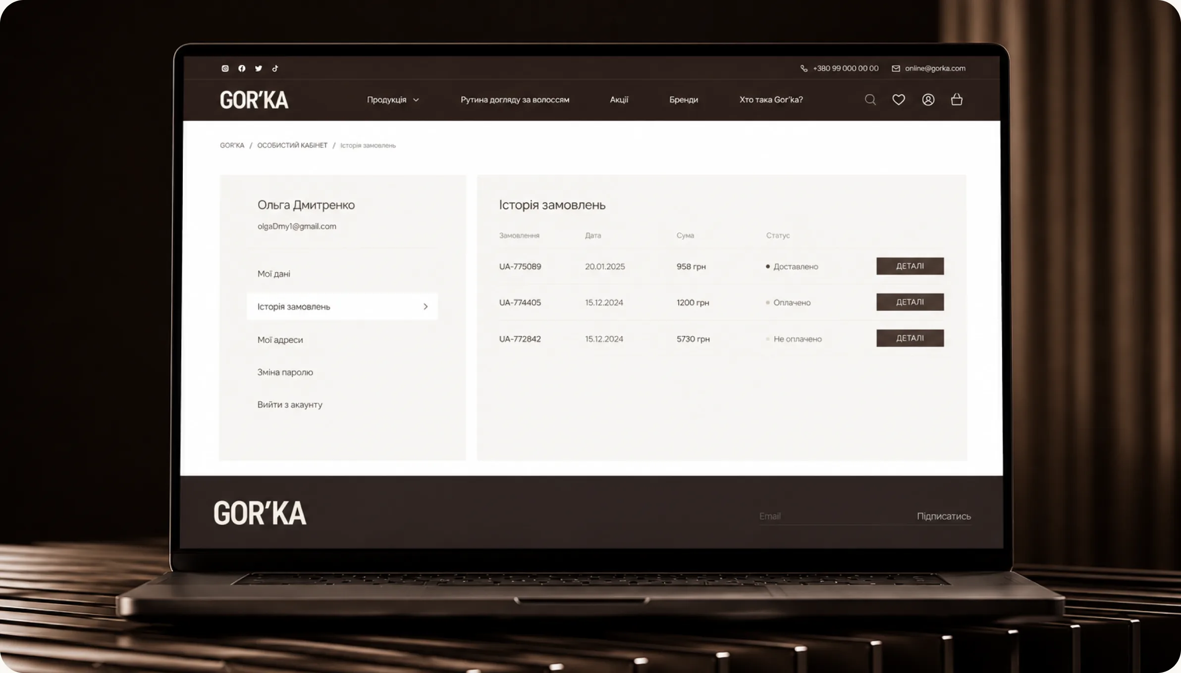
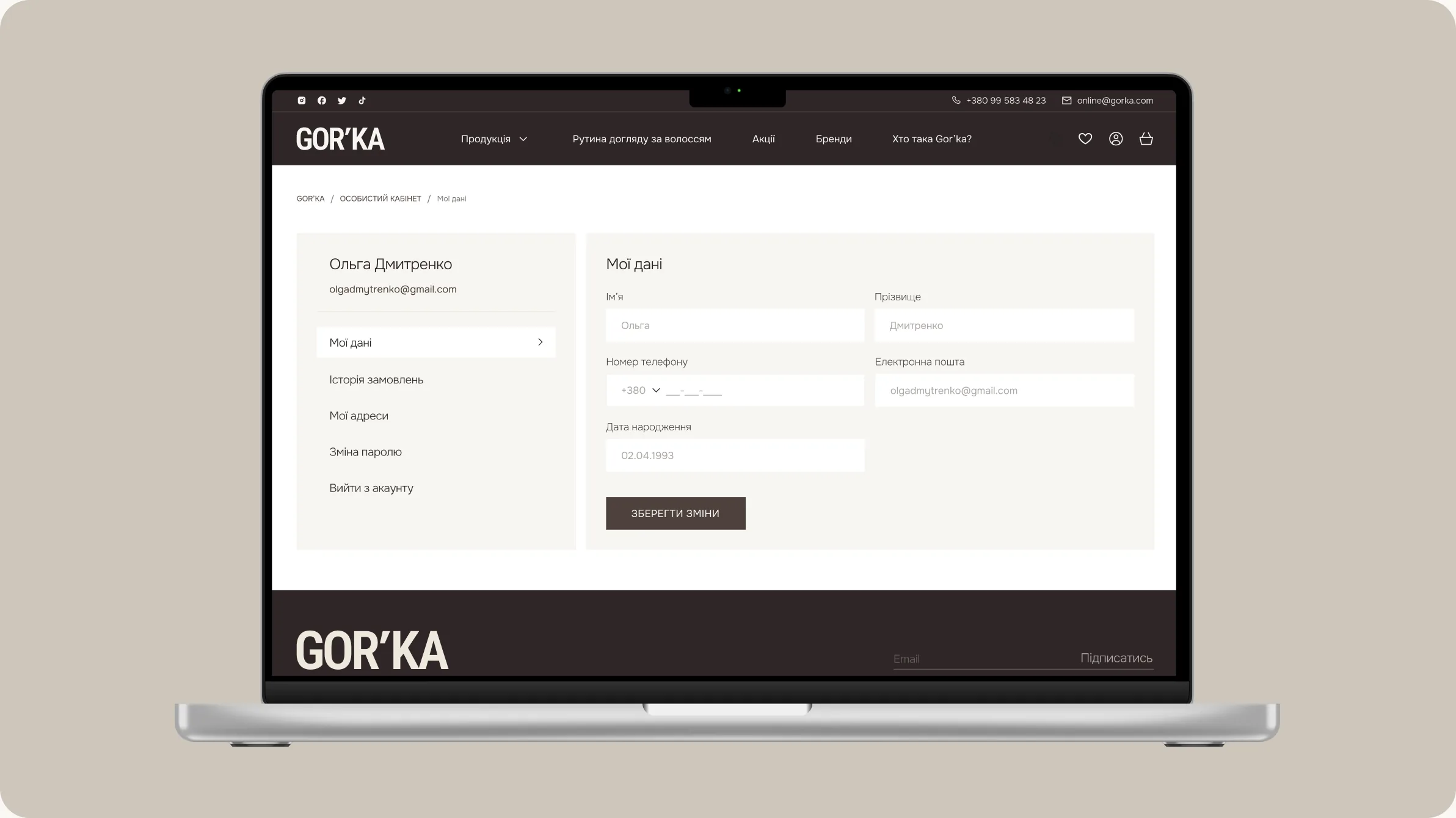
Designed for effortless account management A clean and intuitive personal account was designed to give users quick access to their orders, saved addresses, account details, and profile settings.

Clear navigation and a well-structured interface make managing purchases simple and efficient.
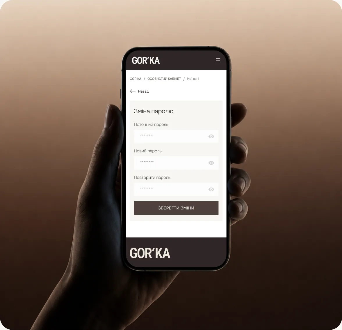
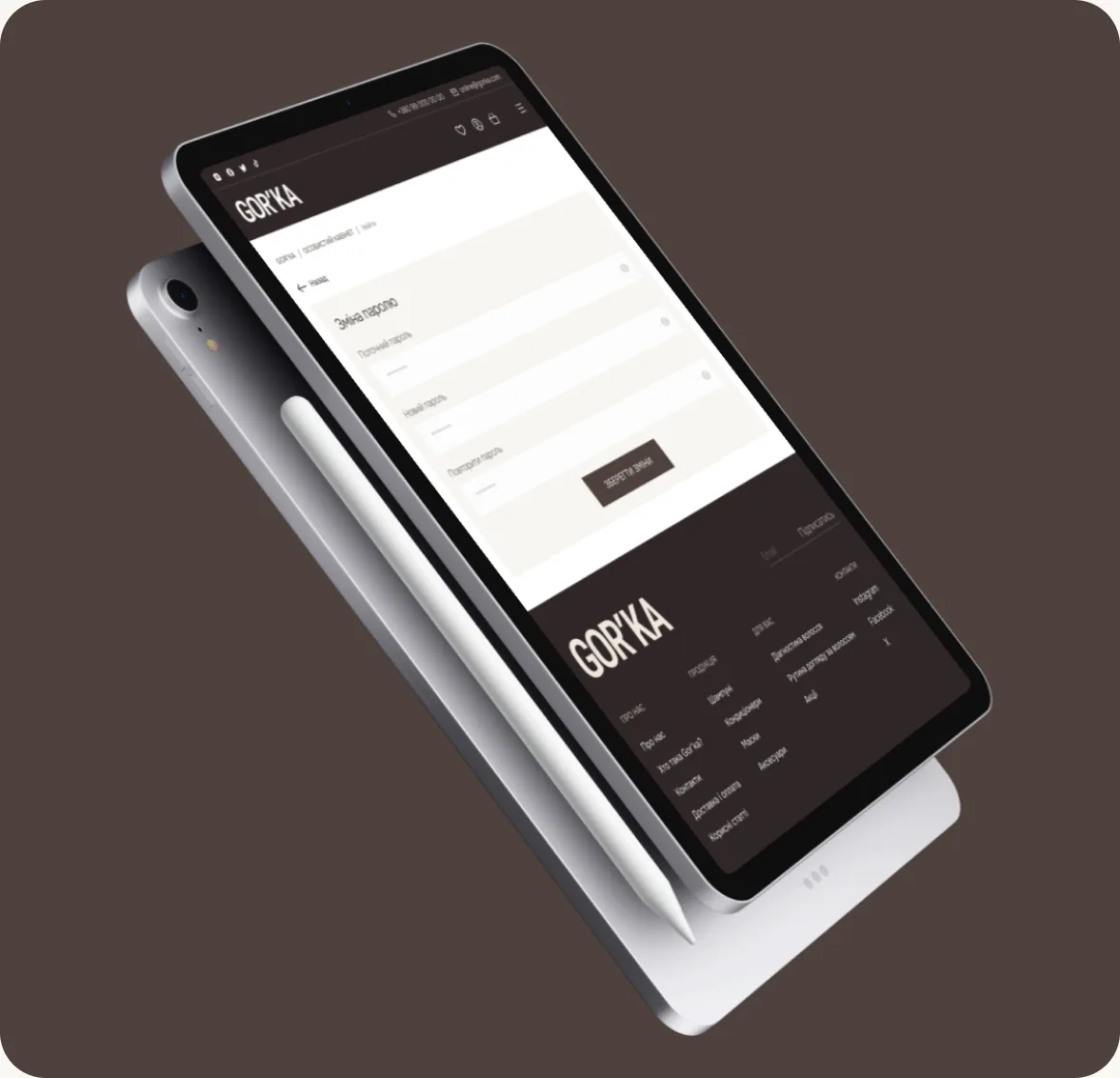
GOR'KA personal account on laptop GOR'KA personal account screens
GOR'KA personal account on mobile GOR'KA mobile account screen

ui design

Seamless Checkout

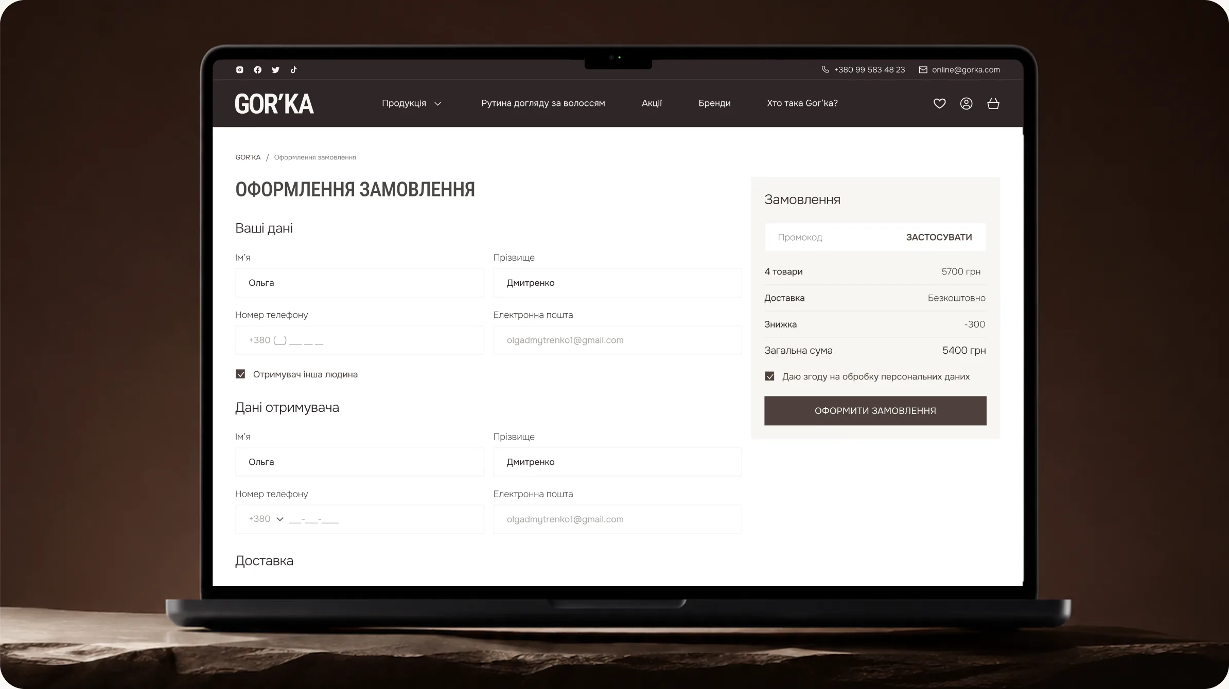
The checkout process was carefully structured to eliminate unnecessary complexity while keeping users focused on completing their purchase. Information is presented in a clear and organised way, making each step easy to understand and complete.

Responsive layouts, consistent UI components, and thoughtful interaction design ensure a comfortable experience across all devices. Every element was optimised to create a fast, reliable, and user-friendly checkout journey.
GOR'KA checkout page

ui design

Product Page

The product page combines detailed product information with an intuitive interface to support efficient decision-making. High-quality imagery, organised content, and clearly structured specifications allow users to quickly evaluate each product.

The layout is designed to keep essential actions easily accessible while encouraging further exploration through product recommendations and complementary items. This approach creates a smooth shopping journey and increases engagement.
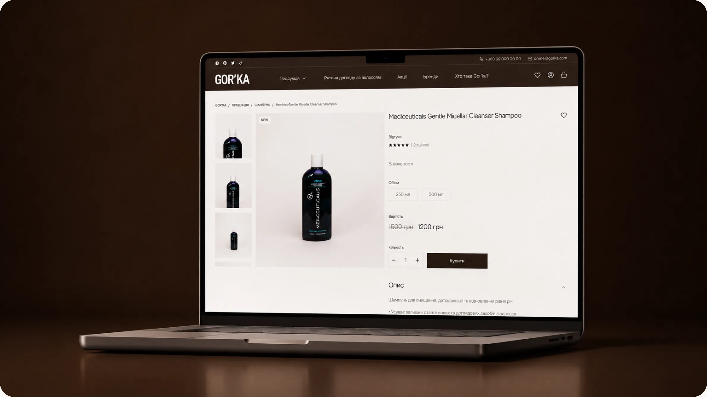
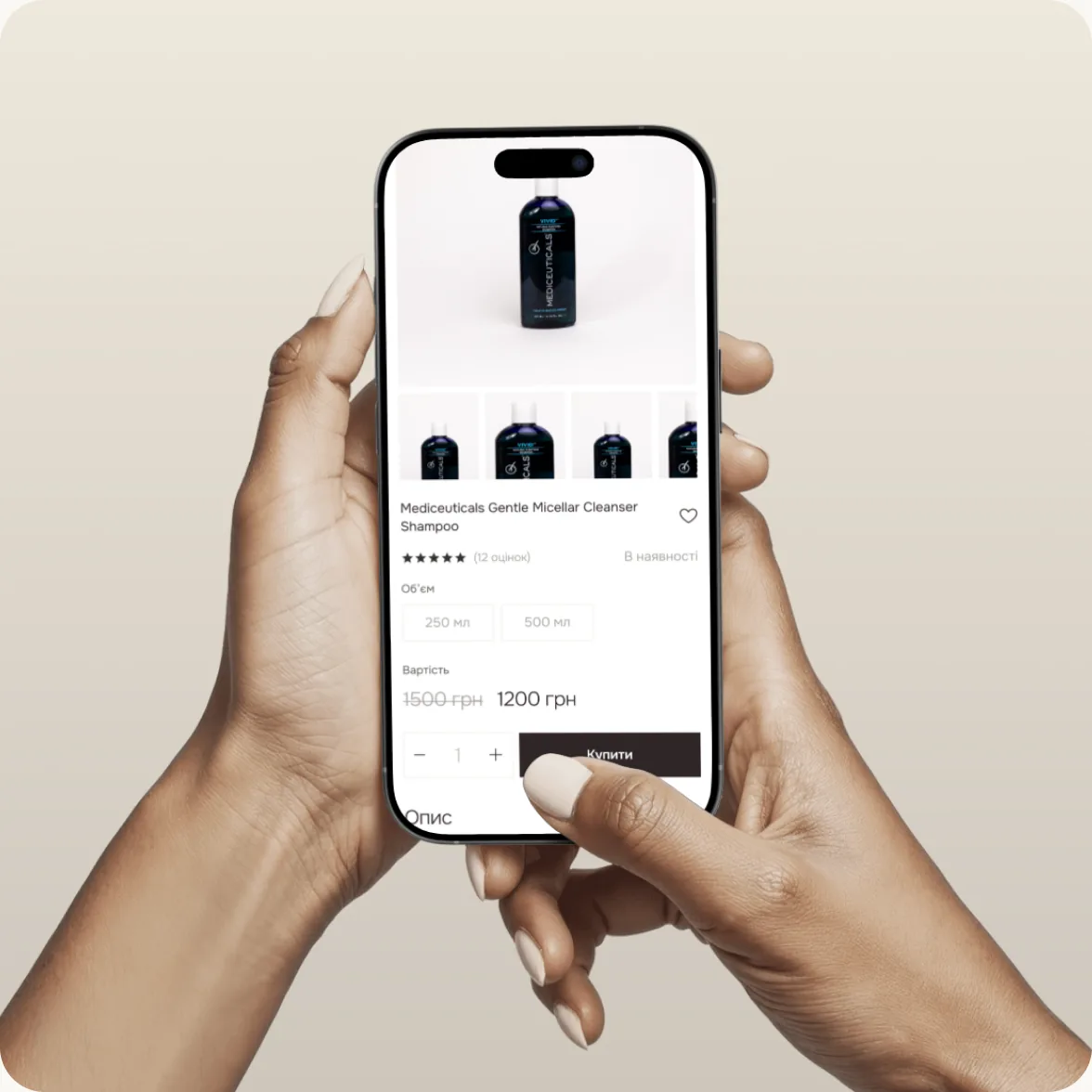
GOR'KA product page
GOR'KA product page mobile GOR'KA product page tablet

ui design

Service Experience

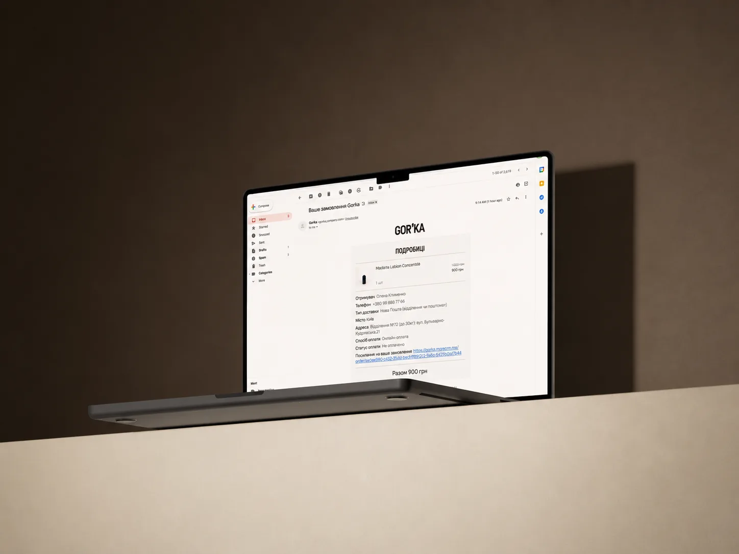
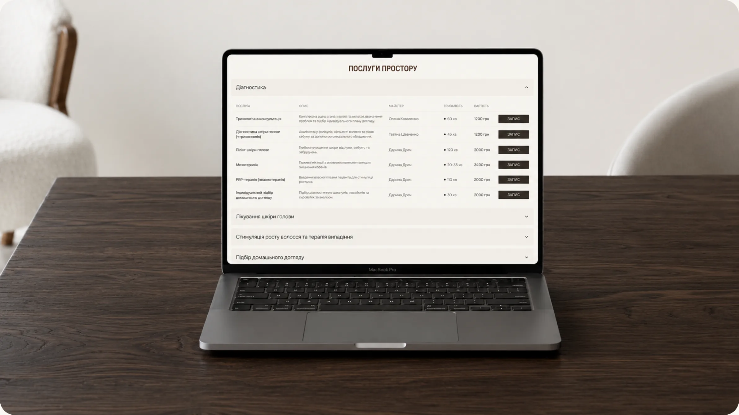
The service experience was designed to provide customers with a seamless journey beyond the core website navigation. Key interactions—including service booking, gift certificate purchases, and order confirmation emails—were carefully crafted to ensure a smooth, intuitive, and consistent experience at every touchpoint.

Each flow prioritises clarity, ease of use, and user confidence. By streamlining every step and maintaining a cohesive visual language, the platform delivers a reliable experience that strengthens customer engagement before, during, and after each service interaction.
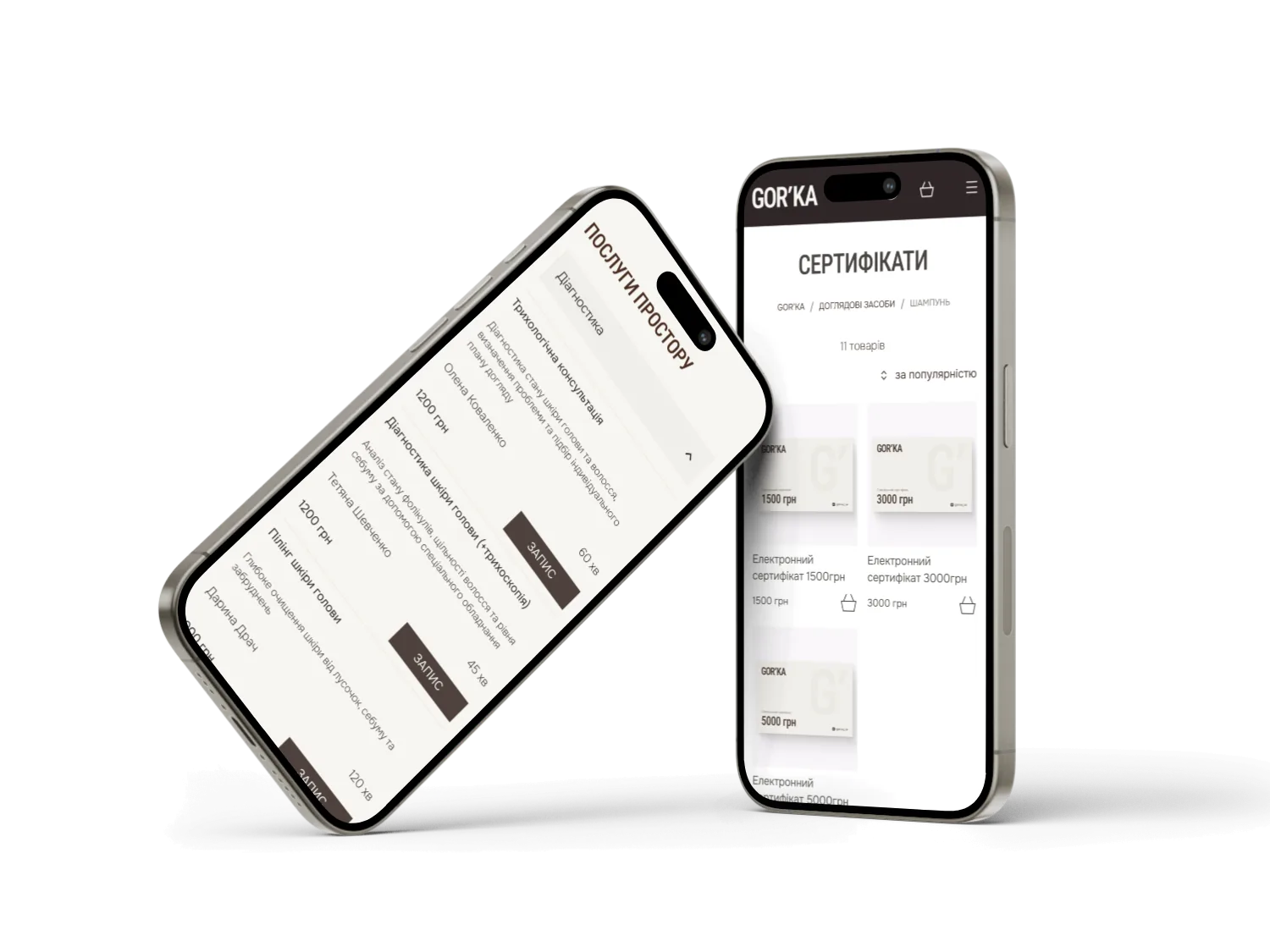
GOR'KA gift certificates on mobile
GOR'KA services booking page GOR'KA order confirmation email

ui design

Blog & News

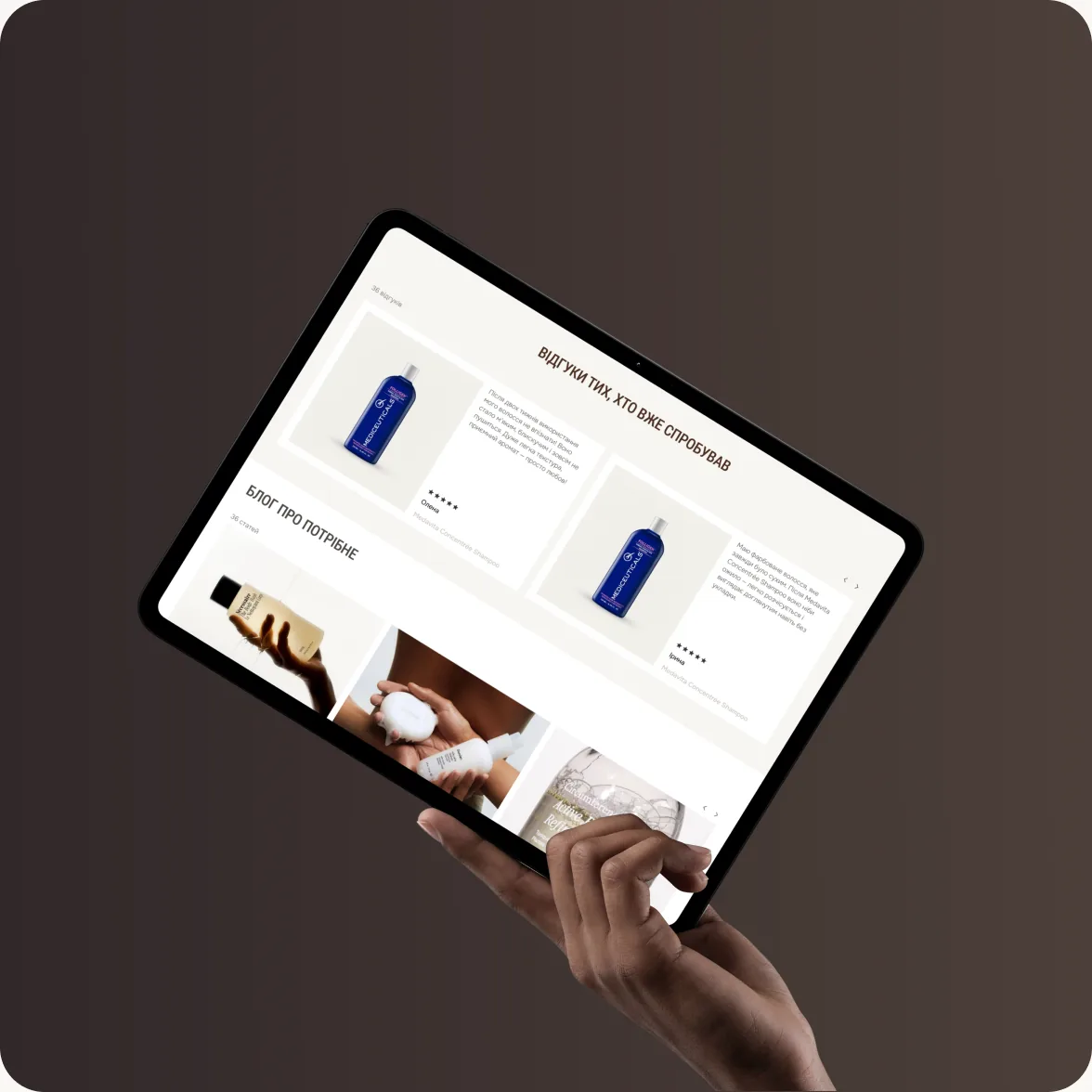
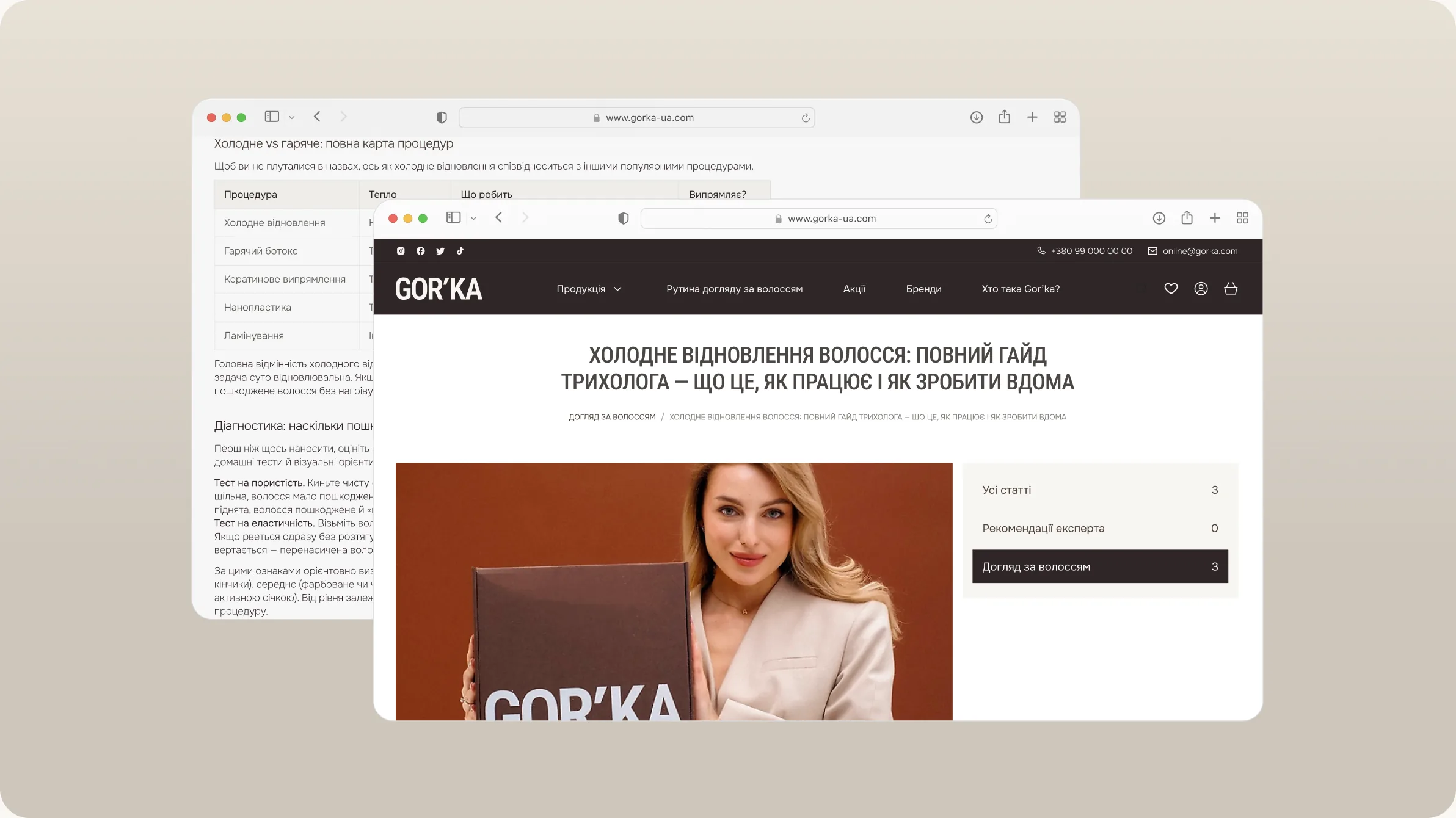
The blog was designed to support content discovery while strengthening the brand's online presence and SEO performance. A clean layout, clear content hierarchy, and intuitive category navigation make it easy for users to browse articles and find relevant information.

Featured posts, article categories, and engaging visual elements encourage deeper exploration and increase user engagement. The responsive design ensures a consistent reading experience across all devices, making valuable content accessible anytime and anywhere.
GOR'KA blog

What the Client Received

Rather than delivering isolated creative assets, we built a complete ecosystem that supports the brand at every stage of its development.

The project included brand strategy, visual identity, packaging design, e-commerce website, SEO optimization, content production, advertising materials, photography, video production, and social media design—all developed as parts of one cohesive system.

By approaching every touchpoint through a unified strategy, GOR’KA received more than a collection of deliverables. It received a brand foundation designed for long-term growth, stronger recognition, and a consistent customer experience across every channel.

What success looked like for the client:

★★★★★

"We were skeptical of another agency. MORE actually showed up and delivered. New patient bookings up 340% in four months."

Dr. Sarah M.

Healthcare · Chicago
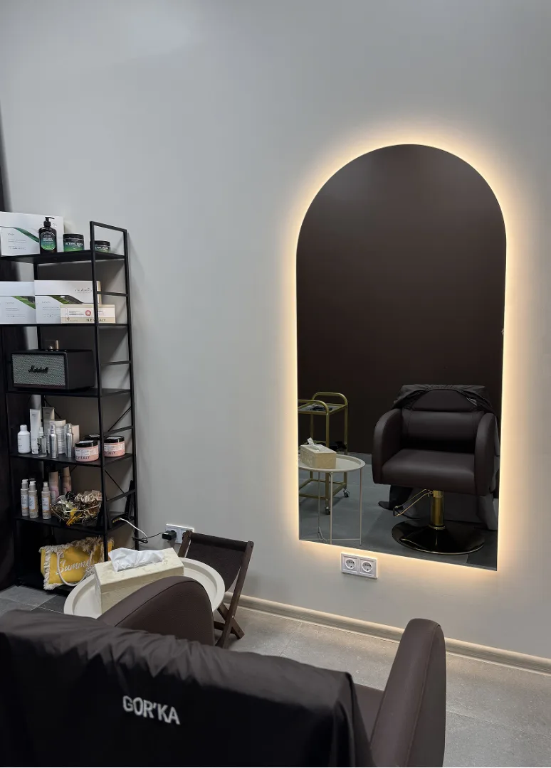
GOR’KA salon interior with an arched backlit mirror

Project Team

Project Lead — Vladyslav Trusov

Project Manager — Igor Makhnovskyi

Creative Director — Bogdan Voyt

Brand Strategy & Design — Polina Volovodenko

Front-End Developer — Denys Anokhin

Back-End Developer — Yevhen Zhyrin

Ready to be our next success story?

Successful Projects

Ready to work with an agency that gets it?

Let's spend 30 minutes together — no pitch, no pressure, just a real conversation about your growth. Walk away with a clear strategy whether you hire us or not.