Dounia Faydi – a brand for a florist
About the project
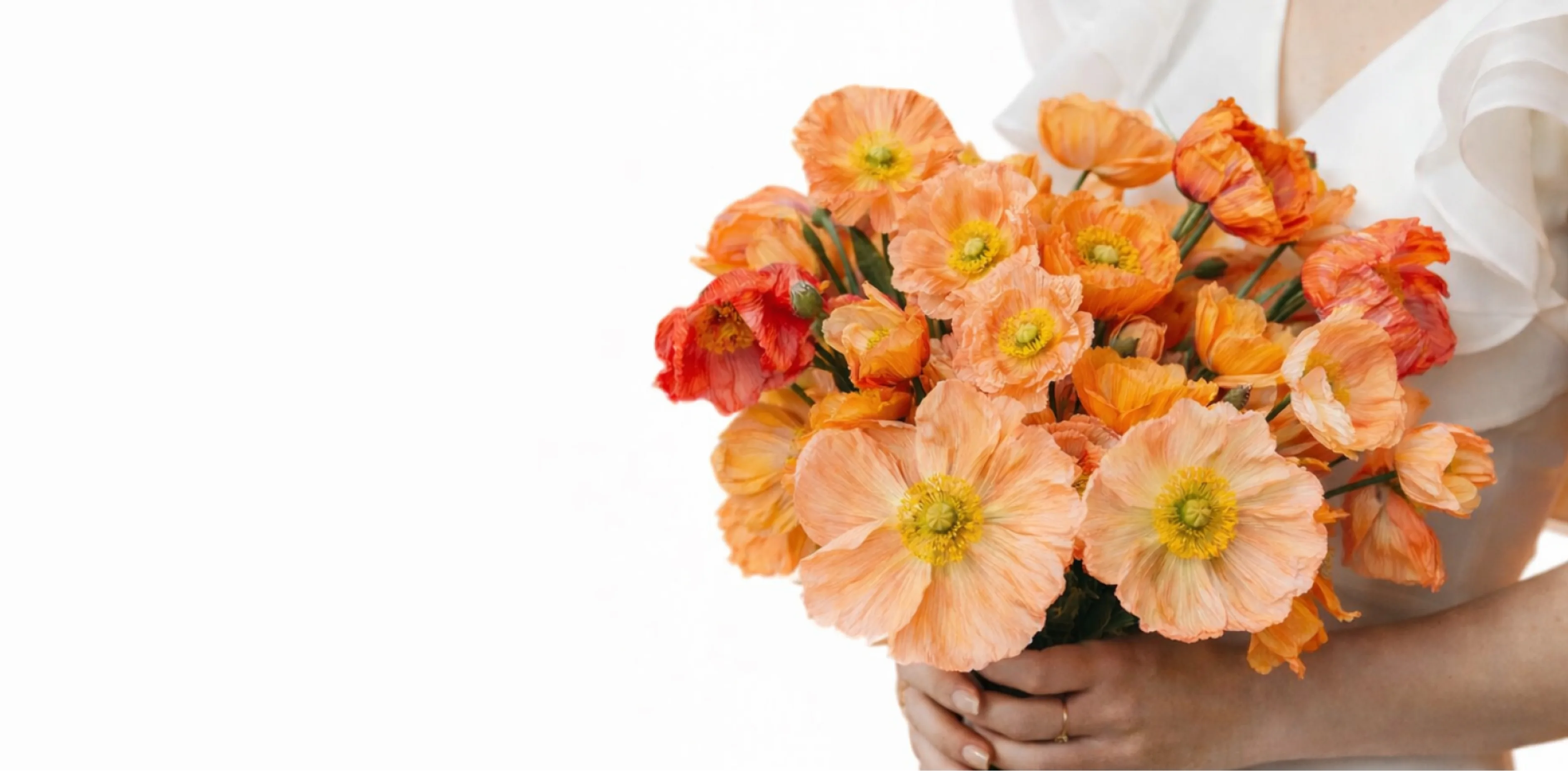
Dounia Faydi is a floral brand built around a personal, expressive approach to flowers and the emotions they carry.
Our work focused on creating a visual identity that reflects Dounia’s individual style and transforms her floral practice into a clear, recognizable brand. We developed the core identity, typography, color direction, visual language, and communication principles as parts of one cohesive system.
The goal was not simply to make the brand look beautiful. We wanted to create an identity that feels personal, refined, and emotionally expressive — one that supports Dounia’s work, strengthens recognition, and gives the brand a clear foundation for future growth.
Building a Brand
Our task was to translate Dounia’s floral style, personality, and emotional approach into a cohesive brand language. Every touchpoint — from the first visual impression to social media and client communication — needed to feel consistent, refined, and unmistakably hers.
We developed a flexible identity that gives the brand a distinctive character, strengthens recognition, and creates a solid foundation for future growth.
From Strategy
to a Brand Language
For us, design is never an isolated creative exercise. It is the natural outcome of strategy.
Every decision - from the smallest visual detail to the overall brand experience - was guided by research, purpose, and long-term scalability.
We began by exploring the floral industry, the competitive landscape, and the visual language commonly used by independent florists and boutique floral brands.
It was important to understand not only how the category presents itself, but where there was room for a more personal and distinctive expression. This helped us define an opportunity for Dounia Faydi to stand apart through a brand language rooted in emotion, individuality, and a refined contemporary aesthetic.
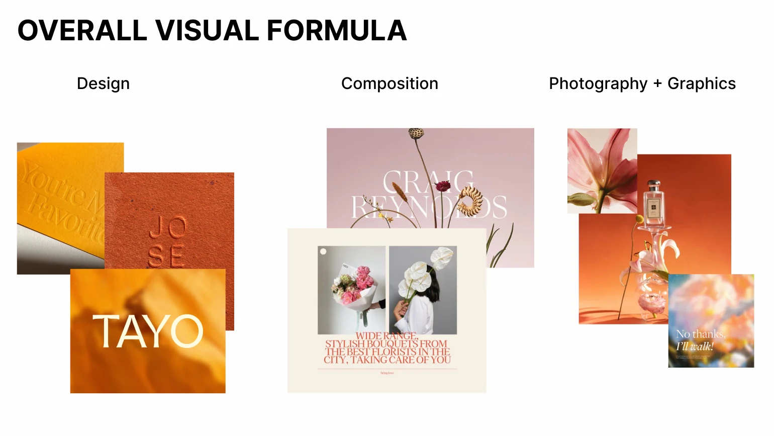
The research helped us define a clear direction for Dounia Faydi — a floral brand built around personal expression, emotion, and a strong sense of authorship.
Rather than simply selling floral arrangements, the brand transforms flowers into a way of communicating feelings, stories, and meaningful moments. This idea became the foundation for its positioning, personality, values, and tone of voice.
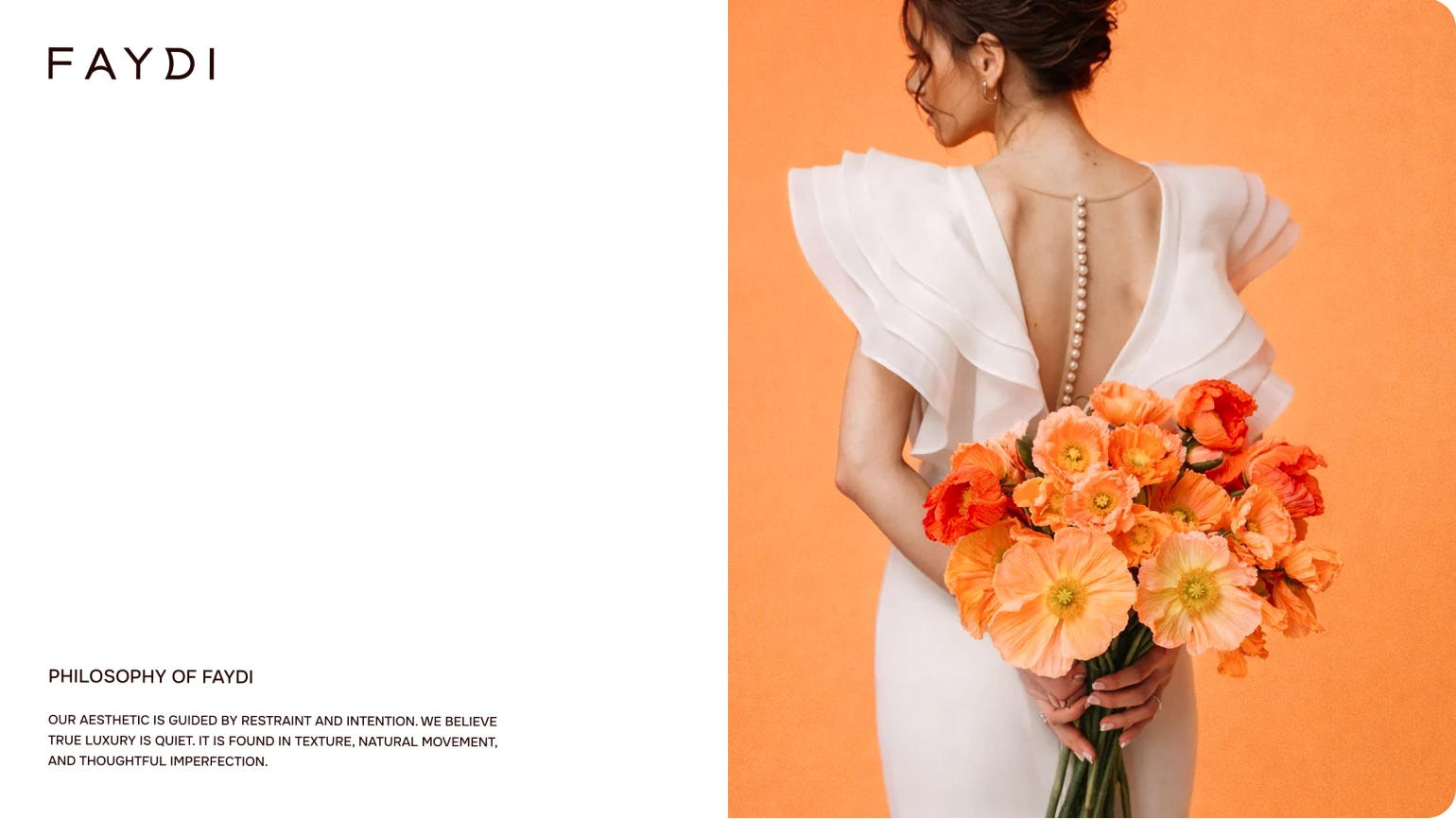
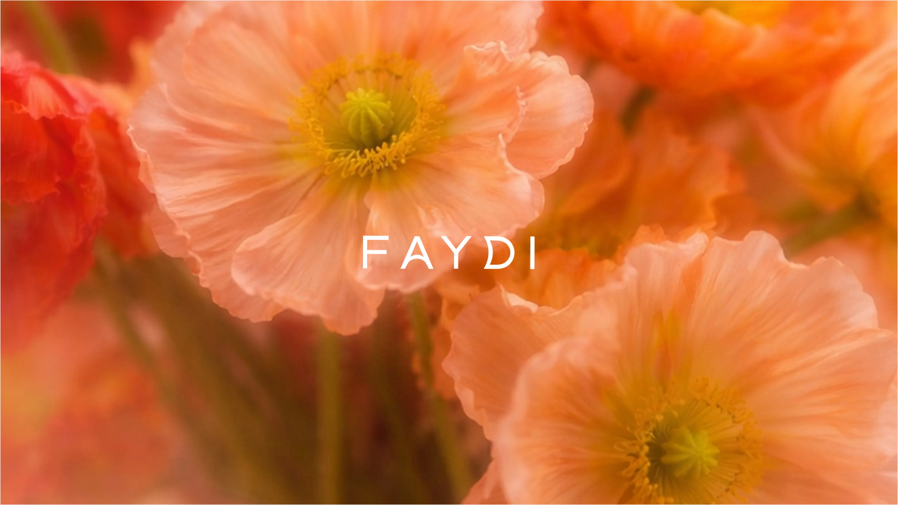
Based on our research, we developed the visual concept for FAYDI, focusing on a balance of softness, elegance, and contemporary expressiveness. The color palette combines warm, natural shades with rich accents inspired by flowers, organic textures, and the emotional nature of gift-giving. In terms of typography, we selected a sophisticated, modern typeface that lends clarity to the brand identity while preserving the brand’s personal and artistic character.
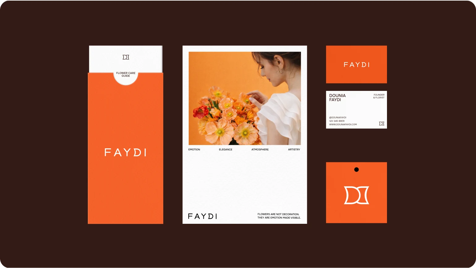
We brought the visual direction together into a complete identity system that reflects Dounia Faydi’s expressive and personal approach to floristry.
Color, typography, photography, composition, and graphic details were designed to support one another and create a consistent visual language across different formats. The system balances softness and refinement with enough structure to remain clear and recognizable.
As a result, the brand gained more than a beautiful visual style — it received a flexible identity framework that can grow across social media, printed materials, packaging, and future brand applications without losing its character.
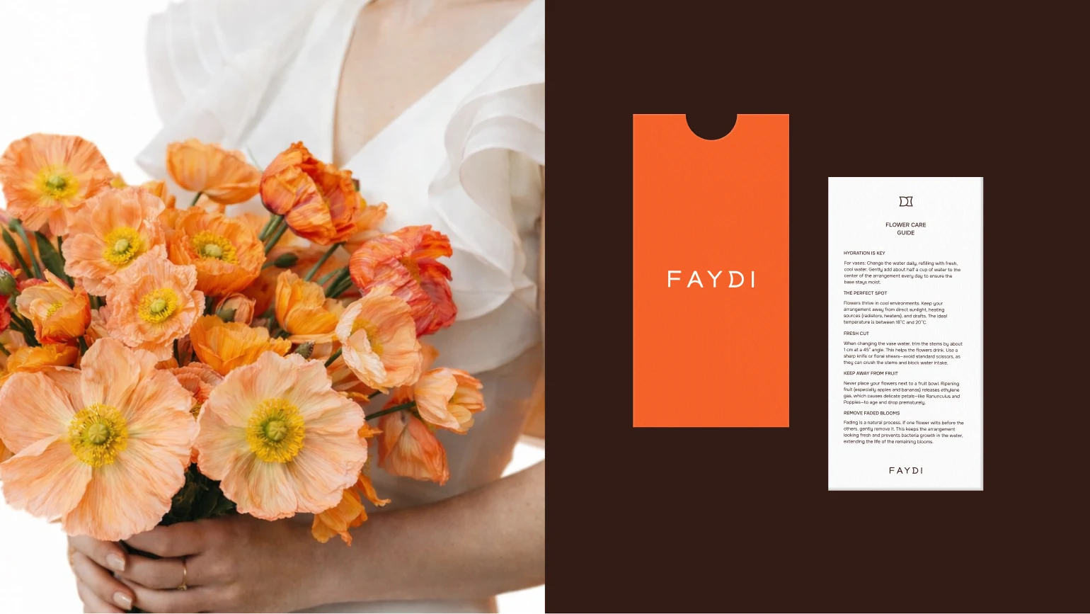
We translated the visual principles into a consistent framework for printed materials, packaging, client communication, and other brand expressions, making sure each format still felt unmistakably connected to the same identity.
Results
The project gave Dounia Faydi a clear and recognizable brand language that reflects both the character of the floral work and the personality behind it.
The identity now works consistently across different touchpoints, helping every interaction — from digital communication to printed materials and packaging — feel connected, intentional, and distinctly Dounia Faydi.
Most importantly, the brand now has a strong visual foundation that can evolve with the business while preserving the sensitivity, individuality, and refined character at its core.
Logo
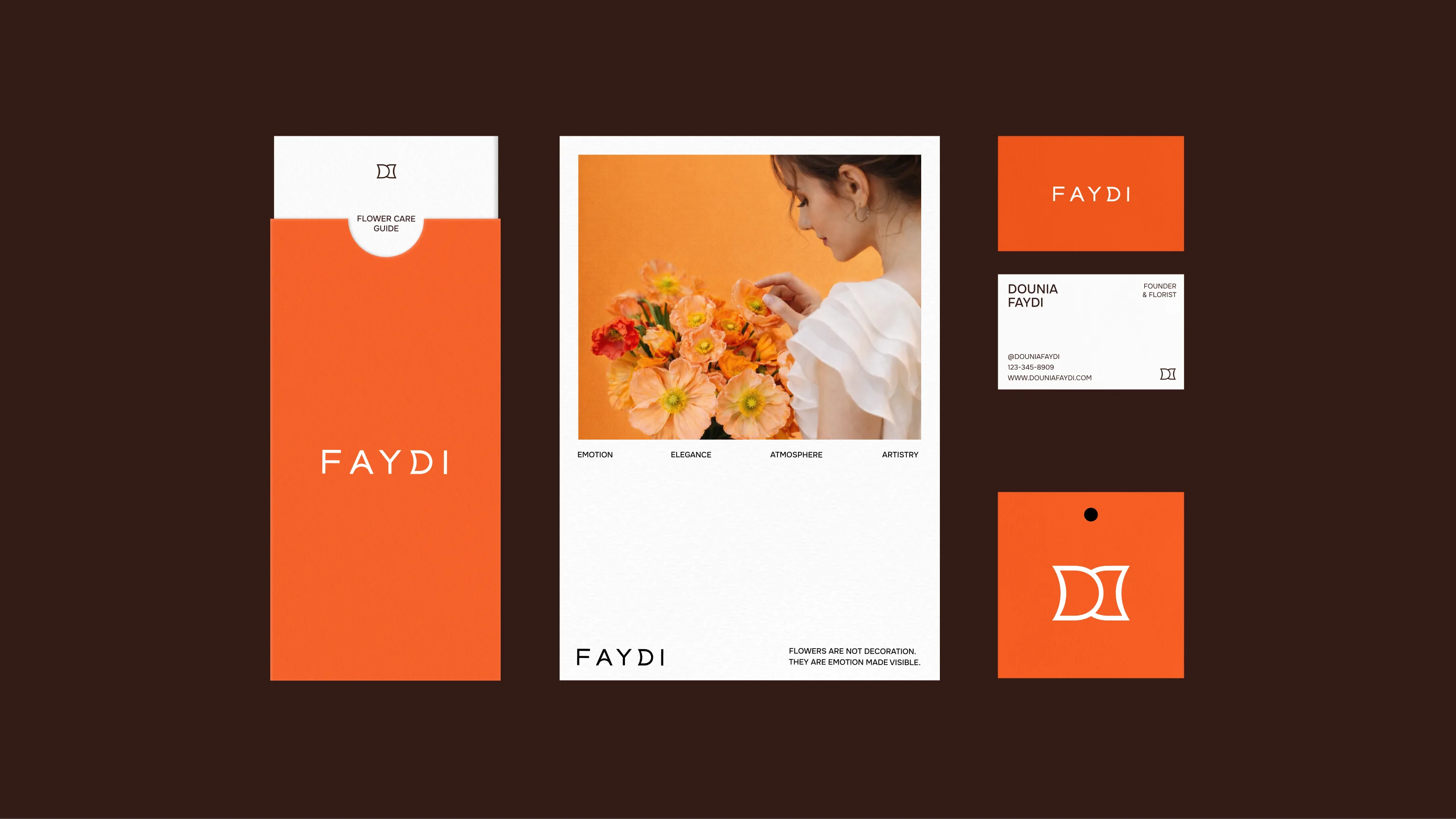
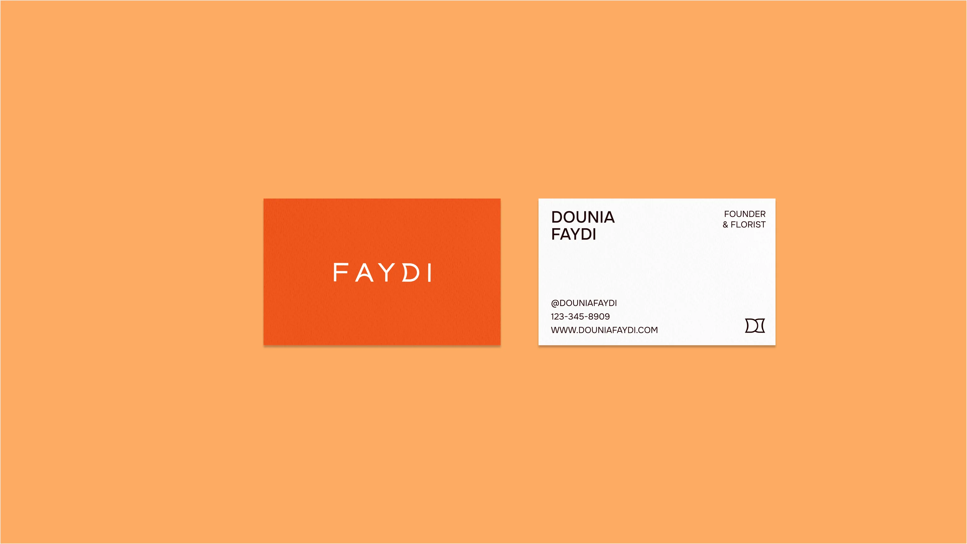
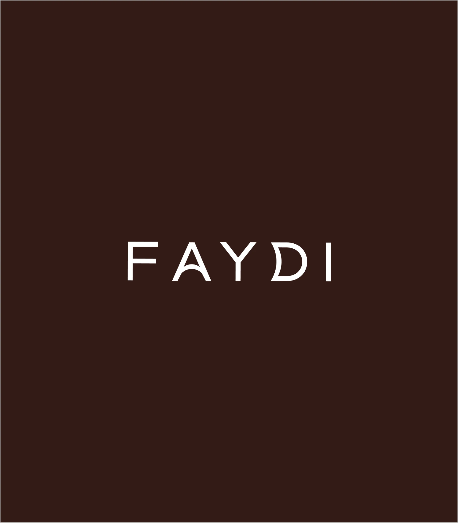
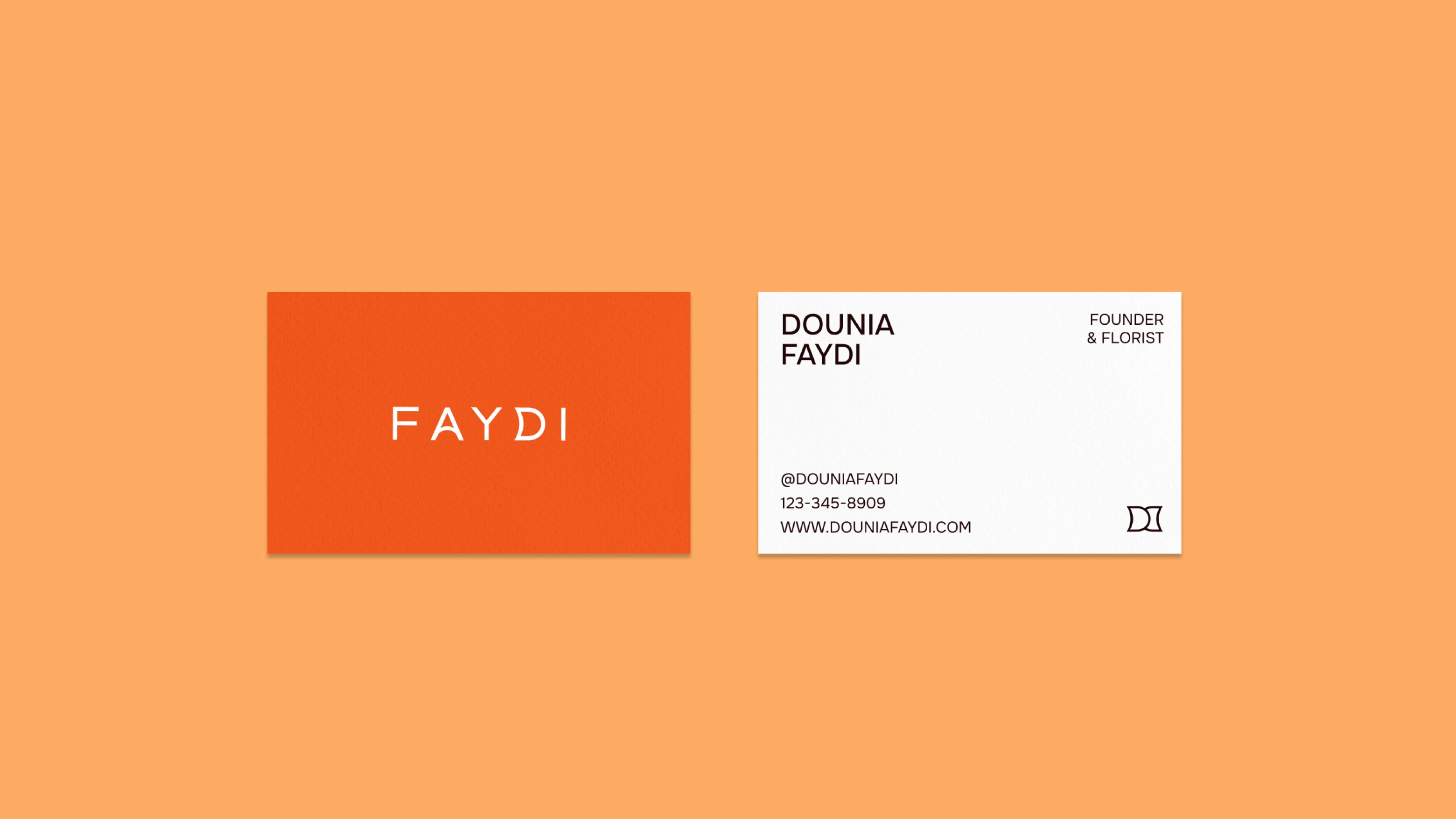
The FAYDI logo was developed to feel refined, expressive, and unmistakably personal. Its elegant letterforms create a distinctive wordmark, while the custom monogram adds a recognizable symbol that can live independently across different brand applications.
The balance between softness and structure reflects the character of the brand itself — emotional and artistic, yet considered and confident.
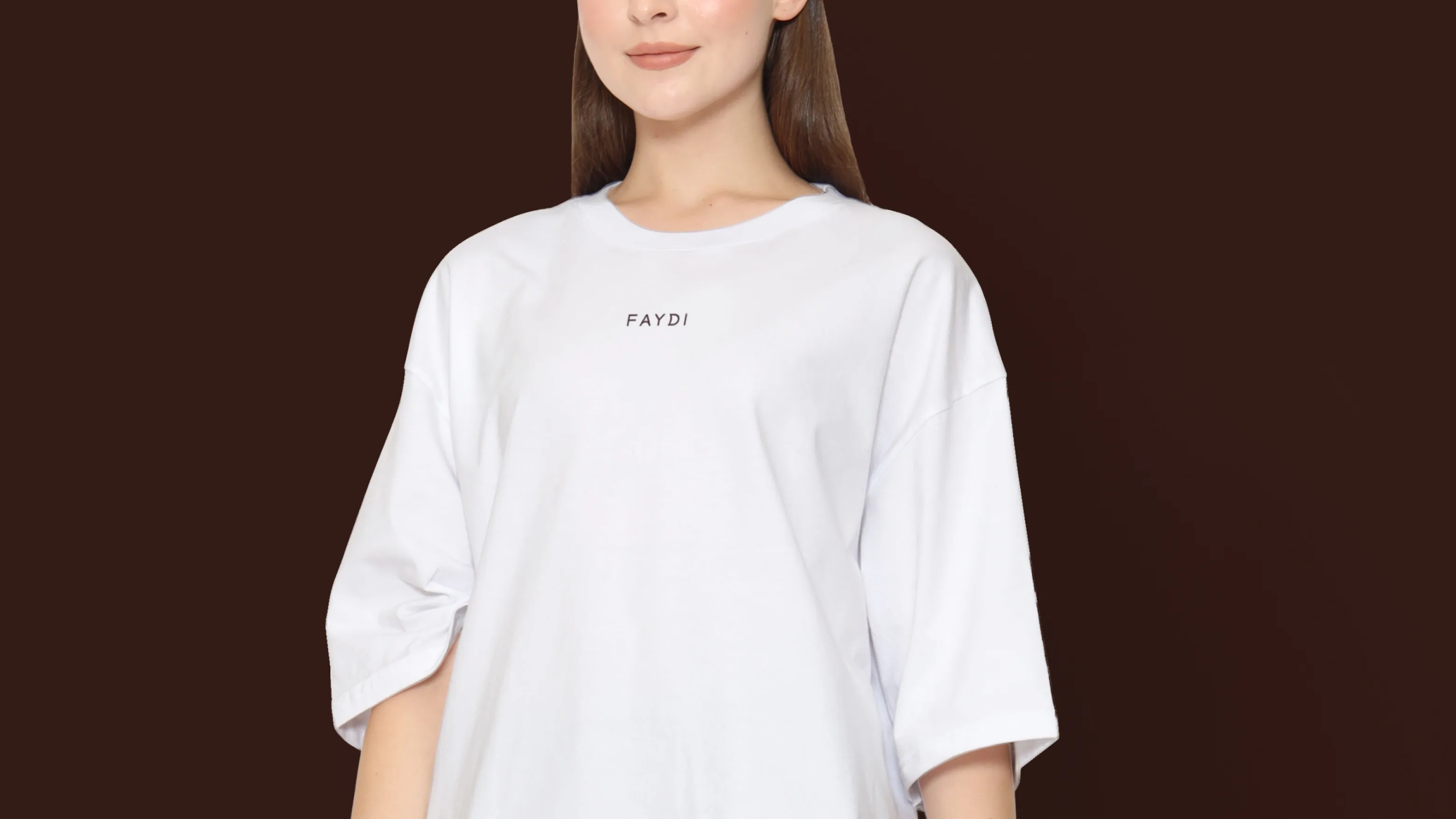
Designed as a flexible identity element, the logo works seamlessly across packaging, printed materials, digital touchpoints, and smaller branded details while maintaining its clarity and character.

Colors & Typography
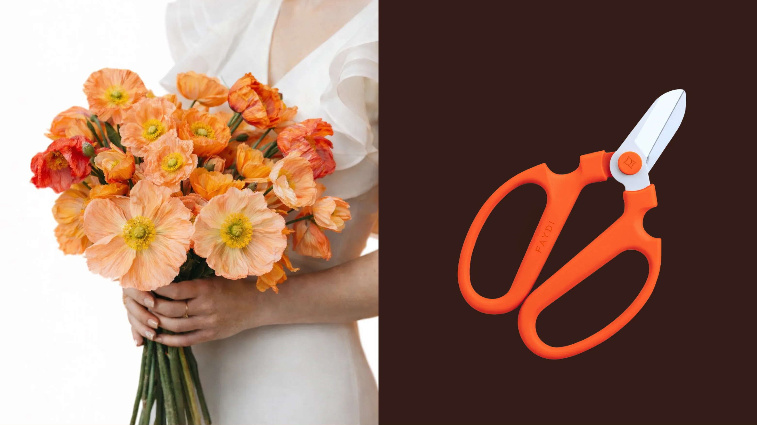
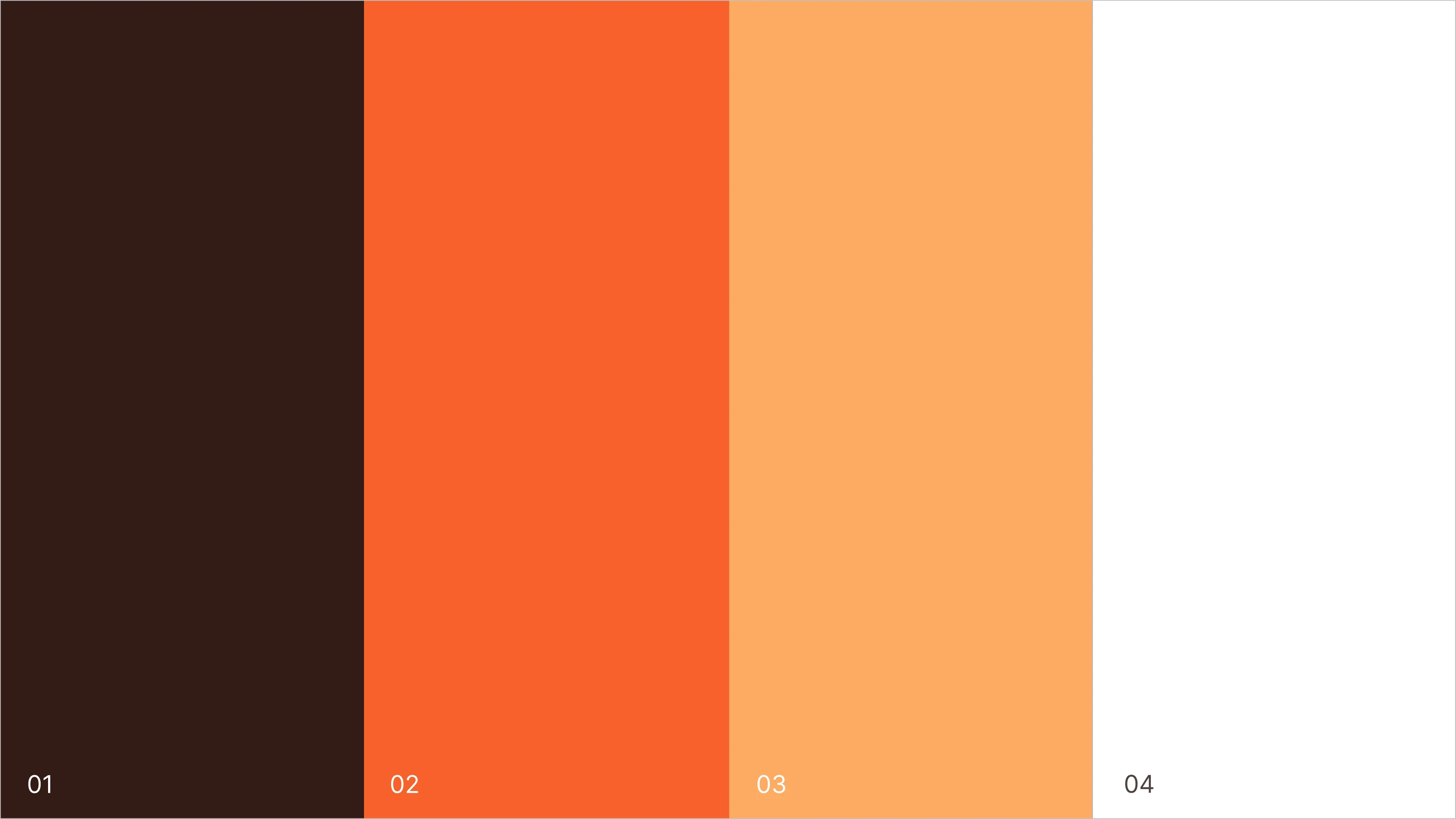
The FAYDI color palette is built around warm, expressive tones that feel natural, tactile, and emotionally rich. Soft neutral shades create a calm and elegant foundation, while deep brown and terracotta accents add warmth, contrast, and personality. Taken together, the palette looks sophisticated without being overly polished—reflecting the organic nature of the flowers and the individuality of Dounia’s creative work.
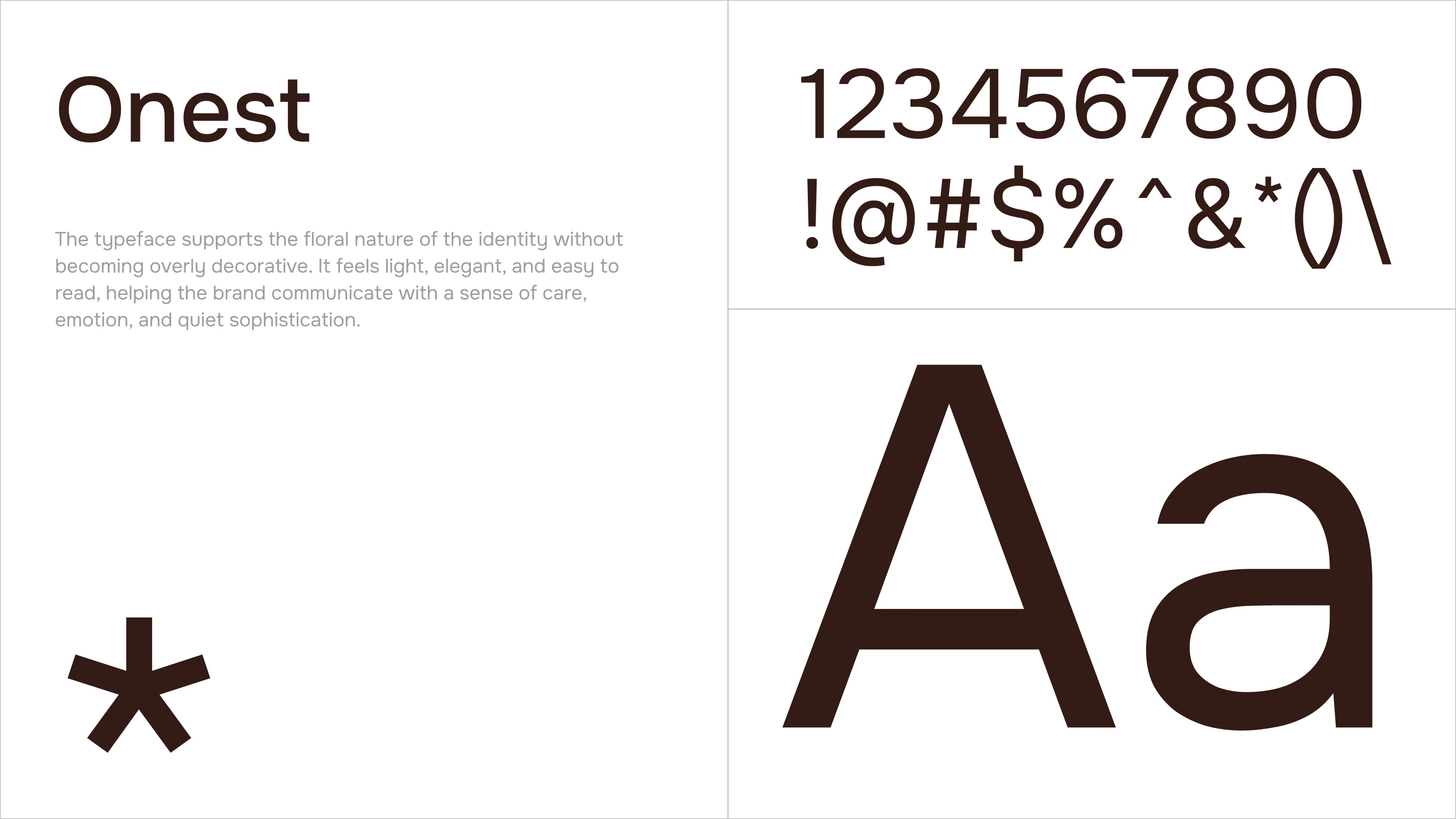
The typography strikes the same balance between character and clarity. The chosen typeface looks modern and sophisticated, with just enough softness to emphasize the brand’s emotional side. Its clear structure ensures clarity and confidence in communication, while the more expressive letterforms add personality and help make the visual identity recognizable and unique.
Packaging
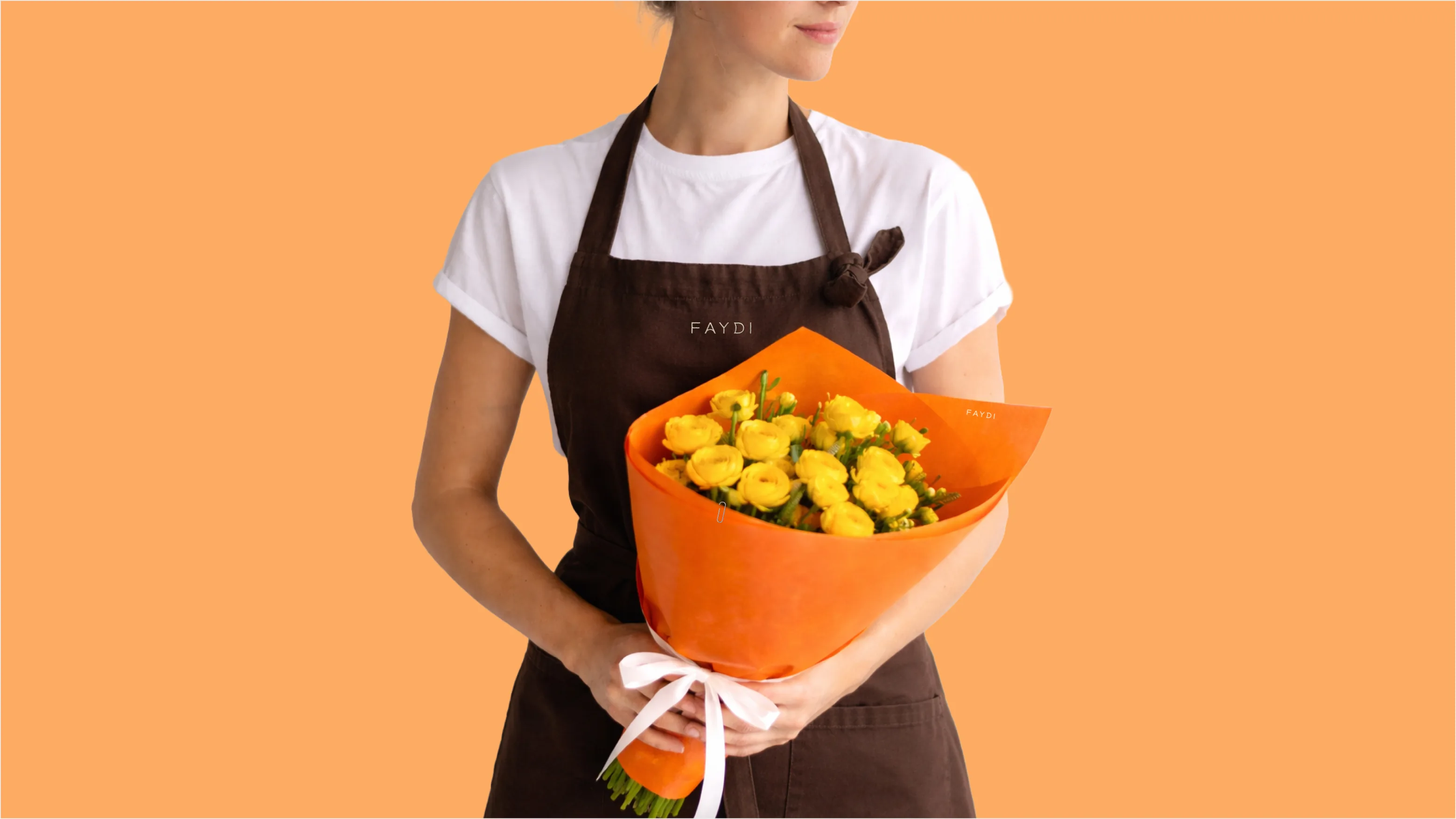
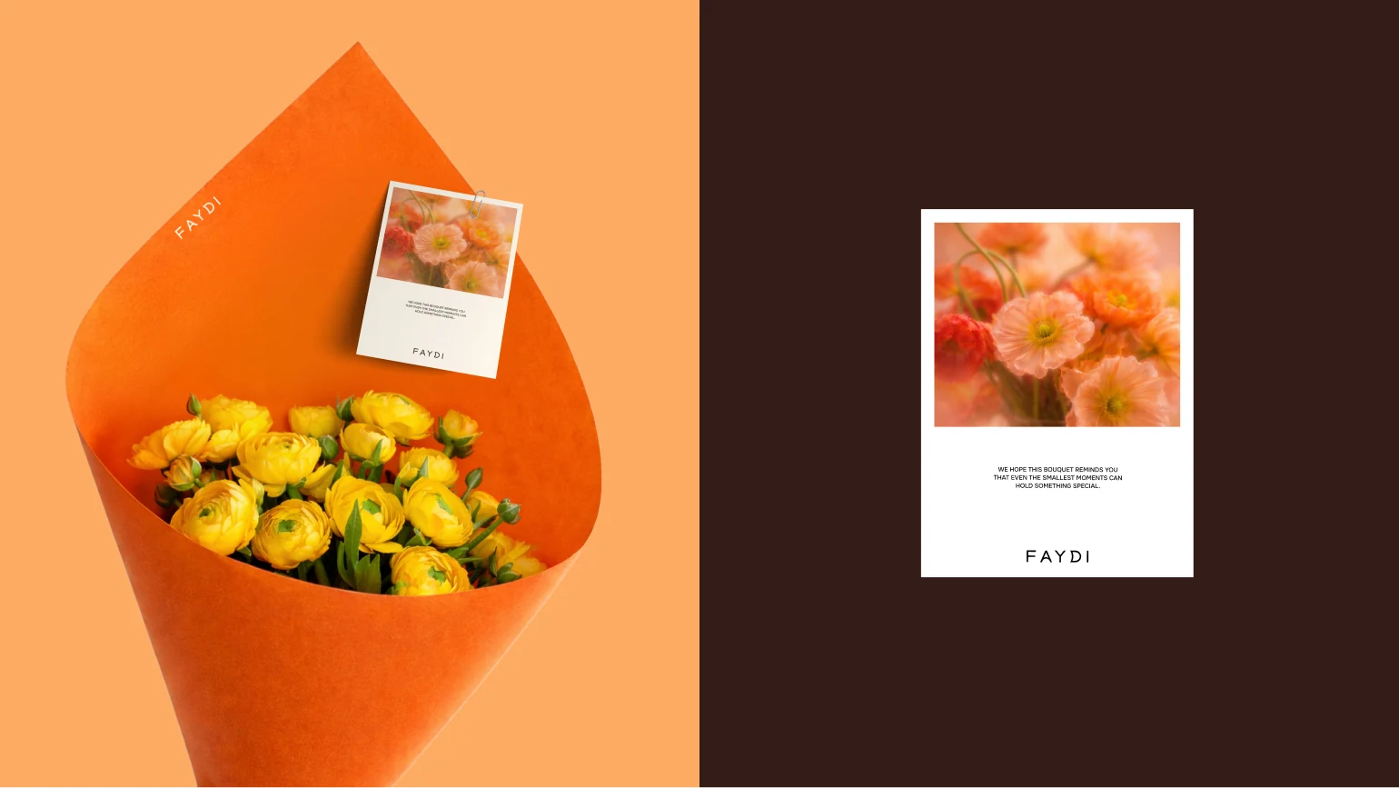
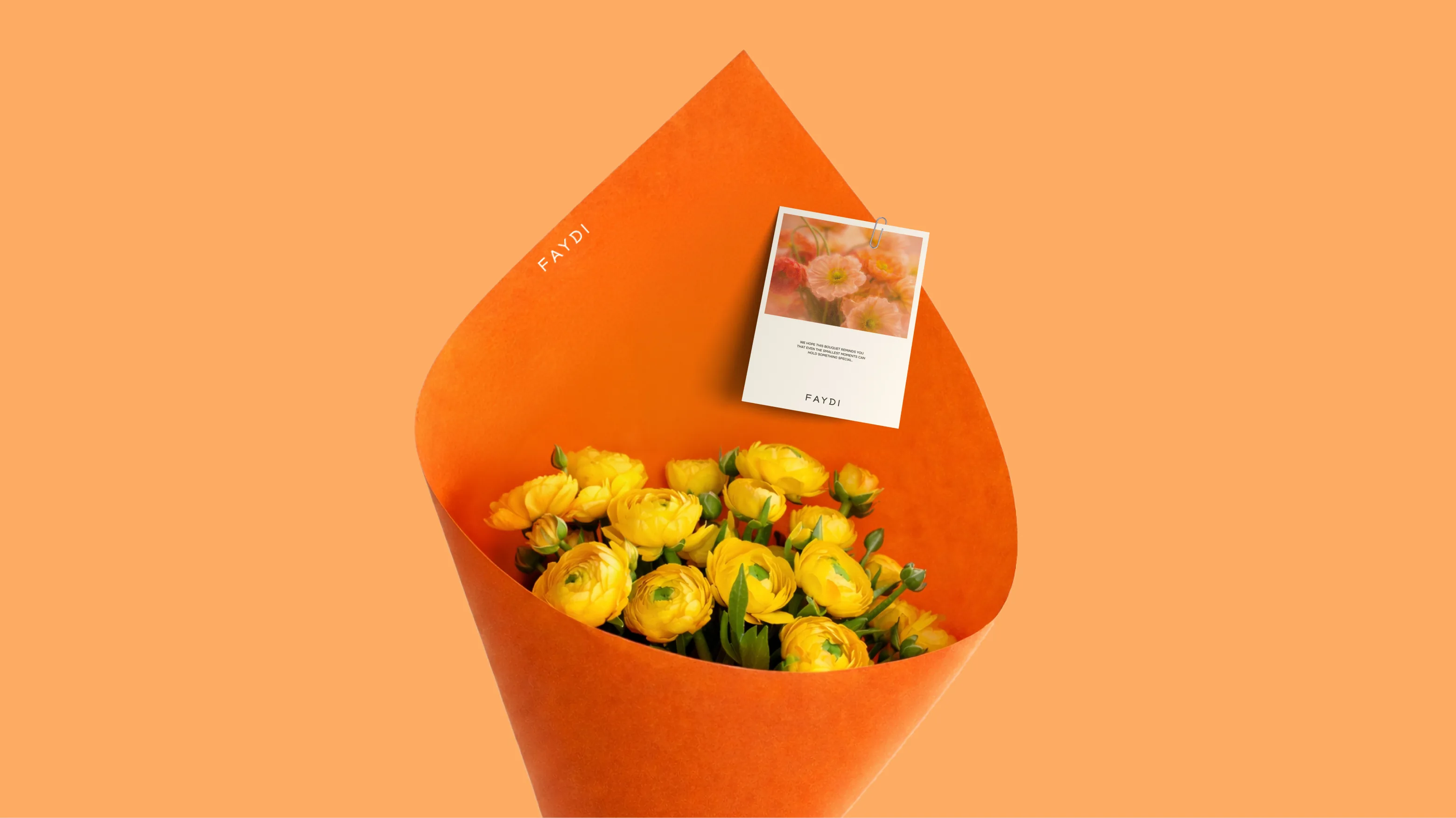
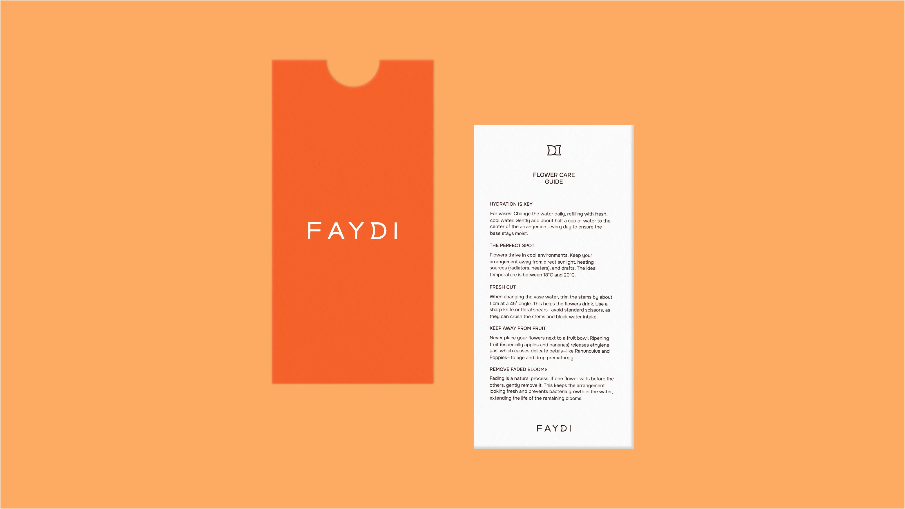
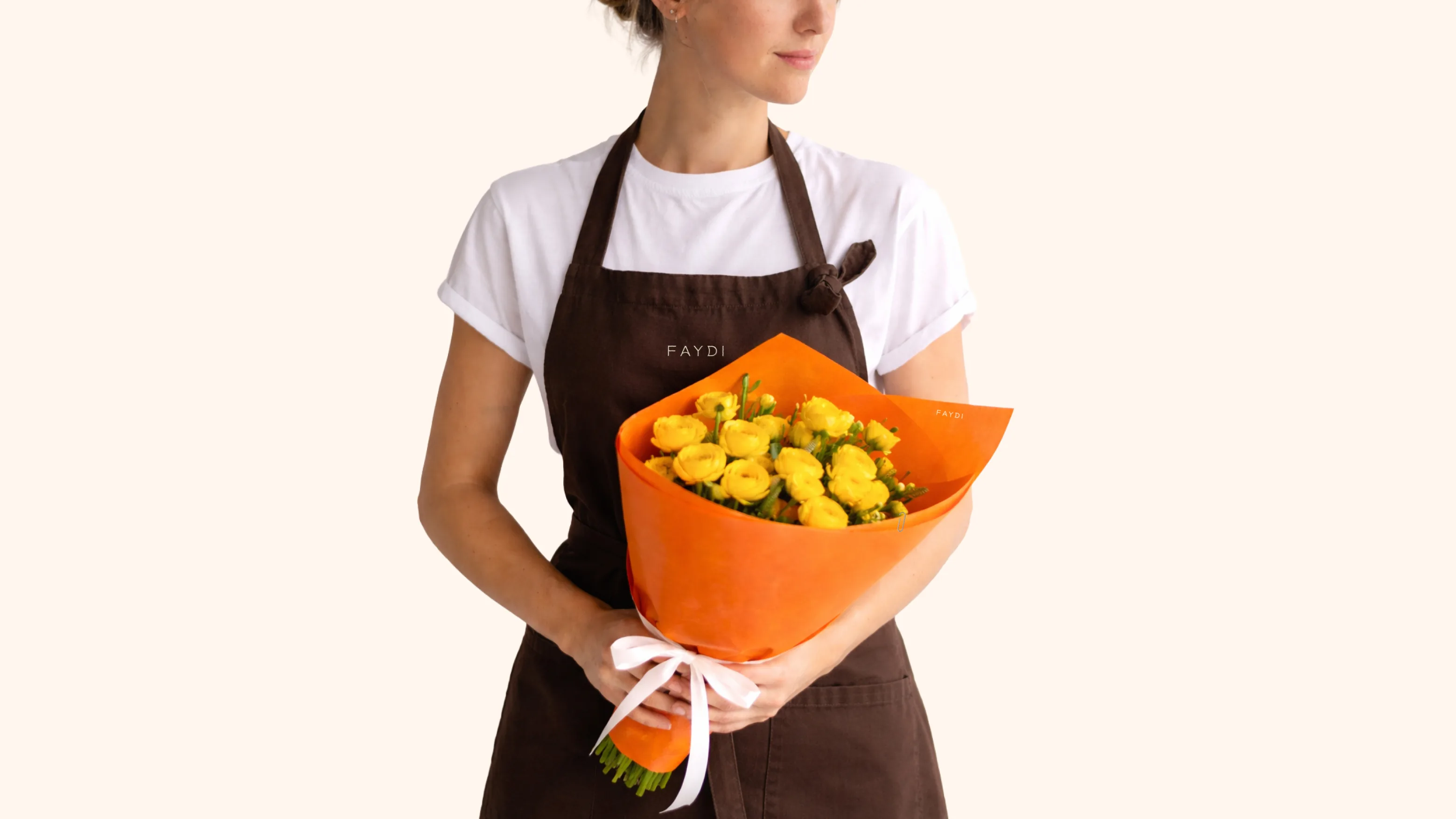
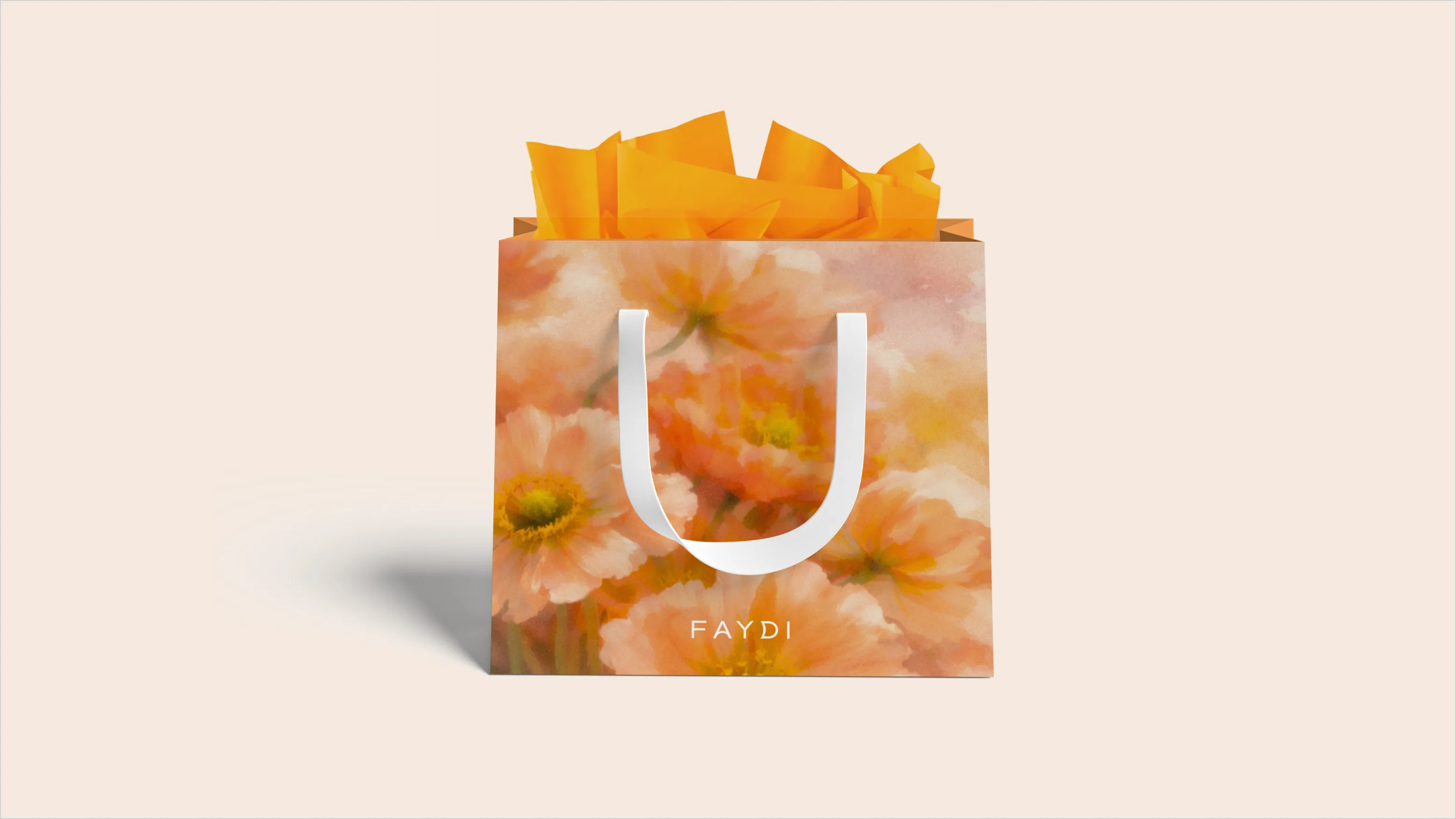
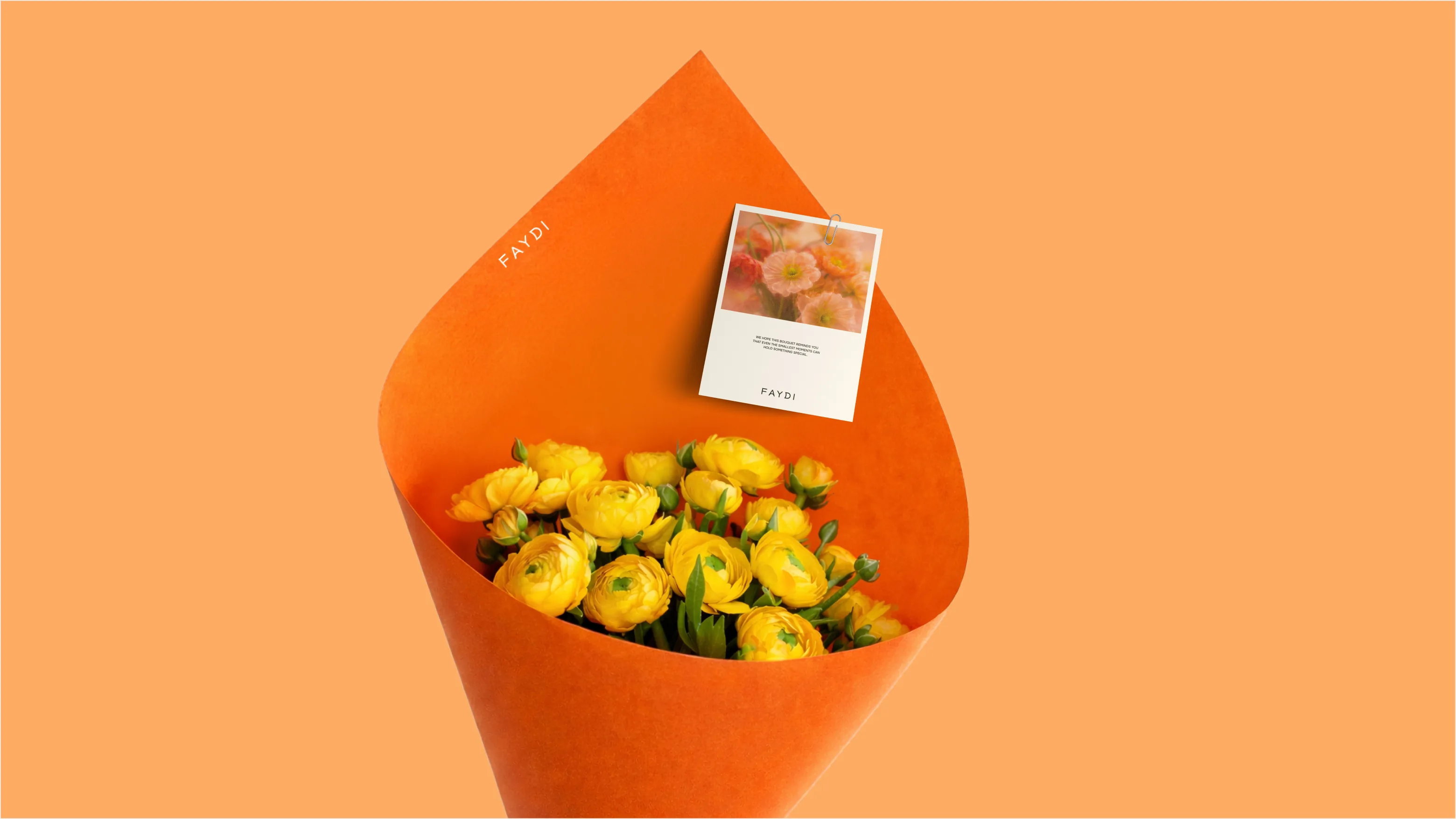
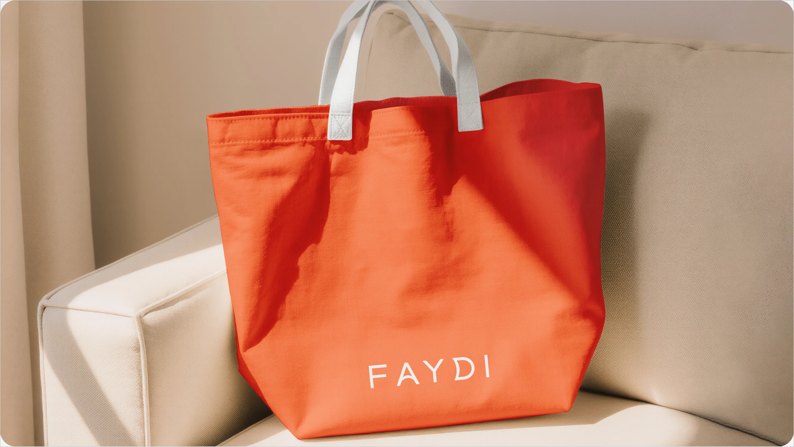
Packaging became an important part of how the FAYDI identity comes to life beyond the logo. We developed a flexible packaging direction built around bold color, floral imagery, and restrained branding. The system allows each piece — from wrapping and cards to bags and accessories — to feel expressive and memorable while still belonging to the same visual world.
Rather than treating packaging as a secondary detail, we used it as another layer of the brand experience: something that extends the emotion of receiving flowers and makes the interaction with FAYDI feel considered from the first glance to the final detail.
What success looked like for the client:
★★★★★
"We were skeptical of another agency. MORE actually showed up and delivered. New patient bookings up 340% in four months."
Dr. Sarah M.
Healthcare · Chicago